Groovelife
September 8, 2025
The ad: Strong visual design makes the product the hero
Groove Life’s Meta ads highlight belts from their range and show how to use text effectively in fashion advertising. Instead of using model or lifestyle photos to drive emotional appeal, they rely on social proof and a tagline that shares a strong value proposition.
The result is an ad in which the product is the hero, while your target audience feels like they could be heroes too.
Why it won Catalog Ad of the week
The Groove Life ads’ effectiveness lies in how they create a strong visual design and emotional appeal. The design is product-focused, while the messaging makes it about the target audience.
It applies proven psychological principles effectively to tap into our aspirations. By buying one of these belts, you’ll receive a product that’s durable and also join an elite circle of legends.
What makes this Catalog Ad great
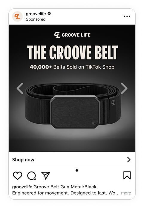
Creates visual hierarchy effortlessly
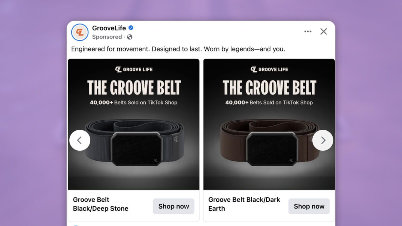
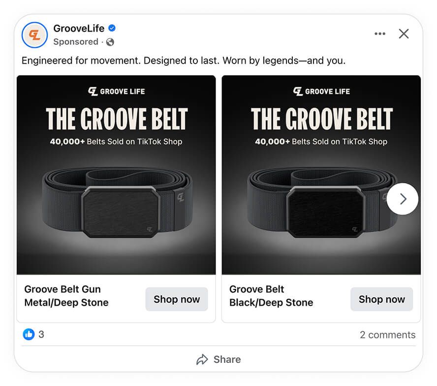
Groove Life's catalog ads follow a direct-response principle, putting the product front and center instead of the story. In this ad, the product is the hero and all the other elements are strategically placed to create a visual hierarchy that directs and keeps the focus on the belt.
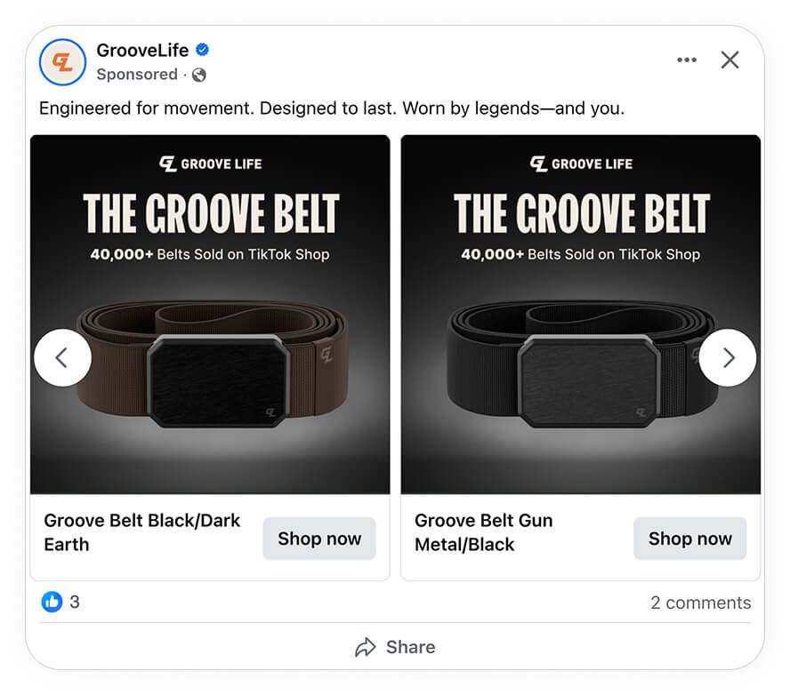
The element that captures the attention immediately is the bold headline, “The Groove Belt”. It’s large, bold and in capitalised font and placed centrally at the top to ensure that it’s the first thing shoppers see.
By emphasising the product name in this way, they’re also creating an extra layer of recognition and prestige. In fact, our stats reveal that showing your product’s name in catalog ads can increase the return on ad spend (ROAS) by 22%, while decreasing the cost per purchase by 20%.
Then, the supporting info “40,000+ Belts Sold on TikTok Shop” is placed just beneath the headline in smaller font. This sentence adds social proof and is strategically included to anchor trust. As it’s secondary to the product name (which is the star of the ad), placing it below the headline fits in with their strategy.
As for the product image, it’s clean, isolated, and centered to ensure no distractions. To make it stand out further, they also use contrast cleverly by placing the dark belt on a slightly lighter background.
Plus, as Groove Life isn’t trying to create a story about the product, there’s no need to add a lifestyle photo. One large photo of the belt is enough.
Builds authority and association
Groove Life’s tagline “Engineered for movement. Designed to last. Worn by legends-and you.” effectively builds brand authority. The word "engineered" implies that careful thought, technical expertise, and high-quality craftsmanship go into all of their products. This is echoed by the phrase “designed to last” which gives their product a strong value proposition.
While their ad positions themselves as an authority figure when it comes to belt designs, they still manage to connect with their target audience of regular consumers. They do this by ensuring that ad remains about the users’ experience and not them as a brand.
Also, by including the phrase “and you”, Groove Life is addressing the shoppers directly, making them feel included. This simple phrase has a powerful effect as it creates a personal connection almost immediately.
What’s more, by placing potential customers in the same circle as legends, they cleverly borrow credibility from iconic figures and then transfer the prestige to the buyer.
Adopts a cross-platform funnel strategy
Groove Life nailed the creative and then went one step further to ensure that their ad appeals to shoppers who are simply exploring as well as those ready to buy.
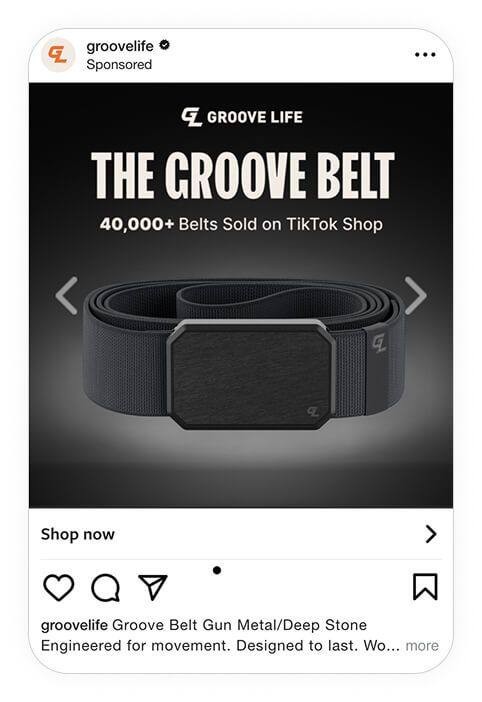
For example, on Instagram, they use a single image in a native-shopping flow which appeals to impulse buyers.
Then, on Facebook, they use the carousel format to target shoppers in the awareness or interest stage of the sales funnel (aka the discovery stage). By showcasing different color belts side by side, shoppers can easily compare their options.
Key Takeaways
The Groove Life campaign is a strong example of how catalog ads can look simple on the surface, yet be strategically built on proven marketing theories.
Here’s what stood out:
👉 Visual hierarchy directs attention
Bold typography leads with “The Groove Belt,” followed by the credibility line “40,000+ Belts Sold on TikTok Shop”. The clear structure guides the eye from attention to trust, then straight to action.
👉 Product as hero simplifies the choice
The belt is isolated against a clean, gradient background, with no lifestyle clutter or secondary visuals. This ensures the product itself, instead of the design elements, drives the ad’s impact.
👉 Authority and association elevate desirability
The phrase “Worn by legends—and you” transfers prestige and credibility to the buyer. It’s not just a belt; it’s a product associated with status and performance.
👉 Cross-platform funnel strategy maximizes impact
Facebook’s carousel showcases product variations side by side for comparison, while Instagram’s single hero shot encourages quick, impulse-driven purchases. Together, they target both exploration and decision-making mindsets.