Fatboy & Happy Horizon
May 20, 2026
.jpg)
The ad: a carousel where every card does two jobs at once
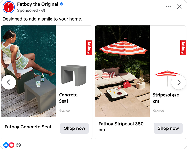
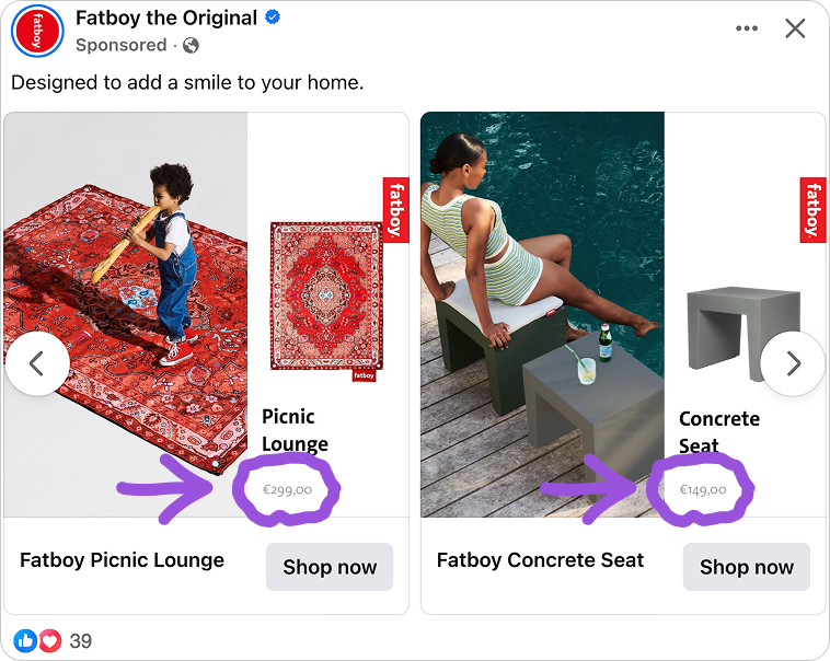
A split card. On the left, a living room, a terrace, a poolside. On the right, the same product isolated on white, name and price placed cleanly below. Scroll through the carousel and the scene changes every time, but the structure never does.
That is what the Fatboy the Original Catalog Ad looks like at first glance. The Dutch design brand behind the modern beanbag has built a carousel that moves through different rooms, different seasons, and different moods without losing a single visual thread across any of them.
The Catalog Ad runs on Meta with the same repeating structure on every card: lifestyle on the left, product on the right, name and price below. Nothing changes between cards except what is being shown and where it lives. That consistency is not an accident. It is a direct extension of how Fatboy approaches everything they make: every detail earns its place, and nothing is left to chance.
What makes it worth studying is not one standout decision. It is how clearly the team at Fatboy and Happy Horizon understood the brand before they opened Confect, and how every part of every card reflects that understanding.
Why it won Catalog Ad of the Week
Most Catalog Ads ask the shopper to do the work. Find the product. Work out the price. Picture it somewhere real.
The Fatboy carousel does all three before the shopper has made any conscious decision to engage.
Every unanswered question a shopper carries while looking at an ad consumes mental energy. The more energy they spend decoding a layout, the less they have left to actually want what they are looking at.
Fatboy keeps that load close to zero. Each card is structured the same way, so by the second or third swipe, the shopper is not reading the format anymore. They are just looking at the product.
That is what a +183% ROAS looks like when the friction is removed at the format level, not just the creative level.
But the performance result is really a brand result. Fatboy has spent decades building one of the most recognisable design identities in European furniture.
The Fatboy team and Happy Horizon did not create a Catalog Ad that sits next to the brand. They created one that is indistinguishable from it. When every touchpoint feels like Fatboy, the purchase decision gets easier, because the shopper never has to wonder if they are in the right place.
When the visual, the product, and the price all land in the same moment, the click becomes the obvious next step. That is the real reason this Catalog Ad performs.
What makes this Catalog Ad great
One card answers two questions every shopper carries
Every card in the Fatboy carousel is split into two clear visual zones.
The two halves are not doing the same job. They are answering two questions every shopper carries before they decide to buy.
The lifestyle image answers whether the product belongs in their world. It places the object in a recognisable context and gives the viewer something real to picture themselves in.
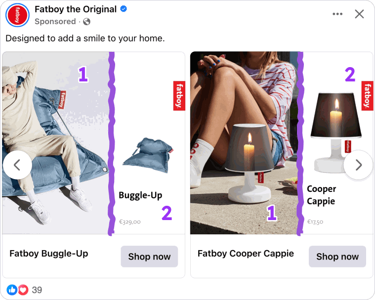
The isolated product shot answers exactly what they are buying: shape, material, and scale, with nothing else in the frame competing for attention.
Most Catalog Ads choose one or the other. The team at Happy Horizon run both in a single card without crowding the layout, and without disrupting the visual calm that is so central to what Fatboy looks like. By the time a shopper reaches Shop Now, both questions are already answered.
The brand mark that lives on the product too
This is the detail that separates a good Catalog Ad from a brand-defining one.
Look at the top-right corner of every card. There is a small red fabric tag with "Fatboy" written in white. It is the same label stitched onto every physical Fatboy product. It sits in the same position on every card, kept small, and never competes with what is being shown.
For anyone who has ever sat in a Fatboy, touched one in a store, or spotted one in a friend's living room, that tag is instant recognition. It does not need to be large. It just needs to be there, in the right place, doing what it always does.
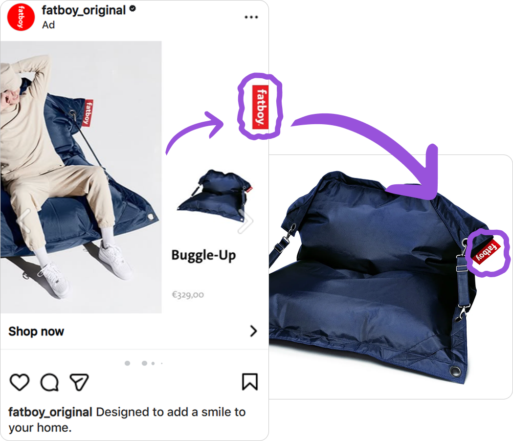
What makes this particularly considered is that the tag is not a logo dropped into an ad. It is a direct reference to the physical object, and that distinction matters.
Bringing a real product mark into the creative activates what brand theorists call physical-to-digital congruence: the visual the shopper recognises from the product in a store or in someone's home triggers the same associations in the ad. Craft. Design quality. A brand confident enough to let the work speak for itself.
Fatboy is one of the most brand-led furniture companies in Europe. The fact that their Catalog Ads feel exactly like the rest of their brand world is not a coincidence. It is a creative decision the Fatboy team and Happy Horizon made deliberately, and it is the kind of decision that most advertisers never think to make.
Each product placed in the moment it would actually be used
Pull back and look at the full range of cards. Fatboy changes the visual context for each product to match its specific use occasion. This is not a stylistic preference. It is a direct application of situated cognition, the principle that people respond far more strongly to images that match the context they are already imagining when they think about a product.
Someone browsing garden furniture is not picturing a studio. They are picturing their terrace. Fatboy meets them there.
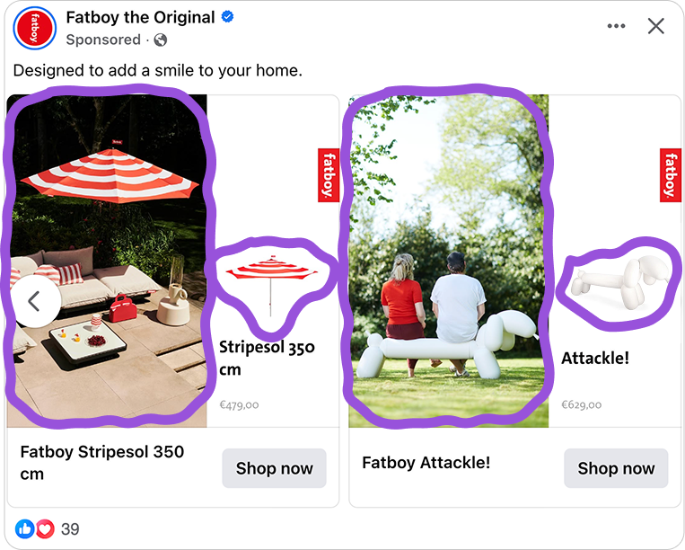
It also solves a practical problem with always-on Catalog Ads. A garden lounger and a lamp do not compete with each other. They reach different people at different moments and both earn their place in the same creative. The outdoor products come forward in summer.
The interior pieces in autumn. The carousel does not go stale because different cards find different people across the full year, and that is part of how a result like this compounds over time rather than peaking in one window.
The price is there, but it never competes with the brand
Look at where the price sits on each card. Small. Clean. Bottom of the frame. Present, but quiet.
That placement is intentional, and it says something interesting about how they think about the Fatboy shopper. You are not buying a Stripesol because its price. You are buying it because it is Fatboy. The price is there for transparency, not persuasion, and the design reflects that.
Most Catalog Ads lead with price as the primary hook. Discounts, red flags, crossed-out numbers. That works for categories where cost is the deciding factor. For Fatboy their shoppers have already decided they want the brand. The price just needs to be visible enough to confirm the decision, not loud enough to interrupt it.
By making the price present but visually quiet, Happy Horizon aims for the right audience without alienating them. A shopper who sees the price and taps through has already decided it works for them. They arrive on the product page ready to buy, not ready to reconsider.
Key Takeaways
Every decision in this Catalog Ad reflects one thing: a deep understanding of what Fatboy is and who Fatboy is for. The Fatboy team and Happy Horizon did not just design a good-looking ad - they built something that feels like the brand from every angle. The work is now in the hands of Merel van de Meulengraaf, who is taking it further with ongoing optimization and new creative iterations.
👉 Answer both questions shoppers have inside a single card
Do not make shoppers choose between feeling something and understanding what they are buying. A lifestyle image and a clean product shot serve different mental jobs. Running both in the same card shortens the path to a confident click.
👉 Bring your physical brand identity into the frame
If your brand has a recognisable physical mark, use it exactly as it appears on the product. Not a logo. Not an interpretation. The real thing, in the right place. That is what makes a Catalog Ad feel like the brand rather than just advertising for it.
👉 Give each product the scene that matches when it gets used
A product shown in its real context of use is far easier to imagine owning. Design each card around the moment the product belongs to, and the creative stays relevant across more audiences and more of the year.
👉 Let the brand carry the price, not the other way around
In brand-led categories, price is information, not a hook. Keep it visible, keep it quiet, and let the brand do the selling. Shoppers who are already sold on the brand just need the number to confirm what they already decided.