Cotton Traders & Glass Atlas
October 27, 2025
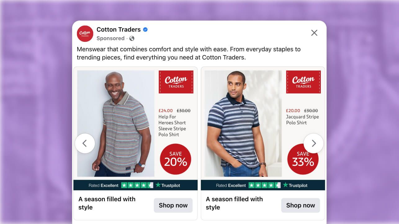
The ad: Simple, balanced and totally click-worthy
Cotton Traders is a UK-based clothing company that specializes in leisurewear. They’ve been in business since 1967 and have a large inventory of high-quality, cotton-made garments, which includes almost everything, from bags and scarves to sweaters, shirts, hats, and more.
When Cotton Traders teamed up with Glass Atlas, they set out to make their advertising game better, stronger, and smarter than before. And the results? A Catalog Ads campaign that put Cotton Traders’ clothing in front of the right people, at exactly the right time.
Why it won Catalog Ad of the week
Nobody doubts that Cotton Traders has stylish or comfortable clothing. But the reason we’re talking about them is because their recent campaign scored a +34% ROAS.
These results were anything but accidental. Cotton Traders and Glass Atlas crafted them by blending Trustpilot ratings, a pop of color, and a layout that’s so clean it practically sells the products on its own.
Their campaign proves that when strong branding, premium products, and design come together, only good things can come from it.
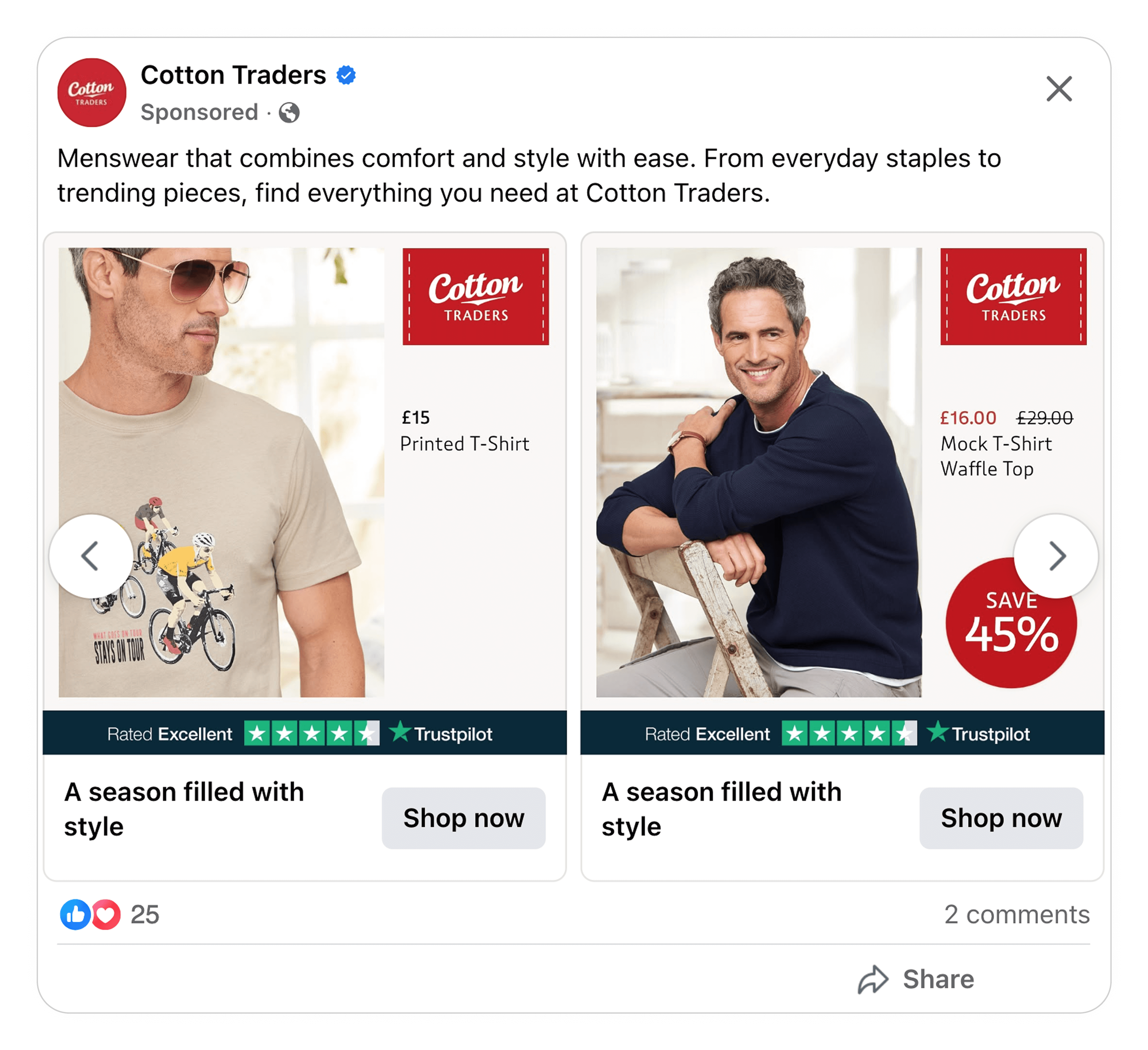
What makes this Catalog Ad great
1. Craft clean and effortless designs
Why does this layout work so well?
This ad stands out not because it’s loud, but because it feels calm and balanced.
It follows the rule of thirds: two thirds allure, one third clarity.
The split design moves like rhythm: the left side pulls you in, the right side guides your mind. Then comes the anchor, the dark Trustpilot bar, grounding the design and giving it confidence and calm.
There’s also a bit of simple yet powerful chemistry going on here.
The human brain is hardwired to recognize faces. So when we see a real human smiling at us, like the handsome man in the ad, we’re that much more likely to stop and take a closer look.
Ultimately, the model in one column ensures you stop and look, while the other column tells you everything you need to know about whether or not this is a deal for you.
It’s a simple, calm and confident design. It speaks volumes about the brand, the products, and the promotion. And if you ask us, that’s why this is a winning ad.
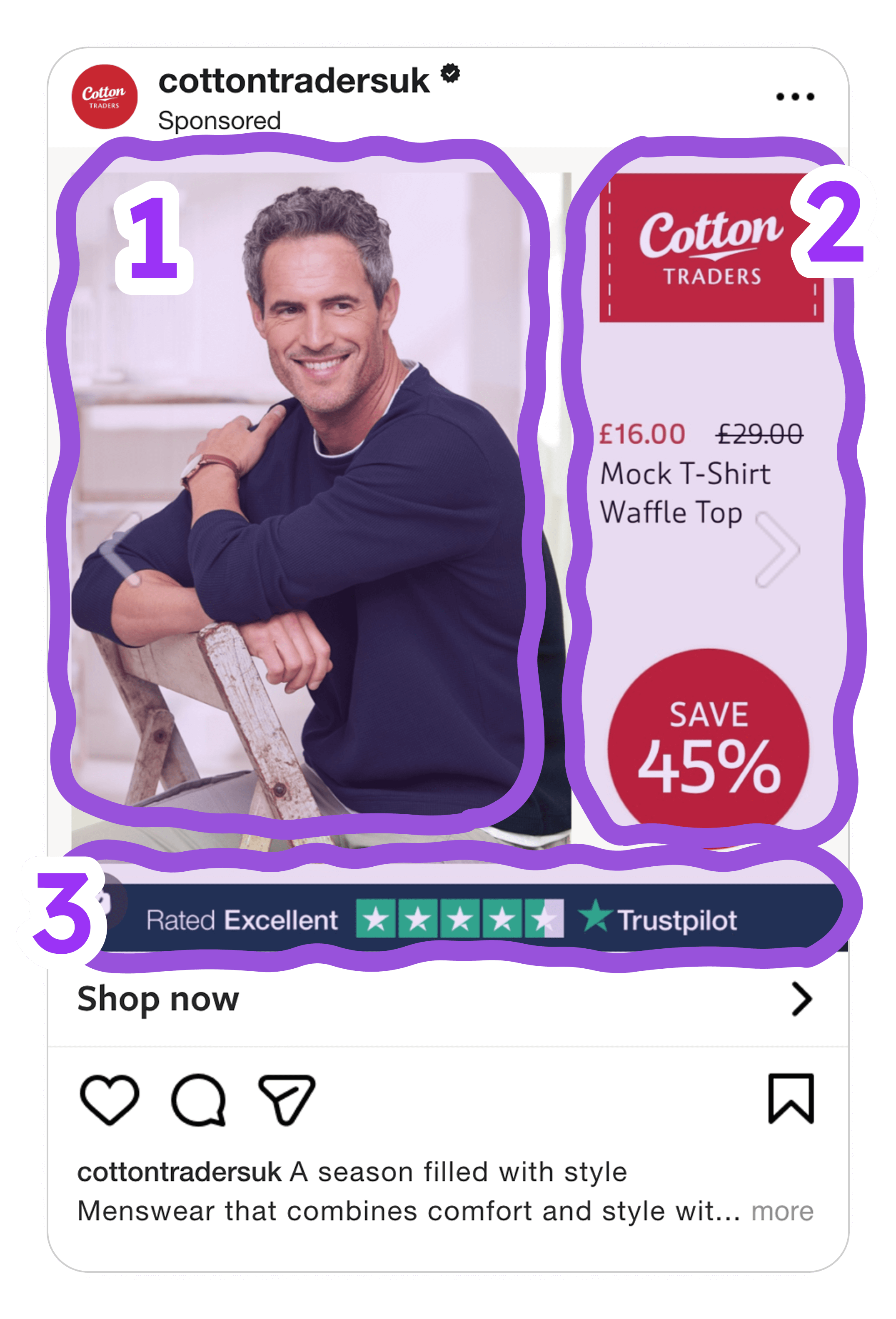
2. Design that sells the deal before you even read the text.
The first thing that grabs your attention here is that bright red circle with SAVE 57%. It is simple, bold and impossible to ignore. Red creates a sense of urgency and energy. It instantly gives that little feeling of “I do not want to miss this”.
And the circle shape adds focus. It feels like a button, something you could almost tap.
Right above it, the new price appears in red and the old one is crossed out. That tiny detail does a lot. It gives your brain an instant before and after comparison. You do not need to think about it, you just feel the deal. Together these elements tell a quick visual story. Here is what it was, here is what it is now, and here is how much you save.
It is clear, emotional, and fast. Perfect for catching attention in a scrolling feed.
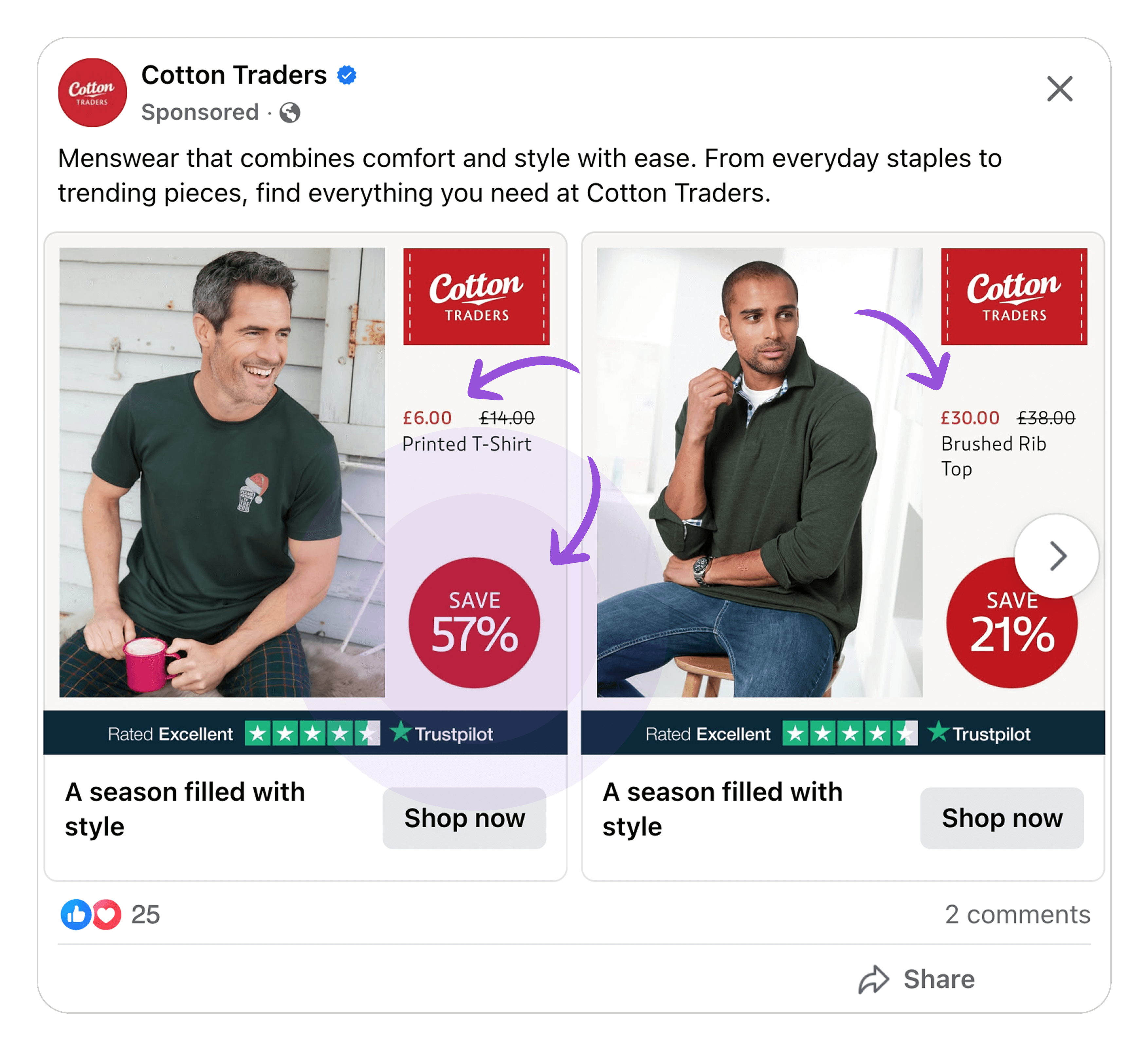
3. Signal proof with Trust pilot ratings
There’s no denying that social proof and Trustpilot ratings help sell your products. But what we really love about Cotton Traders’ use of social proof is how effortless it seems.
It’s not like the Trustpilot bar is big or takes up all that much space. It’s more subtle than that. But it still gives the ad a more complete look than it would have been without it.
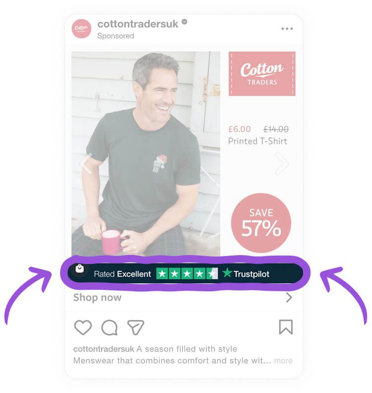
There’s just something super satisfying and eye-catching about the way the dark blue Trustpilot bar pops against the light, airy background. This makes it sure you see it and naturally draws attention to it, without it being the star of the show.
It’s a great example of how you can use design elements to create a visual base. But it’s also a smart move because social proof reinforces trust and tells people: “Hey! We’re not lying about having great clothing! Other people think so too!”
Key Takeaways
Cotton Traders reminds us that winning Catalog Ads don’t have to be complicated or packed with extra details. By using social proof, contrast, and a clean and effortless design, these Catalog Ads captivate your attention and gently nudge you towards taking action.
👉 Use social proof to quietly build trust
Social proof never fails to show your brand in a positive light. But this ad reminds us that trust doesn’t have to be the star of the show. The brand placed a dark blue Trustpilot bar against a light background, ensuring you pay attention to it. But it doesn’t take your attention away from the product or promotion.
👉 Create clean and simple designs
Split layout designs are simple but they work! In this case, the brand placed a lifestyle shot with a model on one side, which ensures you stop scrolling and pay attention. Meanwhile, the other side is filled with important details, including the brand’s logo, the product name, discount, and pricing information.
👉 Capture attention with high-contrast colors
Both the Trustpilot bar and bright red elements pop in this ad. And we absolutely love the way they chose a color that matches their branding. But what’s even better is how they used a high-contrast design to naturally guide your attention to the most important details.
The Catalog Ads created by Glass Atlas for Cotton Traders aren’t reinventing the wheel. But they leverage basic design principles and advertising tactics really, really well. High contrast colors, clean layout, and great balance. Simple, effective, done right.
And the results? Well, they speak for themselves!