Bulk
August 4, 2025
The ad: Social proof meets performance
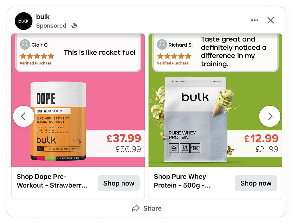
Bulk’s seasonal Catalog Ad is a great example of how to turn real customer feedback into a high-performing campaign. Instead of using a standard product carousel, they focused on what really builds trust - real customer reviews.
Unlike a lot of generic catalog ads, this one is a testimonial-led campaign that blends social proof with polished design. They still use Meta's dynamic product ad tech and with Confect they created on-brand design that attracts customers.
Each product in the ad is paired with a short, specific quote from a verified buyer. The quotes aren’t chosen at random - they’re matched to the product’s benefits and common objections.
The design template can change to fit other products and it still gives a clear, strong experience made for people who care about fitness. Every part is made to build trust, show what’s good about it, and most importantly, help people decide to buy.
Why it won Catalog Ad of the week
This Catalog Ad delivered a 43% higher return on ad spend (ROAS), compared to Bulk’s other catalog creatives.
This kind of uplift is the result of strategic design choices and sharp copy. Bulk knows that combining mobile-first visuals with audience-focused storytelling that highlights social proof is how you get the most out of the Catalog Ad format.
What makes this Catalog Ad great
1. Building Trust with Social Proof
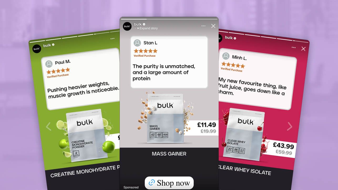
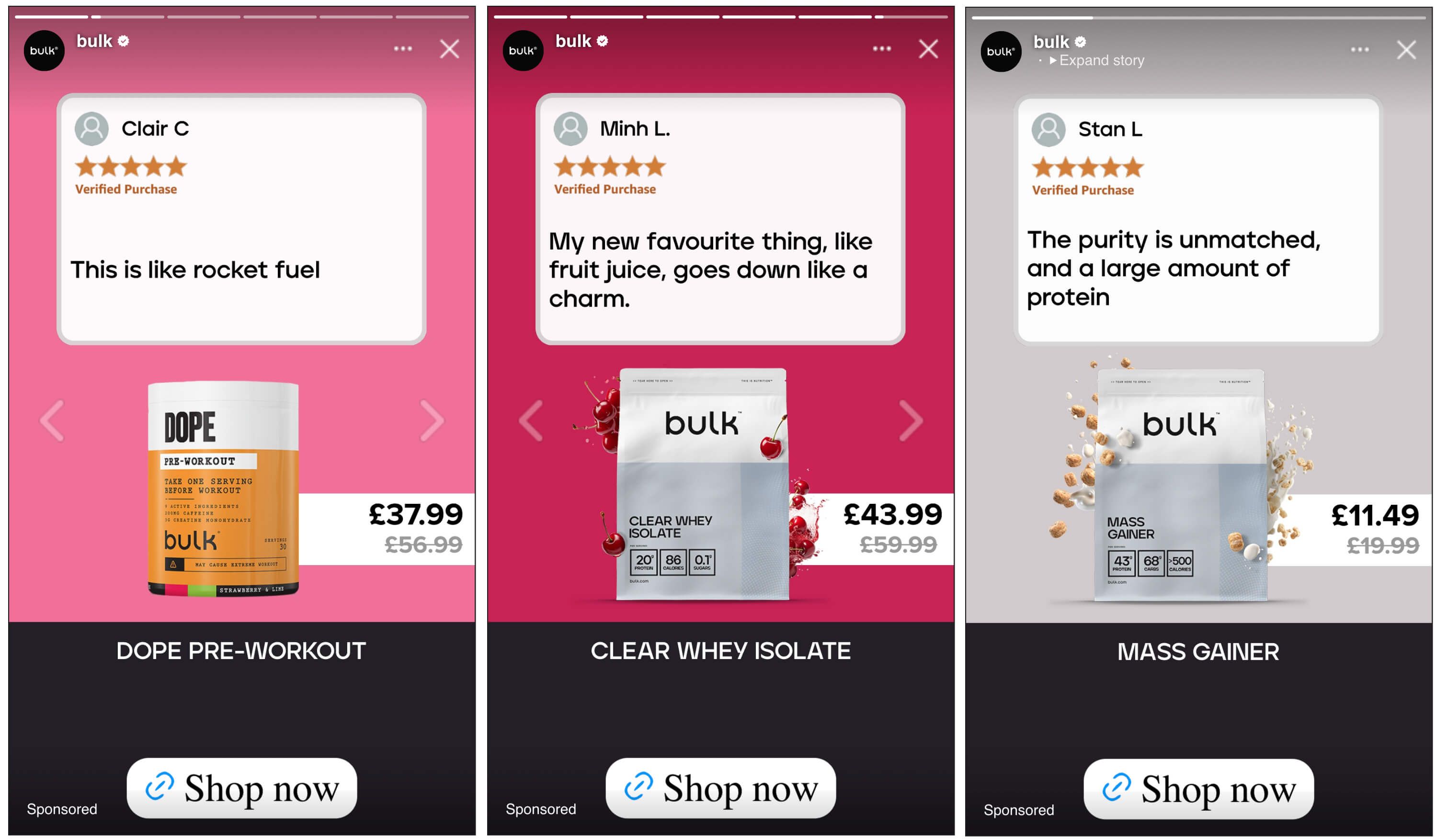
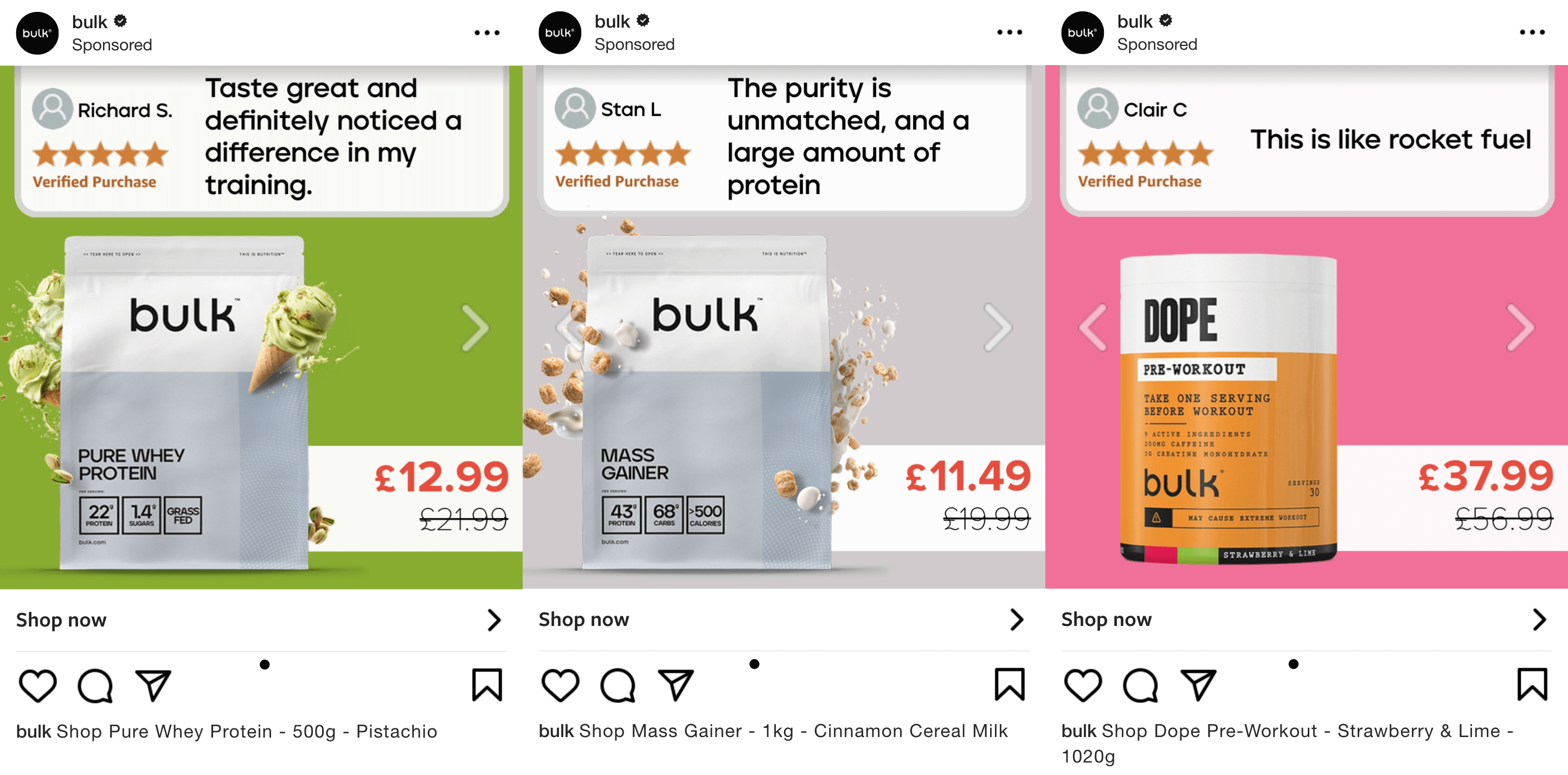
What stands out immediately in Bulk’s catalog creatives is how user testimonials take center stage - quite literally. Every product shows a 5-star review from a happy customer. It goes beyond a trust signal. Each review overcomes a specific objection their new customers may have:
- “Tastes great” and “Goes down like a charm” ease concerns about flavor and digestion with protein powder.
- “Pushing heavier weights, muscle growth is noticeable” addresses doubts around creatine’s effectiveness.
- “This is like rocket fuel” nails the core value of any good pre-workout - energy.
- “No bloat, light and at a competitive price. Love it.” removes hesitation about side effects and pricing.
But here’s what makes it next-level: it’s all 100% automatic.
These aren’t handcrafted creatives or manually selected quotes. The reviews are pulled dynamically from the product feed and automatically paired with the right product in Meta’s catalog ads - meaning Bulk is running personalized, review-powered creatives at scale, with zero manual design.
Each quote hits both the problem and the payoff - not with brand spin, but with real-world experiences customers can trust. It’s conversion-driving copy - without needing a copywriter.
And by layering in the reviewer’s name, profile photo, and the ‘Verified Purchase’ badge, Bulk adds another layer of social credibility that cold audiences respond to - especially in competitive verticals like health and fitness.
In short:
Bulk doesn’t just use social proof - they make it the hero of their ads. And they do it 100% automatically.
Attention-Grabbing Backgrounds & The Rule of Thirds
While many catalog ads rely on basic white or brand-colored backgrounds, Bulk’s approach is more intentional - and more effective.
Each creative:
- Uses bold, product-specific background colors (e.g. green for whey, neutral tones for mass gainers) that pop on mobile
- Includes floating product elements like cereal pieces or limes, adding depth and motion to the layout
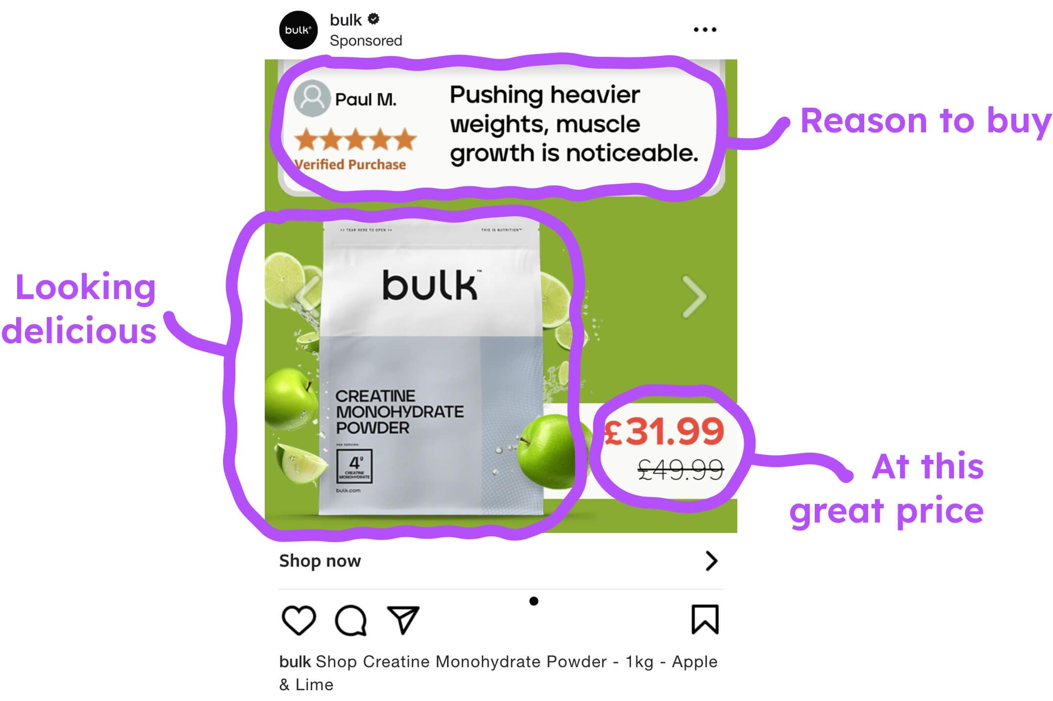
- Key elements like testimonials and pricing are placed using the rule of thirds, making the design easier to scan and understand quickly.
This ad uses the rule of thirds to organize content in a way that feels natural and easy to follow:
- Top third: A short review from a real customer (with name, photo, and Verified Purchase badge) - establishing trust right away.
- Middle left and center: The product itself - large, clear, and surrounded by floating apple and lime slices that reinforce the flavor and add depth.
- Bottom right: The price - bold and easy to spot.
- Middle right: Left intentionally empty, except for a subtle arrow - making space for the carousel to breathe and encouraging swipes without clutter.
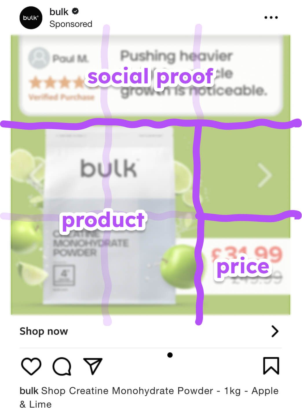
The background color isn’t just visually appealing - it matches the product flavor (Apple & Lime), making the whole ad feel connected and intentional.
By placing key elements where people naturally look - top left for trust, center for the product, and bottom right for price - Bulk guides attention in a smooth, logical flow.
This structure ensures nothing competes for attention - everything works together to guide the eye. Add in clean typography, plenty of whitespace, and strong contrast, and you get a layout that’s both scroll-stopping and easy to absorb.
Optimized for Every Format: 1:1 & 9:16
Instead of using a one-size-fits-all approach, the ads are designed in multiple aspect ratios to fit across Feeds, Reels, and Stories without awkward cropping or wasted space. For example, 1:1 works well on Facebook and Instagram Feeds, while 9:16 is ideal for Stories and Reels where the entire screen can be used as a canvas.
By adapting their creative to fit the medium, Bulk ensures:
- The product is always prominent
- The testimonial remains readable
- The CTA is visible and tappable
This multi-format strategy ensures you cover all the key platforms while maximising performance per placement.
Key Takeaways
Bulk’s campaign proves that Catalog Ads can be exciting and engaging. With just a few smart strategy choices and decision decisions, they turned a standard, product carousel into a high-converting, trust-building ad.
Here’s what you can implement from their playbook:
👉 Embed Social Proof Where It Matters
Pull reviews shared on your product pages into the ad creative itself. It builds instant credibility, especially when they’re combined with “Verified Purchase” signals and specific, benefit-focused quotes.
👉 Design for Attention and Flow
Use bold, product-related backgrounds and respect the rule of thirds to structure your creatives. Let the ad guide the user’s eyes from review to product to price to CTA.
👉 Optimise for Multiple Formats
Meta’s most valuable placements - like Reels and Stories - demand vertical (9:16) formats. Bulk showed how translating a design into multiple ratios amplifies performance without compromising consistency.
👉 Design Around Your Product and Campaign
What truly elevated this ad was how it balanced dynamic catalog content with the feel of a unified campaign. Across all placements, it showcased products and highlighted how each product enhances performance.
Bulk’s ad improved performance by 43% because it looked good and was built with intention. It does that by pairing striking design with strategic storytelling.
The lesson here is: Great Catalog Ads stir feelings. In Bulk’s case, they overcome subconscious hesitation by using social proof to answer real concerns. Without sounding salesy, they show which problems their product range can solve and the benefits you can expect.