
Bronze Snake
August 5, 2026
.jpg)
The ad: A Catalog Ad that feels like browsing a new collection, not a sale
Bronze Snake is an Australian brand established in 2006, known for minimalistic, premium apparel with clean lines and effortless silhouettes. Every piece is designed in-house, and the brand releases new styles weekly rather than in a couple of big seasonal collections. This Catalog Ad is built to show that steady stream of new styles off.
What stands out immediately is what's missing. There's no "SALE," no strikethrough price, no urgency countdown. It isn't a discount push at all. It reads like a lookbook a shopper chose to scroll through, and that choice is exactly what makes it work.
Nothing here is a default setting. Every element Bronze Snake placed on the card is doing a job, and every element they left off was left off on purpose.
Why it won Catalog Ad of the Week
Great design is nice to look at. But the reason this Catalog Ad earned the feature is what it did to Bronze Snake's performance.
No single design choice owns any one of those numbers. Performance always rides on audience, bidding and landing page as much as creative, so we won't pretend the layout alone moved them. What we can say is that the direction is exactly the one every advertiser wants, and a creative built like this is structurally set up to earn it.
The reason comes down to information. A bare product feed, just the product on a white background, tells a shopper nothing about who is selling or why to trust them. This ad puts the brand, the product name, the price and a proof point in front of the viewer on every single impression. Even the views that never turn into a click are still building recognition and familiarity for Bronze Snake, and a plain feed cannot do that.
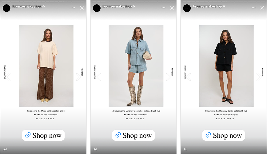
What makes this Catalog Ad great
Put the product first, then control its size, placement, and the details around it
At a glance this ad looks simple: one product, one clean studio shot, a few details around it. Simple is not the same as default, though. The space the product takes up, where it is positioned, and which details appear around it (brand, rating, name, price) are all deliberate choices rather than whatever a feed happened to output. A standard product image gives you the product and little control over the rest. Bronze Snake has set every element on purpose, and that degree of control is the real difference between a considered ad and an automatic one.
There is a reason that control matters. A typical Catalog Ad crowds a badge, a discount and a busy background into one square, and a shopper scrolling past has no single place to look, so they keep going. With one clear subject on an empty background, there is only one thing to notice, and people notice it. That is figure-ground separation and negative space, the plainest tools in design and two of the most reliable. Because none of the usual discount cues are present, the ad comes across as a collection worth browsing instead of stock to clear.
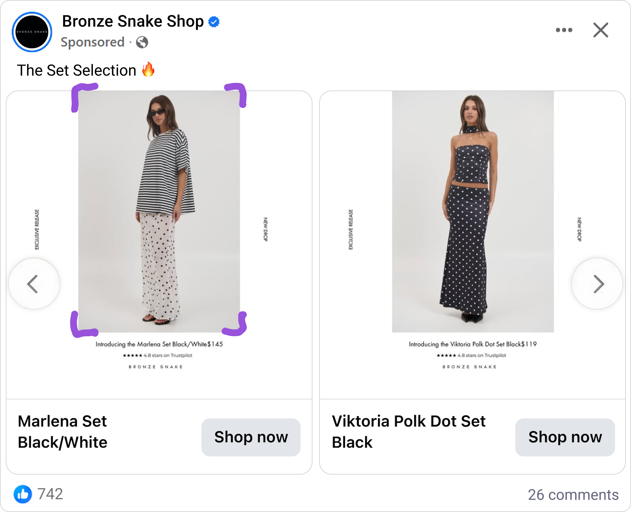
The restraint does not stop at the product. Bronze Snake puts the Trustpilot rating, 4.8 stars, directly under each item, with the BRONZE SNAKE name below it. The order is chosen on purpose: a shopper reads the rating first, then connects it to the brand. This is social proof positioned at the exact moment a shopper hesitates. Someone weighing a $139 set from a brand they do not know well is really asking whether they can trust it, and a 4.8 rating right beneath the product answers that before they have to go looking. Every piece has a place in a clear order: product, then proof, then brand.
Give new product its own design lane, so it never looks like a sale
Down the side of each card, Bronze Snake runs a vertical Exclusive Release and New Drop label. Across the bottom, the copy reads Introducing the Kristen Set Black $139. Everything about the treatment says new and full price: no markdown, no strikethrough, no clearance styling anywhere near it.
That separation is the real mechanic worth copying. In many catalogs, new arrivals and discounted stock share one creative template, so the new product inherits the visual language of a sale, which quietly cheapens it. Bronze Snake keeps its new, full-price product in a clean lane that never blends with sale styling. This leans on a well-documented price-quality inference: shoppers read discount cues as a signal of lower value, so presenting a product at full price with no markdown protects how premium it feels. Browsing the ad feels like previewing a fresh drop rather than digging through a markdown bin.
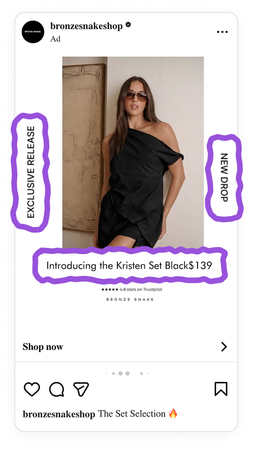
The copy pulls the same trick. Introducing, then the product name, then the price reads like a line someone wrote for that specific item, when the name and price are actually pulled from the feed automatically. The automation stays out of sight, so every product gets a premium new-release introduction with nobody writing a line per SKU.
What Bronze Snake leaves out matters as much as what it includes. There is no countdown, no only 3 left, no manufactured scarcity. The pull here is the novelty effect, our built-in interest in what is new, which draws attention on its own and gives a returning shopper a reason to keep checking back. Urgency is a discount-and-limited-stock tactic; this brand is playing a longer, more premium game and relies on newness to carry it. For an audience already watching for the next Bronze Snake drop, that is enough.
Design once for 1:1, 4:5 and 9:16 so the ad looks native in every placement
This campaign runs across all placements, and Bronze Snake built the set in 1:1, 4:5 and 9:16 to match. The ad shows up looking intentional in the feed, in the taller vertical feed slot, and full screen in Stories, instead of one square creative stretched or cropped to fit wherever it lands.
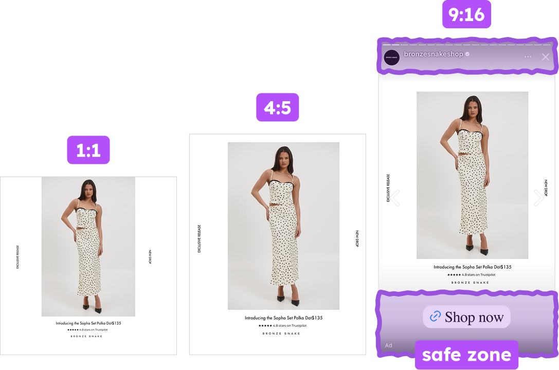
A vertical design made for Stories does something a stretched square cannot: it belongs there, nothing clipped or off-center. That is worth more than neatness. Each placement where Bronze Snake appears correct and on brand is one more time the audience sees the brand as itself, and those repeated, consistent impressions are the reach side of mental availability, the idea that a brand gets chosen more often when it turns up in more buying situations and looks the same each time. Covering more placements well means reaching more people with the identical idea rather than a degraded copy of it.
There is a second payoff. An ad that renders cleanly everywhere, nothing stretched or clipped, reads as a brand that pays attention to detail, and shoppers take that polish as a stand-in for product quality before reading a single word. Looking right in every placement is not housekeeping, it is brand perception built one clean impression at a time.
Key takeaways
Instead of a discount or a busier layout, this ad leads with the product, the proof, and the feeling of a fresh drop, giving the shopper everything needed to act.
👉 Put the product first, then control its size, placement, and the details around it
Give the product a clean background and it becomes the first thing a shopper notices, which shifts the ad from a sales pitch to a browse. Then place the supporting details on purpose, proof above the brand name and both right under the product, so a shopper takes in trust and identity at a glance instead of working through clutter.
👉 Give new product its own design lane, separate from your sale creative
When new arrivals never pick up the visual language of a markdown, the ad reads as a fresh drop rather than a clearance bin, and the Introducing plus name plus price stacking scales that premium, full-price treatment across every item automatically while still reading hand-made. Rely on novelty, not manufactured urgency.
👉 Design all three ratios together, not just the square.
Building 1:1, 4:5 and 9:16 from the start keeps the ad looking native in every placement, holds key elements inside the safe zone, and reaches more of the audience with the idea intact.