benuta
February 4, 2026
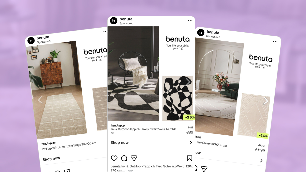
The Ad: A home focused catalog ad that shows the product in use
This catalog ad is built around one simple idea: show how the rug looks in use and remove everything else. The lifestyle scene comes first, making the size, placement, and color easy to understand at a glance.
The in use view does the work early. You immediately see how the product sits on the floor, how long it feels in the space, and how the cream tone works with calm interiors. That realism helps catalog ads feel practical rather than decorative.
Developed by benuta’s Content Team in close collaboration with the Performance Marketing Team, the creative stays closely aligned with the website experience. The rug color, texture, and pricing treatment match what users see after the click, which helps the ad feel familiar and easy to trust rather than disruptive.
The structure stays simple from start to finish. First you see the product in context, then you confirm the details, and finally you notice the price. You can understand everything quickly and move on with confidence, which is why catalog ads like this work so well.
Overall, the ad feels calm and helpful. It does not try to convince you. It simply shows the product clearly and lets you decide if it is right for you.
Why it won Catalog Ad of the week
This catalog ad won because it understands how people shop for home products. Instead of trying to impress, it focuses on helping users feel certain about what they are seeing, which is especially important for rugs where visual confirmation drives confidence.
The creative makes that decision process feel easy. Clear context, familiar pricing, and a calm layout allow users to assess relevance quickly inside catalog ads without stopping to decode the message.
That clarity translated directly into performance. benuta recorded a +41% ROAS, showing that when catalog ads reduce doubt and stay consistent from ad to site, users are more likely to complete the purchase.
The impact showed across the funnel as well, with a +59% higher CTR and a 27% lower CPA, proving the creative improvements didn’t just convert better, they attracted more qualified traffic too.
Overall, the win comes from restraint. The ad supports intent instead of interrupting it, which is exactly why this type of catalog ad structure continues to deliver strong results.
What makes this Catalog Ad great
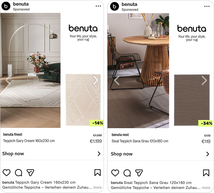
Clear comparison between in use context and product detail
This catalog ad works because it shows the rug in use and then immediately confirms what you are buying. The transition from lifestyle context to product clarity feels natural and helps users move from interest to understanding without friction.
Seeing the rug on the floor gives a sense of scale and mood. The product view then removes any remaining questions by showing the exact shape, color, and finish. That sequence is especially effective in catalog ads where users want reassurance before committing.
.png)
The comparison also keeps expectations aligned. What you see in the real space matches what you see in the product card, which avoids surprises after the click. That consistency is key for catalog ads selling larger home items.
By pairing context with confirmation, this catalog ad makes the decision feel logical rather than emotional. It is a simple structure, but one that helps these visuals guide users smoothly toward purchase.
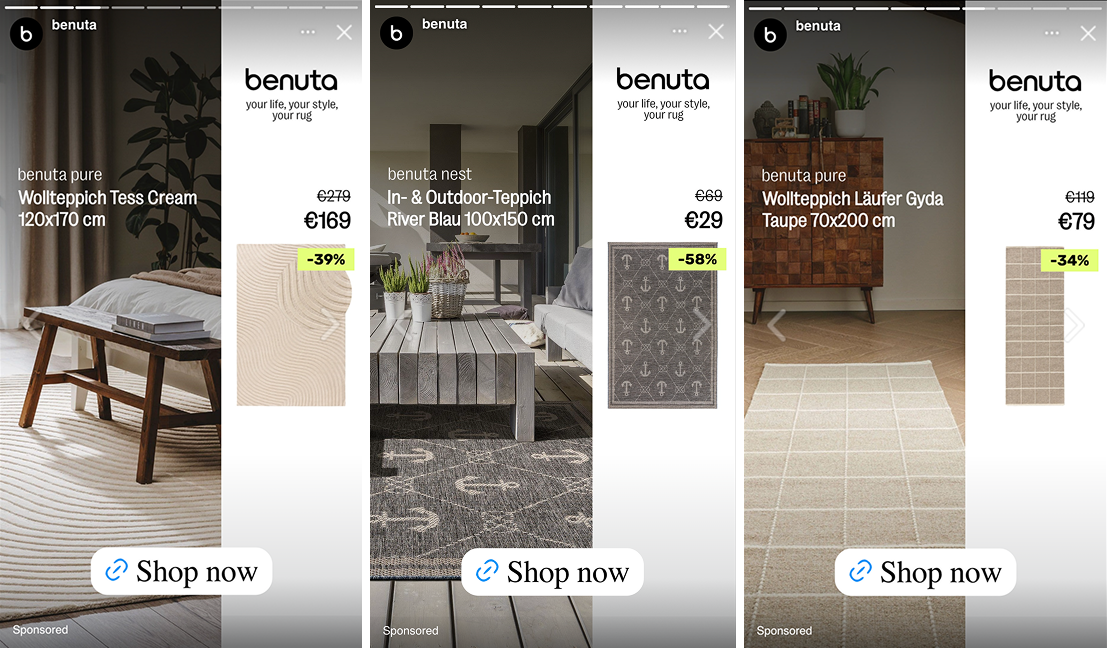
Pricing cues that make the offer easy to read
This catalog ad treats pricing as part of the overall experience, not a separate sales message. The numbers feel familiar because they follow the same visual logic users meet after the click, which makes the transition from ad to site feel seamless.
That continuity matters more than the discount itself. When price colors, placement, and emphasis stay consistent, users do not have to recalibrate their expectations. The decision feels uninterrupted, which is exactly what catalog ads need to support high intent browsing.
.png)
Instead of pulling attention away from the product, the pricing quietly confirms value. You notice the reduction, understand the difference, and move on without friction. There is no moment where the offer feels disconnected or overly promotional.
By aligning pricing presentation across touchpoints, benuta keeps the experience predictable and calm. That sense of control helps catalog ads turn interest into action without adding pressure.
Designed for natural size adaptation across placements
This catalog ad is clearly built with multiple placements in mind. The creative adapts smoothly across 9:16, 1:1, and 4:5 without feeling resized or compressed, which keeps the product readable wherever it appears.
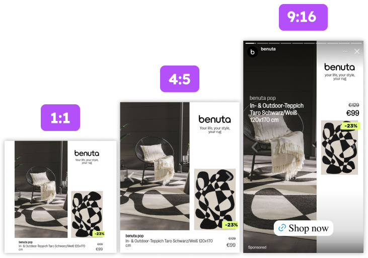
The rug stays large in every version. Spacing, margins, and focal point remain consistent, so the product never feels lost when moving between feed and vertical environments. That consistency is very important for catalog ads where attention is limited.
What works especially well is how the hierarchy holds. The product leads, the price follows, and supporting elements stay secondary. Even as the format changes, the order of information never does.
By designing for each ratio instead of forcing one layout to stretch, benuta ensures the ad feels intentional everywhere. That level of care is what allows catalog ads to perform reliably across placements without sacrificing clarity.
Key Takeaways
This catalog ad shows how performance improves when every element supports the same decision journey. By aligning context, layout, and pricing, catalog ads help users move forward without feeling pushed.
👉 Showing products in use reduces hesitation
Letting users see how the rug looks once placed removes guesswork early. For catalog ads selling home products, this kind of visual confirmation matters more than extra messaging.
👉 Consistency turns interest into action
Matching pricing logic and visual language between ad and site keeps expectations aligned. In catalog ads, that continuity makes the path from scroll to purchase feel controlled and reliable.
👉 Designing for placements protects clarity
Building catalog ads specifically for 9:16, 1:1, and 4:5 keeps the product readable everywhere. When layouts adapt naturally, the decision stays focused instead of disrupted.