
Anothers Legacy
The ad: A birthday sale that never forgets it is selling jewelry
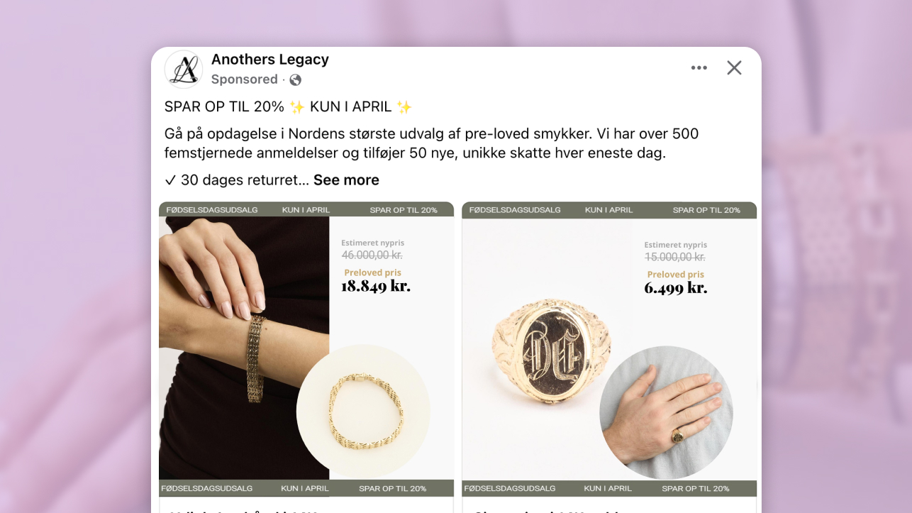
This Catalog Ad from Anothers Legacy is running a birthday sale on high-end gold jewelry. A product at its estimated new price, now available at a noticeable discount for the month of April only.
That is a significant promotion on a significant product. The creative makes the deal feel exciting without making the jewelry feel cheap. That is harder than it looks.
The layout leads with a lifestyle image on one side and a clean isolated packshot on the other - so the buyer gets the emotional pull and the product detail in a single frame. The olive green header and footer carry the birthday campaign message. Two prices sit clearly in the middle: the estimated new price and the birthday discount price.
Anothers Legacy is a Danish brand selling vintage and second-hand gold jewelry. Their products are not impulse buys. They need to feel worth it even when they are on sale.
Why it won Catalog Ad of the Week
Running a sale ad on a luxury product is a real balancing act. Go too promotional and the product loses its value. Go too restrained and the deal goes unnoticed.
Anothers Legacy found the balance. The ad communicates a clear discount, a firm deadline, and a significant saving - while every design decision still reads as premium.
A +45% ROAS improvement on a high-ticket product category is a strong result. Jewelry buyers take their time. They compare. They come back. Getting that kind of lift means the ad was doing real persuasion work, not just showing up in the right feed.
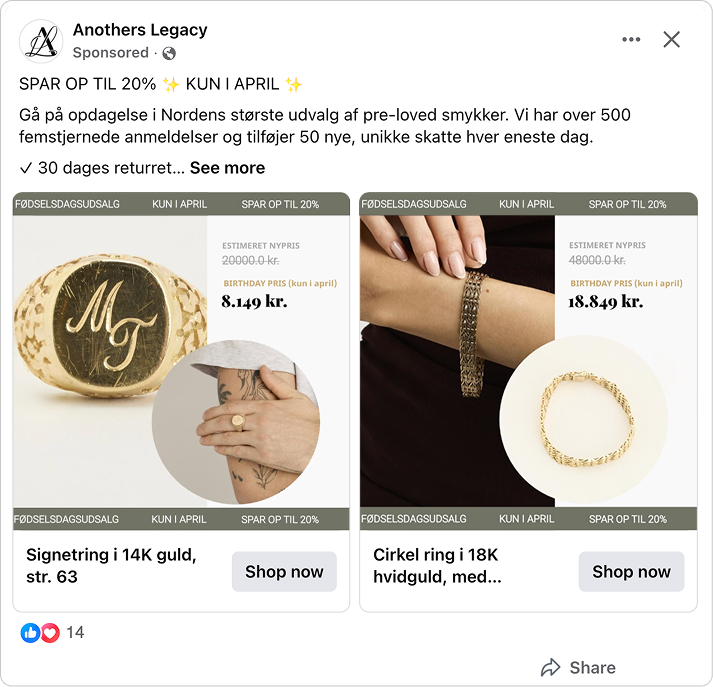
The design did not just look good. It answered the questions a jewelry buyer has before she decides to click.
What makes this Catalog Ad great
Anchor to the estimated original price, not the shop price
You see the product. Then you see two prices: the estimated new price struck through at the top, and the birthday discount price in bold below it. Your brain does the comparison before you consciously choose to.
That is anchoring at work - but with a twist. The anchor here is not the shop price. It is the estimated price this piece sold for when it was new - not a price Anothers Legacy ever charged, but what the original seller sold it for. So the buyer is not comparing the discount to what it costs in the store. She is comparing it to what this piece was worth when it was first sold. That is a significantly bigger gap, and it makes the deal feel much more extraordinary.
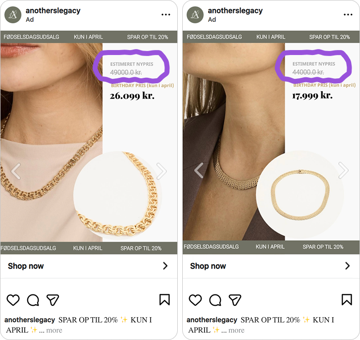
What makes this particularly smart is the word "estimeret" - estimated. Anothers Legacy sells vintage, second-hand jewelry. They never sold the product when it was new - the original seller did. Anothers Legacy estimated what that piece sold for at the time, and that estimated price is what they anchor to. A buyer's first instinct might be to question whether that number is real. "Estimeret" answers that skepticism before it forms.
It signals honesty. It says: this is our read on the market value, not a number inflated to manufacture a deal. And that small transparency makes the anchor more convincing, not less.
Wrap your sale in a birthday celebration so it feels like a gift, not a discount
Most promotional ads break the luxury feel the moment a sale message appears. A bold red slash. A starburst. Aggressive typography. Each one is a signal that belongs to a different kind of brand.=
Anothers Legacy avoided all of it. Look at what they chose instead: an olive green banner, not red. A neutral near-white background. A thin strikethrough on the estimated new price, not a bold red cross. The "BIRTHDAY PRIS" label is clear but not loud.
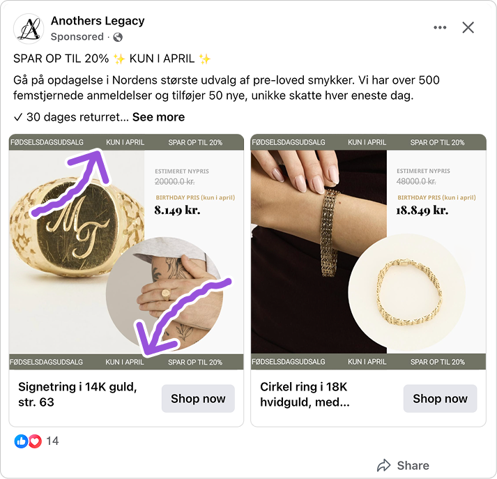
Every element went through a premium filter first. The birthday framing does something else too - a birthday sale feels like a celebration, a gift to the customer, rather than a clearance. That emotional positioning is very different from a standard percentage-off banner. The sale message lives inside the brand frame, not the other way around.
This matters because design carries meaning beyond what it says literally. An olive banner reads as considered and restrained. A red starburst reads as discount brand. Anothers Legacy has spent years building a premium identity, and this ad protects it while still delivering the deal clearly.
Put the product render and the lifestyle shot in the same Catalog Ad
A jewelry buyer stops scrolling when something catches her eye. But stopping is not the same as buying.
She also needs to feel confident about what she is actually looking at. The product, the detail, the quality. A lifestyle shot creates the want. A clean packshot answers the questions that follow.
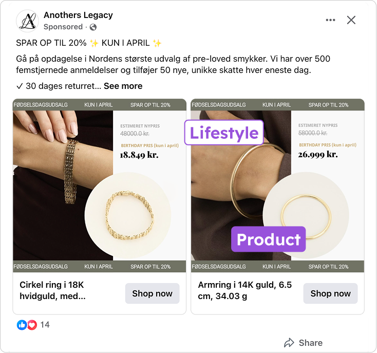
Most Catalog Ads force a choice between the two. Anothers Legacy shows both at once. The buyer gets the emotional pull and the product clarity in a single glance, without having to go looking for either.
Both prices sit clearly alongside both images. No hunting for it. No extra clicks needed. Everything that moves someone from interest to action is already in the frame.
The luxury code holds across 1:1 and 9:16, and that is not easy
Designing one great format is one thing. Keeping the same premium feel across three aspect ratios is a different challenge.
The 9:16 is where most ads fall apart. A layout built for a square frame gets stretched into a Story and suddenly the text is cropped, the product is off-center, and the whole thing looks like an afterthought.
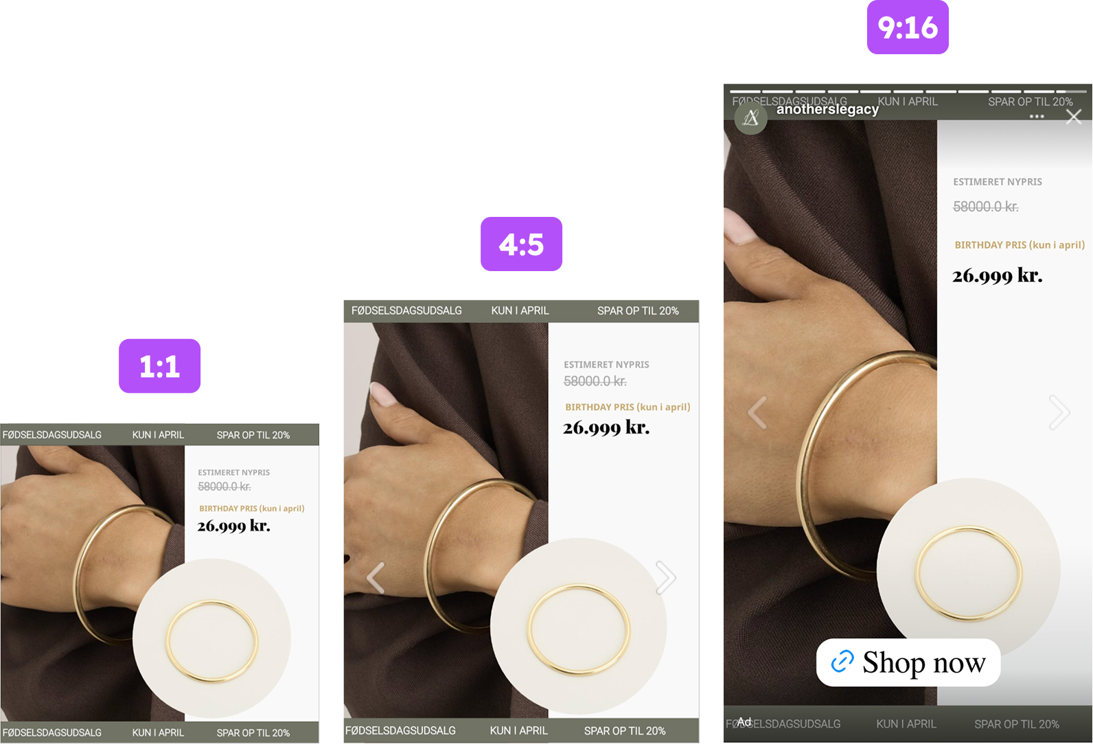
The composition was rebuilt for each format. The olive header and footer carry the brand frame across 4:5, 1:1, and 9:16. The pricing hierarchy stays readable at every size. The lifestyle shot and packshot sit correctly in all three.
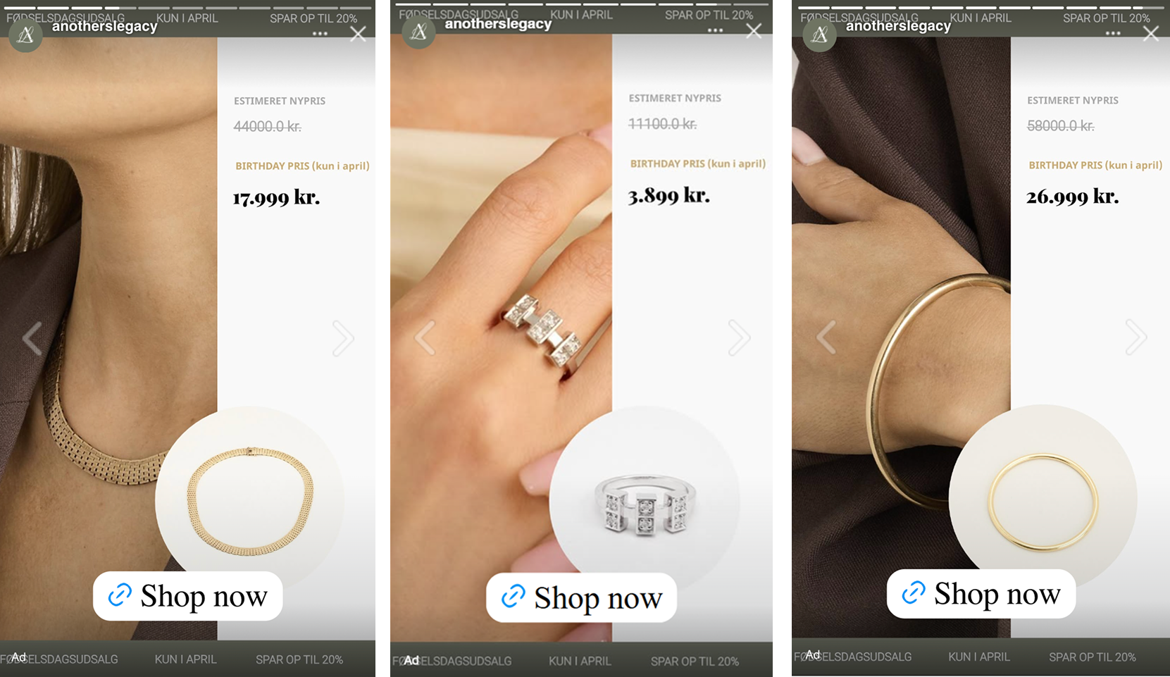
The 9:16 in particular is clean. All the key elements sit within safe zones, clear of the Instagram interface and the "Shop now" overlay. The premium feel that the 4:5 builds stays intact in a full-screen Story.
Key Takeaways
Anothers Legacy built a sale ad that protects the product it is selling. A real deal, a clear deadline, and a design that never stops feeling premium. That combination is what makes this one stand out.
👉 Anchor to the estimated original price, not the shop price
A crossed-out estimated new price does more than a crossed-out shop price. The gap is bigger - and because Anothers Legacy never sold the product when it was new, "estimeret" makes that anchor honest rather than manufactured. Transparency here makes the deal land harder, not softer.
👉 Wrap the sale in a celebration, not a discount
Olive over red. Thin strikethrough over bold slash. Birthday framing over generic discount messaging. The sale message should live within the premium frame, not replace it.
👉 Put the lifestyle shot and the product render in the same ad
Desire and confidence both have to be there. A lifestyle shot stops the scroll. A packshot closes the consideration. When both are in the same frame alongside clear pricing, the buyer has everything she needs without leaving the ad.
👉 Design for all placements from the start
The 9:16 is not a resized version of the 4:5. It is a different composition that carries the same design intent. When that decision is made at the start, the premium feel survives every placement.