Alpa
September 29, 2025
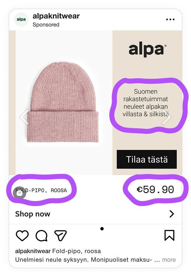
The ad: Knitwear for the autumn season
Alpa sells high-quality knitwear made from 100% alpaca wool. So it’s no surprise they focused their campaign on showing off their garments’ premium material and its main selling points, which is that alpaca wool is soft, warm, and durable.
Their product line includes hats and scarves, cardigans, shirts, and many other items. Using the Catalog Ads format is a smart choice, as it allows them to leverage Meta's algorithm to match the right product with the right buyer at the right time.
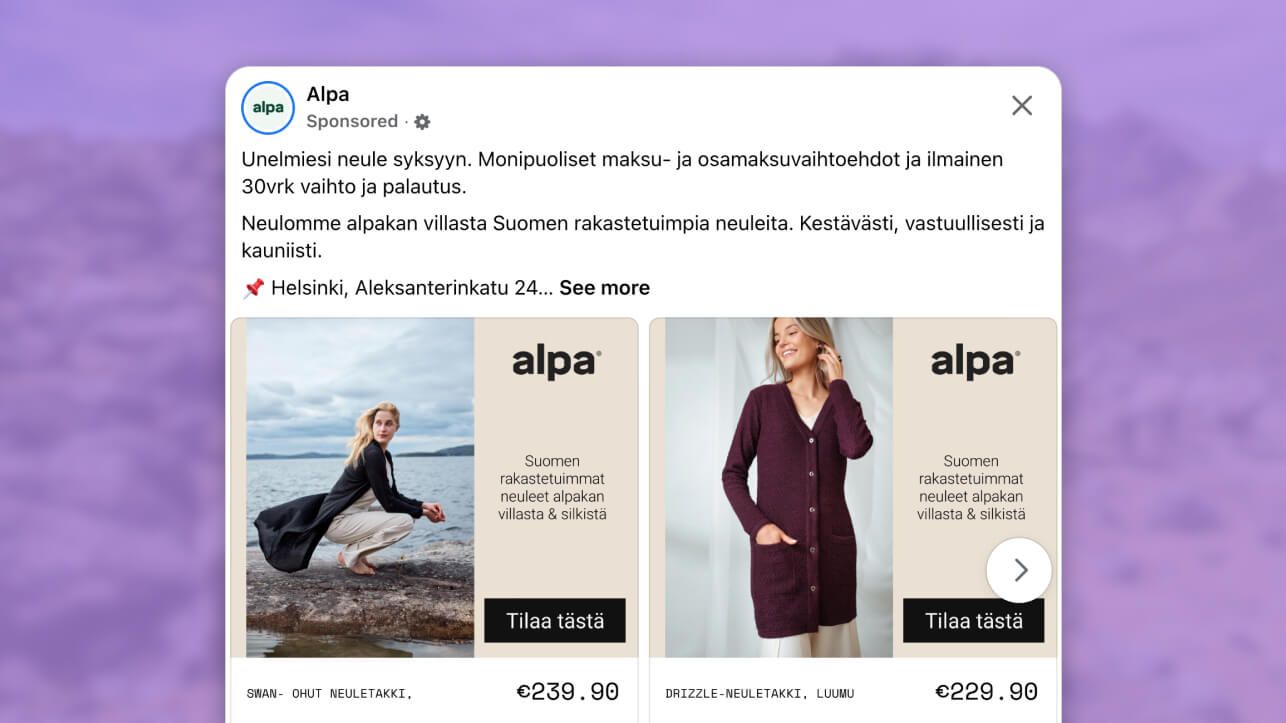
In Alpa’s catalog ad, the product image dominates the space, putting the spotlight on the premium look and feel that customers can expect when they purchase these items.
Our eyes are immediately drawn to the product at the start of the ad. So it’s clear that the product is the star.
Why it won Catalog Ad of the week
The proof is in the results: this Catalog Ad achieved a 43% higher ROAS than their other catalog campaigns.
It is not by luck that Alpa obtained these results with their Catalog Ads. It’s a combination of the team recognizing seasonal changes (think autumn and knitwear) matched with beautiful and functional design that focuses the buyer’s attention on what matters most.
What makes this Catalog Ad great
1. Use layout to guide customers towards their next purchase
Every one of Alpa’s Catalog Ads are designed in a way that reflects the brand and its website, which works to create a seamless user experience.
The layout uses a clear visual hierarchy that naturally guides the viewer’s attention through the ad.
First, your eyes are drawn to the most important things (product shots), and then you’ll naturally guide into looking at the transactional information, like the brand name, product details, pricing and CTA.
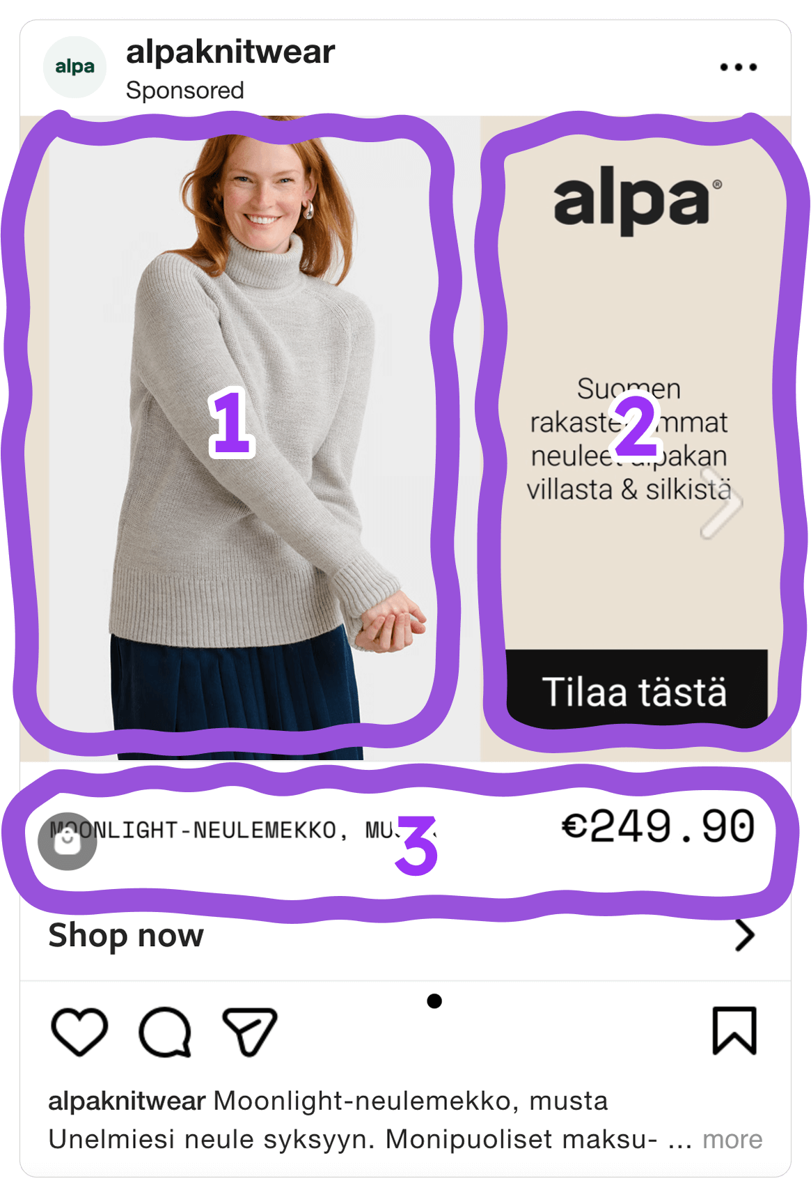
It’s subtle. But it’s a great way to show your viewers the most important info first, which can be followed up by other information that will determine whether or not someone will want to buy your product.
2. Show the best images for the product
Another thing that’s interesting here is that Alpa used different types of images depending on the type of products they’re showing. Clothing items feature model shots, while accessories are shown using packshots.
The model shots help viewers imagine themselves wearing the knitwear. And by actually showing you how these products fit into everyday life, these types of images add a bit of emotional weight to the ad.
But then the packshots provide clear, distraction-free product details. So you get a closeup of what the materials really look like, too! (colors, fabric, textures, etc.)
Not many brands go that extra mile to tailor the ad experience for their buyers. They usually show a packshot and call it a day.
But Alpa made sure to choose images that show each product from its best angle by using a combination of packshots and model shots!
It’s one of those things that can feel accidental, but in reality you need to put in work to prioritize product imagery.
3. Include relevant product information
Alpa does a great job of showcasing the product and guiding the buyer with their layouts.
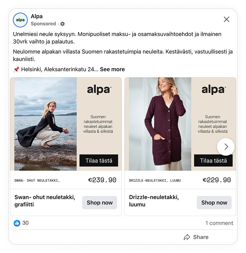
The final missing piece of a perfect ad is the inclusion of transactional information, such as the product name, color, and price. All of which helps the viewer decide whether the product is right for them.
Creating an ad that converts doesn’t have to be pushy or salesly. When including relevant product information, you can let the viewer decide for themselves what they think of the product.
Alpa’s ads aren’t pushy.
They’re not in your face.
But they do present the right information in a way that’s just subtle enough for interested buyers to notice, consider, and take action.
Key Takeaways
Alpa’s campaign reminds us of the importance of knowing your product's core value proposition. It also shows us how you can use different types of images, layouts, and design choices to guide the user through a seamless and more enjoyable shopping experience.
Here’s what to take away from their Catalog Ad playbook:
👉 Use layout to guide customers
Composition can play a big role in how people see your Catalog Ads. Too many details or a cluttered design, and your ads are messy and unnoticeable. But design clean, on-brand ads and you can create a seamless shopping experience that naturally guides your viewers towards their next purchase.
👉 Show the best images for the product
Using only packshots can leave people wondering how your products fit into their everyday lives. Using nothing but model shots can leave viewers with questions about what your products really look like. So it’s best to use different image types to suit the specific type of products you’re advertising.
👉 Include relevant product information
Every brand and every product has something that sets it apart from the competition. When you identify that and show people relevant information, you create ads that are timely, compelling, and that frame your products as something that’s actually needed.
Alpa’s Catalog Ad campaign nailed a +43% ROAS because they took a strategic approach to designing the ads. They focused their designs on the things that matter most to potential customers (the look and feel of high-quality alpaca wool), and then crafted the rest of the ad experience around that.
This just goes to show you that proven design tactics really do work! And you don’t need to be pushy or salesly to land that next customer!