Urban Outfitters & Nest Commerce
March 26, 2026

The Ad: A lifestyle catalog ad that makes the product instantly clear
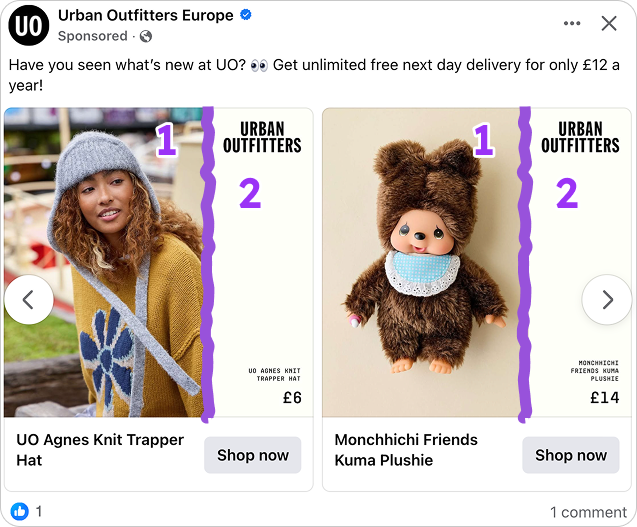
The layout is immediately clear. Around two thirds of the space is dedicated to the product visual, while the remaining third holds the product details. This structure defines the hierarchy from the first glance and anchors the catalog ad in a simple, readable format.
Urban Outfitters and Nest Commerce use this split to stay fully on brand. The styling, color direction, and composition reflect a consistent visual identity, where the product is presented in a way that feels natural, curated, and aligned with the broader campaign.
The visual side is dedicated to presentation. It frames the product within a real setting, giving it context while keeping it as the central element in the composition.
On the right, the information is tightly structured. Product name, key attributes, and price are grouped into a clean vertical block, making the details easy to scan without interrupting the visual flow.
Each part of the layout has a defined role. The visual draws attention, while the information confirms the choice. This balance is what allows catalog ads to feel both expressive and precise at the same time.
Why it won Catalog Ad of the week
This catalog ad won because the layout makes the product immediately understandable and easy to evaluate. Urban Outfitters and Nest Commerce structure the space clearly, allowing users to move from visual impression to product details without interruption.
That structure is reinforced by the elements inside it. The visual anchors the product in a real context while staying fully on brand, while the information panel keeps the details precise, structured, and easy to act on. Each element works together to support a clear and focused experience within catalog ads.
The performance reflects this design logic. A 50% increase in ROAS and an -18% in CPA shows how a well defined structure and controlled presentation directly improve results in catalog ads.
Another key factor is how the system holds together across variations. The same layout and visual logic can be applied across multiple products while maintaining both clarity and a consistent brand expression, which is essential for scalable catalog ads.
.png)
In the end, the ad stays tightly focused on the product and how it is presented. Every element supports the buying decision, which is exactly why this catalog ad earned Catalog Ad of the Week.
What makes this Catalog Ad great
A split layout that separates inspiration from decision
The layout is built on a clear division between visual presentation and product information. This structure makes the catalog ad easy to process, with each section serving a distinct purpose.
The visual side focuses entirely on how the product is presented. It carries the atmosphere, color direction, and overall feel, allowing the product to be understood in context without additional explanation.
On the opposite side, the information is arranged into a structured vertical block. Product name, key attributes, and price are grouped together, creating a tight and predictable reading pattern.
This separation creates a controlled flow. The visual captures attention, while the information locks in the decision, which is how catalog ads maintain clarity while guiding users toward action.
A format system that adapts seamlessly across placements
The format system is built from a 1:1 foundation and extends across 4:5 and 9:16 placements without changing its core visual logic. The structure is not redesigned, it is adapted, which allows the catalog ad to stay consistent across formats.
As the layout moves into taller formats, the proportions shift while the hierarchy remains intact. The product stays dominant, the information stays structured, and the overall composition continues to reflect the same brand and campaign feel, even as the resolution changes.
.png)
This adaptation also changes how the product is experienced. In 1:1 and 4:5, the layout supports browsing within a feed of multiple catalog ads. In 9:16, the format shifts toward a single product focus, reducing browsing behavior and guiding users toward a more direct decision.
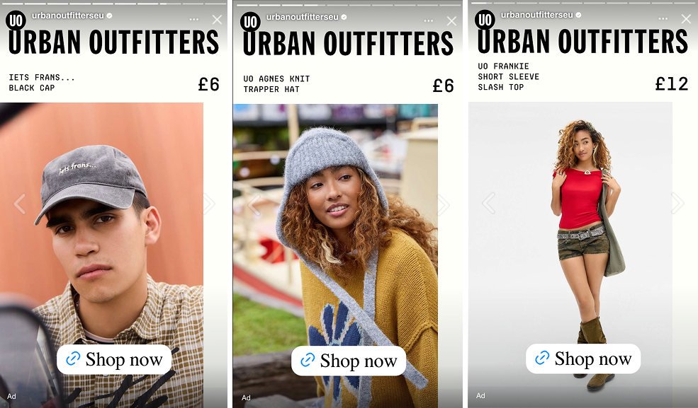
What stands out is that the visual identity holds throughout. The spacing, proportions, and overall direction remain aligned, which is how catalog ads scale across placements without losing brand consistency or clarity.
Product details that stay precise and on brand
The product information is presented with a clear sense of control. Only the most relevant details are included, which keeps the message focused and aligned with the overall visual direction of the catalog ad.
The structure of the information mirrors the discipline of the layout. Each detail is placed with intention, creating a consistent rhythm between product presentation and supporting information.
There is also a strong sense of brand alignment in how the details are styled. Typography, spacing, and hierarchy follow the same system as the rest of the ad, ensuring the information feels integrated rather than added on.
This consistency is what makes the section effective. The details reinforce the product instead of expanding the message, which is how catalog ads maintain clarity while staying fully on brand.
Key Takeaways
This catalog ad shows how structure, format adaptation, and brand consistency work together to create a focused and scalable experience across placements.
👉 A clear layout makes products easier to evaluate
The split between visual and information creates a structured flow. This is how catalog ads guide users from first impression to product understanding without friction.
👉 Format adaptation shifts from browsing to decision
Designs extend from 1:1 into 4:5 and 9:16 while keeping the same logic. In taller formats, catalog ads move toward a single product focus, supporting faster decisions.
👉 Consistent design keeps the ad on brand at scale
Visual identity, spacing, and hierarchy stay aligned across formats. This is how catalog ads maintain a strong brand and campaign feel across all placements.