Tretorn
January 21, 2026
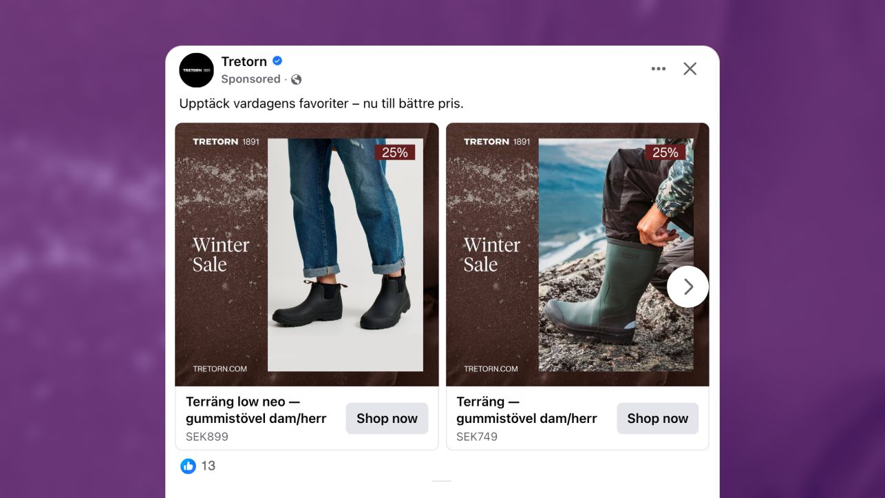
The Ad: A winter sale catalog ad that lets texture and product do the talking
This catalog ad is built around one clear idea: show the boots in use and remove everything else. There is no styled environment or decorative framing. Just a close cropped winter scene, the product in motion, and a calm Winter Sale message that sets the context instantly.
The approach feels confident and grounded. By focusing on the lower body and natural movement, the ad shows how the boots actually live in winter rather than how they look in a studio. That realism helps catalog ads feel useful instead of promotional, which matters when people scroll quickly.
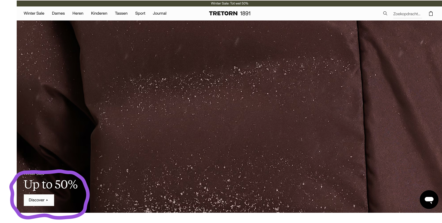
Developed by Tretorn, the creative uses a textured, earthy background that mirrors the brand’s website experience. That consistency makes the ad feel familiar rather than intrusive, which helps it blend naturally into catalog ads feeds instead of standing out for the wrong reasons.
By keeping the composition simple and the messaging separated, the ad reduces cognitive load. You can scan the product, notice the offer, and decide relevance within seconds. That ease of reading is what allows catalog ads like this to perform reliably across fast scrolling environments.
Why it won Catalog Ad of the week
This catalog ad won because it makes the decision feel effortless while you scroll. In catalog ads, people want quick reassurance that a product fits the moment, and here the winter context and product use are clear straight away. You do not have to stop and decode what you are looking at.
The boots naturally lead the experience, with the offer confirming value rather than competing for attention. That balance keeps the flow calm and intuitive, which is exactly how catalog ads support faster choices without feeling pushy.
By keeping the message simple and familiar, Tretorn team aligned the creative with real browsing behavior, which is why this catalog ad performed so well.
.png)
What really strengthens this approach is how little the ad asks from you. There are no secondary messages or visual detours. You see the product, understand the season, and register the saving in one smooth glance, which is where catalog ads consistently perform best.
What makes this Catalog Ad great
Product imagery that anchors the decision in real use
What works well in this catalog ad is the mix between contextual and isolated product imagery. Some frames show the boots worn on the body, while others strip the scene back to the product alone. That variation helps you understand both how the boots function and what they look like without overloading the experience.
In several frames, the winter context is reinforced through the background rather than the styling. The textured, frosted surface behind the product subtly signals cold weather and seasonal use, even when the boots are shown in a clean, isolated view. That allows the ad to stay minimal while still clearly anchoring the product in winter.
.png)
In the more product focused frames, this approach becomes especially effective. You are not relying on snow, props, or full environments to understand purpose. The background does that work quietly, while the boots remain easy to read in terms of shape, material, and construction.
Together, these cues give you enough information to decide without needing multiple angles or extra copy.
By combining restrained winter signals with clean product presentation, the imagery supports decision making without turning the ad into a lifestyle scene. That balance is well suited to catalog ads, where clarity and speed matter more than storytelling.
A winter sale system that feels intentional, not decorative
The smart part of this catalog ad is how the Winter Sale is expressed consistently across different image sizes and product formats. The textured background acts as a unifying element, whether the product is shown large, cropped, or more isolated within the frame.
In some placements, the product fills more of the canvas. In others, it sits smaller with more negative space around it. What stays consistent is the winter backdrop and its role in setting season and mood. That consistency keeps the experience coherent, even when individual frames differ in scale.
.png)
Rather than relying on exact sizing or identical layouts, the background works as a recognition cue. You quickly register that these products belong to the same Winter Sale moment, regardless of how they are framed.
This is especially important in catalog ads, where multiple products appear side by side and visual continuity helps reduce scanning effort.
By using the background as a system signal instead of a decorative layer, they make the campaign feel connected across variations. The sale feels intentional and familiar, even as products and compositions change.
Discount and copy placement that supports fast scanning
The way the discount and copy are handled keeps the experience light. The offer is easy to spot, but it never takes over the layout or distracts from the product itself. In catalog ads, that balance matters because people want information, not persuasion, while they scroll.
What helps is the clear separation between product and message. The Winter Sale text sets context, while the discount badge confirms value. They do different jobs and stay out of each other’s way. This makes the ad easier to read at speed, which is exactly how catalog ads are usually consumed.
.png)
There is also restraint in what is not said. No stacked messages, no urgency language, no competing claims. You are given just enough to assess whether the offer is relevant to you. That simplicity keeps the decision calm and avoids the feeling of being pushed.
By treating the discount as guidance rather than a trigger, the ad stays credible. It respects your pace and lets you decide when to engage, which is why this kind of copy and placement continues to work so well in catalog ads.
Key Takeaways
This catalog ad shows how strong performance comes from designing the sale as a system, not a headline. When season, product, and layout work together, catalog ads help people decide without pressure.
👉 A sale performs best when it shapes the entire design
The Winter Sale is embedded into the visual system rather than announced loudly. In catalog ads, this makes the offer feel timely and intentional instead of promotional.
👉 Mixing context and clean focus supports faster decisions
Some images show the product in use, while others slow things down with isolated product views. This balance helps catalog ads serve different decision styles without adding friction.
👉 Clear offers work when they stay supportive
The discount confirms value but never competes with the product. Treating offers as guidance rather than urgency keeps catalog ads easy to scan and easier to trust.