The Fragrance Shop & Unreasonable Agency
March 4, 2026
The ad: A lesson in product-focused designs with clear promotional framing
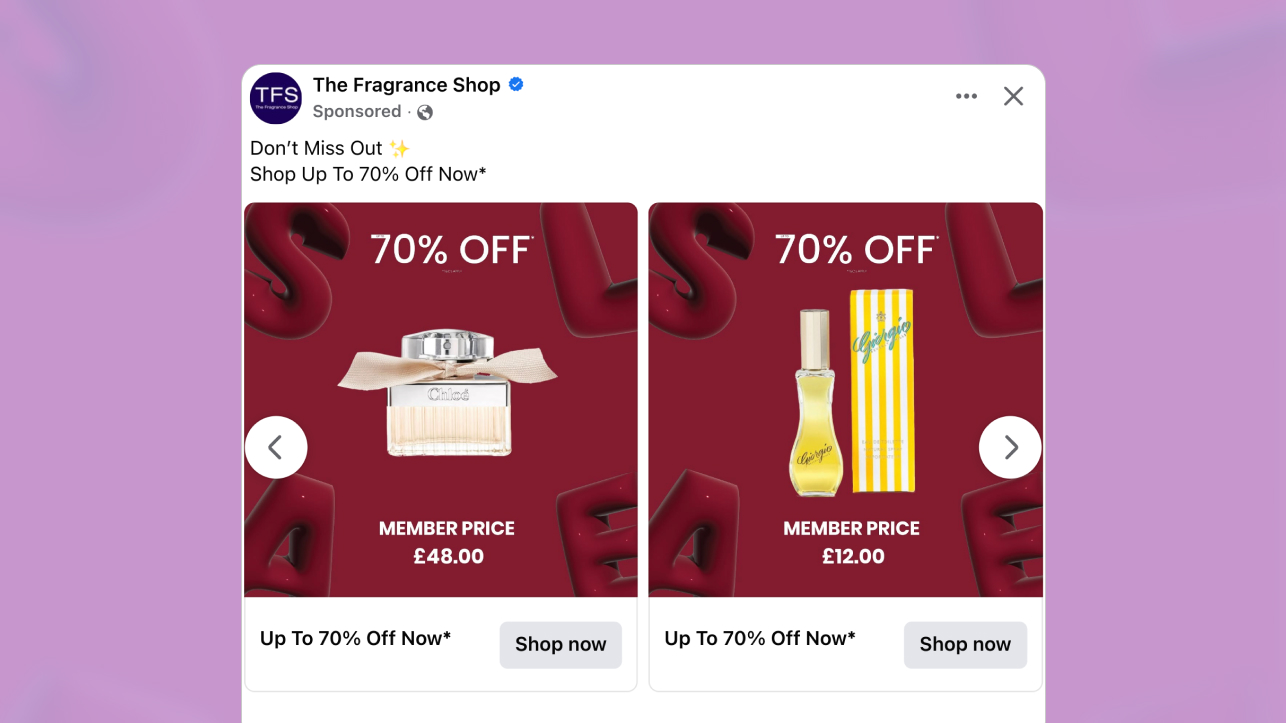
This value-oriented catalog ad stands out because it doesn’t mess around about what it’s trying to say. It’s not flashy or distracting. All it takes is a quick glance and it’s obvious you’re looking at a sales ad from a fragrance brand.
Created by The Fragrance Shop & Unreasonable Agency, this ad features a bold, red background and a white font that are great at grabbing your attention. But really, it’s the visual simplicity and the clear product visibility that drive the sales message home.
The design features only a handful of visual elements, including the product, discount, and member’s price.
This focused composition is exactly what makes the ad effective. By eliminating unnecessary elements, the layout becomes direct, confident, and easy to process. Every component has a clear purpose. The product establishes relevance, the discount captures attention, and the member price anchors the value.
Why It Won Catalog Ad of the Week
This ad outperformed because of the clear sales intent and product focus, which make it an effective tool for driving sales.
Because there’s nothing to distract attention, viewers are immediately drawn into looking at the product and pricing info. These anchor expectations and give them everything they need to know about the offer, without having to click-through to the shop to learn about prices or savings.
The +77% increase in ROAS reflects how efficiently this catalog ad converts attention into revenue. But the +201% higher conversion rate is even more revealing.
This catalog ad more than tripled the brand’s conversion rate because it aligns the right offer with the right audience. When customer club members click on catalog ads that clearly highlight their exclusive pricing, they click with intent. That intent translates directly into stronger conversion performance.
What Makes This Catalog Ad Great
Clear value orientation and a concrete price anchor
This ad outperformed because it fully owns the sale moment. The design and visuals make the intent obvious, saying: “Here’s a fragrance brand offering products at a great new, heavily-discounted price for members.”
Making that sales intent clear was smart. But we also love how the bold, red background and large 70% OFF play together and create a scroll-stopping visual impact. The high-contrast design ensures the ad grabs your attention, even when you’re scrolling quickly through your feed.

Meanwhile, the member’s price helps ground the discount into something tangible.
Instead of wondering how much you’re saving or what the final price will be, this ad provides clear pricing expectations. That helps move value from an abstract savings into a clear and affordable number people can understand.
Ultimately, scroll-stopping designs like this and rational price anchoring are strong performance traits we’ve often seen work well in catalog ads.
Built for 1:1 and 9:16 placements with safe zone precision
One of this catalog ad’s key strengths is its centered composition. The product and pricing details are anchored in the middle of the layout, creating immediate visual balance and structural control.
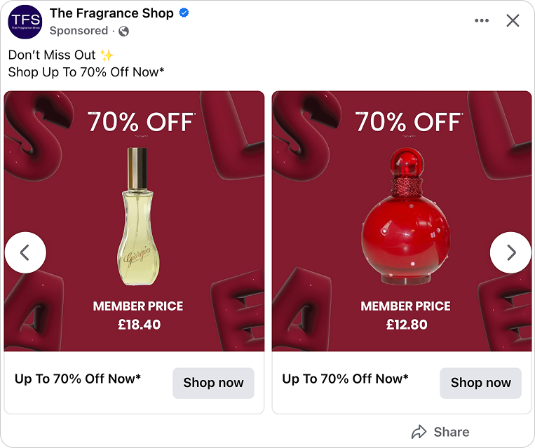
When viewing the square 1:1 versions side by side, the hierarchy is consistent across all products. The discount sits prominently above the product. The product remains centered. The member price follows below. This structure does not shift between variations.
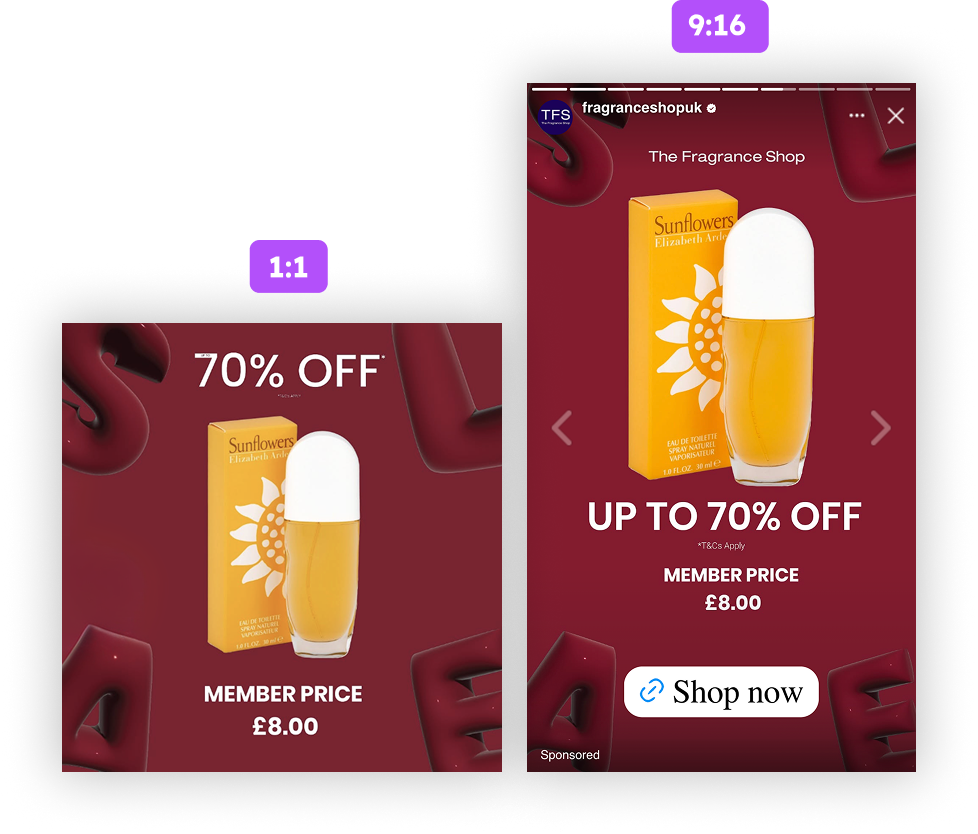
That consistency becomes even more important in vertical 9:16 placements.
Because the creative is vertically stacked, it naturally adapts to taller formats. The discount remains at the top, the product stays central, and the member price anchors the lower section. The visual flow remains intact without redesign.

Crucially, the layout respects safe zones in 9:16 environments. None of the critical elements sit too close to the top or bottom interface overlays. The discount, product, and member price remain fully visible in Stories and Reels placements. That protects clarity and performance.
Strong catalog ads are not simply resized. They are structurally built to function across formats.
A product-focused design within a promotional frame
Yes, the intent of this ad is clearly promotional. But even with the heavy sales messaging, the product remains front-and-center.
The fragrance bottle and packaging are presented in a way that keeps them as the main focus of the ad. This ensures the design is clearly transactional but also shoppable since people easily understand what type of products they’re looking at.
Value is important. It always will be. But this ad isn’t just about prices or discounts. Viewers also get a look at the product. What a fragrance bottle looks like may not be the most important decision-making factor.
But it’s still an important visual component of the ad and lends an elegant, higher-end feel to the overall design.
In the end, it’s the balance between bold promotion and product clarity that allows catalog ads like this to convert rather than just attract attention.
Key Takeaways
This catalog ad proves that qualified pricing, structural adaptability, and disciplined hierarchy drive performance. It is not just about discount visibility. It is about aligning message, audience, and format.
👉 Use member exclusive pricing to attract high intent traffic
When catalog ads clearly communicate a customer club price, they do more than promote a discount. They filter for qualified users who already understand the value exchange. That alignment increases conversion rate because the clicks come from buyers, not browsers.
👉 Design catalog ads for 1:1 and 9:16 from the start
High performing catalog ads are structurally built for distribution. A centered, vertically stacked layout ensures that square and vertical formats maintain clarity without redesign. Respecting safe zones in 9:16 placements protects key information from being obscured and preserves performance.
👉 Build a stacked hierarchy that mirrors real scrolling behavior
Users scan vertically. Catalog ads should reflect that. Placing the discount at the top, the product in the center, and the member price below creates a logical decision flow. This reduces friction and makes the purchase decision faster and easier.