TWILFIT by CHANGE Lingerie
April 15, 2026
The ad: A well-balanced ad that supports quick decision-making
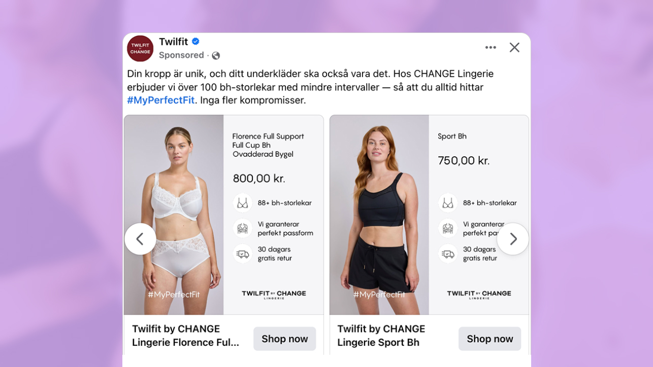
This catalog ad from TWILFIT by CHANGE Lingerie shows a clear and deliberate approach to how products are presented and explained within a single layout.
The layout keeps the focus on the product, while placing supporting details exactly where users expect them. This makes it easy to take in both the visual and the information without effort.
Instead of separating inspiration and information, TWILFIT by CHANGE Lingerie combines them within one structured view.
The split layout plays a key role. One side shows the product, while the other side presents price, value points, and delivery details.
What stands out is how TWILFIT by CHANGE Lingerie actively addresses concerns users may have when buying this type of product online, where fit and comfort are difficult to assess without trying it on.
By clearly showing a wide size range, a fit guarantee, and a 30 day free return policy, the brand reduces the perceived risk directly within the ad. The presence of the brand logo further reinforces trust, making the offer feel more reliable.
TWILFIT by CHANGE Lingerie also introduces the #MyPerfectFit hashtag directly within the catalog ad, which is uncommon in this format. By using a hashtag that is already present in their organic content, the brand connects this catalog ad to its broader communication. This turns the ad into part of a consistent brand message around fit and comfort, rather than a standalone promotion.
Together, these elements show how TWILFIT by CHANGE Lingerie builds confidence at the moment of first interaction, not just after the click.
Why it won Catalog Ad of the Week
This catalog ad performs because TWILFIT by CHANGE Lingerie has structured it in a way that combines product visibility with clear purchase information in a single view.
The viewer can understand both the product and the offer without needing to leave the ad.
The layout is built to guide attention. The visual introduces the product, while the surrounding elements explain price, value points, and delivery. What makes this especially effective is how the brand anticipates user concerns and answers them upfront.
What makes this especially effective is how TWILFIT by CHANGE Lingerie removes hesitation before it can become a barrier.
By surfacing size range, fit reassurance, and return options directly in the ad, the brand answers the most common concerns upfront instead of leaving them for the product page.
This structure translates into performance, with the ad achieving a +26% increase in return on ad spend (ROAS).
This reflects how reducing perceived risk early can directly impact conversion performance.
Each element supports a specific role. The image shows the product clearly. The information explains what matters. The pricing and delivery details set expectations.
.png)
This is why the catalog ad not only attracts attention but also converts users who are ready to act.
What makes this Catalog Ad great
Product information that reduces friction and supports buying intent
The product information in this catalog ad focuses on the details that influence whether a user moves forward or drops off.
Rather than reducing the amount of information, TWILFIT by CHANGE Lingerie organizes it clearly so each element is easy to understand. Product name, price, size range, fit guarantee, and return policy are all visible and grouped in a structured way.
This is particularly important for products where uncertainty around fit and comfort can prevent users from taking action.
.png)
TWILFIT by CHANGE Lingerie uses these elements to actively remove that uncertainty by making reassurance part of the ad itself, not something users need to search for.
The role of these elements is not to persuade through messaging, but to clarify what the user is getting.
By addressing concerns directly within the layout, the brand reduces the mental effort required to evaluate the product.
This approach reduces uncertainty during evaluation. The user can understand the offer and decide whether to continue without leaving the ad.
As a result, the catalog ad supports stronger buying intent by making the path from interest to action more direct.
Product on one side. Information on the other
The ad places the product on one side and the key information on the other, making it clear what you are looking at and what you need to know.
This makes it easy to separate the product from details like price, size range, and delivery without mixing them together.
.png)
Instead of placing everything in a single frame, the design keeps each part in its own space. This prevents the layout from becoming crowded and harder to read.
This also supports how TWILFIT by CHANGE Lingerie presents reassurance elements, keeping them visible without taking focus away from the product.
This is what makes the catalog ad effective. It organizes information in a way that feels simple and easy to follow.
Designed to perform across 1:1 and 9:16 formats
The layout is designed to work across both square and vertical formats without changing how the content is presented. TWILFIT by CHANGE Lingerie has designed the layout so that no elements need to be removed or reduced when adapting formats. The product, price, and supporting details follow the same order in both versions, only shifting position to match the format.
Because the product remains large and clearly framed in both layouts, it keeps its visual weight regardless of placement. In the square version, it sits alongside the information, while in the vertical version, it leads the sequence with details following below. This keeps the product as the main focus in every format.
.png)
The supporting elements are grouped and spaced in a way that remains readable when the layout shifts. Nothing overlaps, and no element loses visibility when moving between formats. This also ensures that reassurance elements such as size, fit, and returns remain clearly visible across placements.
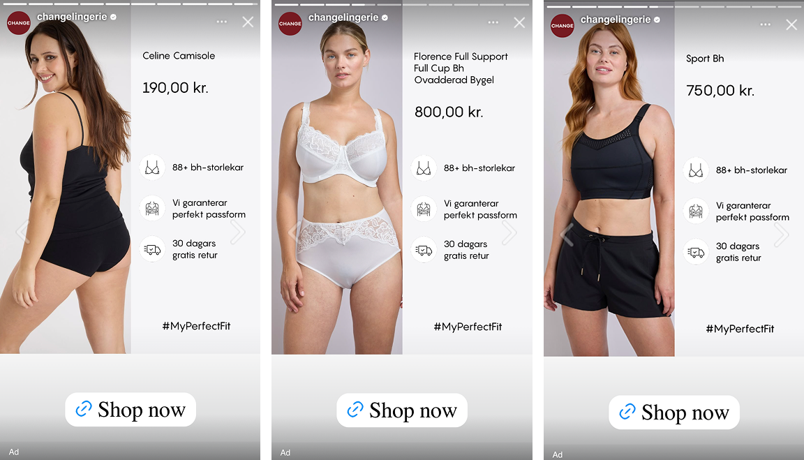
The layout also respects safe zones. The product stays fully visible, while text and pricing are positioned away from the edges. This ensures that product, pricing, and key details remain fully visible across placements where interface elements might otherwise interfere. This becomes especially important in 9:16 environments, where overlays can block content if safe zones are not considered in the design.
Key Takeaways
This catalog ad from TWILFIT by CHANGE Lingerie shows how thoughtful structure and clear product presentation can support buying intent and improve performance.
👉 Structure creates understanding
Clear separation between product and supporting details makes the catalog ad easy to follow. Each element has a defined role.
👉 Addressing concerns drives conversion
By proactively showing size range, fit guarantee, returns, and brand cues, TWILFIT by CHANGE Lingerie reduces perceived risk and builds confidence before the click.
👉 Consistency across formats drives scalability
By keeping the same order of elements in both 1:1 and 9:16, the catalog ad maintains clarity across placements and adapts to different viewing environments.