Sherpa Adventure Gear
April 29, 2026

The ad: A catalog ad that lets the product do the talking
This catalog ad from Sherpa Adventure Gear promotes outdoor apparel through a split-frame layout that separates the product visual from the product detail. One side shows a model wearing the gear in a natural setting. The other carries the brand name, product information, and a color panel that matches the product itself.
What makes it immediately noticeable is how calm it feels. No urgency. No price overlay. No promotional pressure. Just the product, presented clearly, in a format that invites the viewer to look rather than decide.
The split structure does something that single-frame catalog ads often struggle with. It gives each type of information its own space, so nothing has to fight for attention. The product visual and the product detail coexist without either one getting crowded out.
Sherpa Adventure Gear built this catalog ad around exploration rather than conversion pressure, and that restraint is what makes it stand out in a feed full of louder alternatives.
Why it won Catalog Ad of the Week
Most catalog ads lead with price, discounts, or urgency badges. This one leads with the product. And that single structural decision is the core reason it won.
By removing promotional pressure from the frame entirely, Sherpa Adventure Gear shifted the viewer's first interaction from evaluation to engagement. Instead of asking someone to decide, the ad invites them to look. That difference in experience is what drove a +79% increase in ROAS.
When viewers are not immediately confronted with pricing or discount information, they spend more time with the product itself. That additional attention builds familiarity and confidence, two things that matter far more in apparel purchasing than a badge ever could.
.png)
The result is a catalog ad that performs not by pushing harder, but by removing the friction that usually gets in the way.
What makes this Catalog Ad great
A split layout that gives the product room to breathe
Sherpa Adventure Gear structured each card as two distinct zones. The larger panel shows the product on a real model in a clean, natural setting. The smaller panel carries the brand name and product details in a color-blocked format that complements rather than competes.
Showing the product on a real model provides immediate reference for fit, proportion, and real-world appearance. This ultimately reduces uncertainty, which is a key friction point in apparel purchasing decisions, especially when shopping online.
.png)
The generous spacing around the model keeps the eye focused. There is no clutter pulling attention toward the edges of the frame. The product fills the space it is given, and the viewer follows naturally.
This is the kind of layout decision that looks simple but takes real discipline to execute. Sherpa Adventure Gear resisted the temptation to add more, and the clarity shows.
A color system where the product controls the environment
This is the most distinctive thing Sherpa Adventure Gear did in this campaign, and it is worth slowing down to appreciate.
Most catalog ads treat color as a branding decision. A background gets chosen, and products are placed in front of it. Here, the process works the other way around. The product defines the color environment. The background, the detail panel, and the surrounding composition all follow the tone of the product being shown.
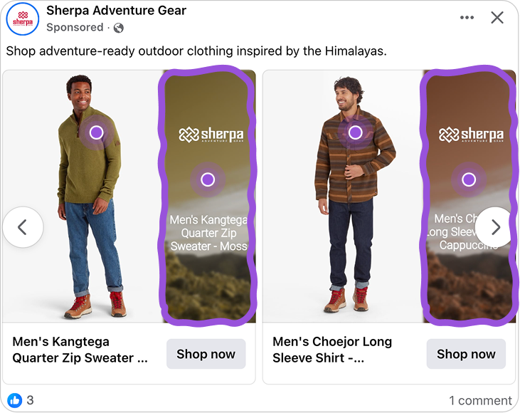
What looks like a handcrafted design for each product is actually a dynamic system. The product image drives the color selection across the entire card. Every variation feels visually intentional because it is. The system ensures that the background and panel always complement the specific product appearing in that frame, not just the brand in general.
This matters because it creates a catalog ad that feels cohesive at a level most ads never reach. The product does not sit in front of a background. It exists within a visual environment built around it. Viewers may not be able to articulate why it feels so considered, but they feel it. And that feeling builds trust.
For catalog ads running across many products and placements, this kind of system is rare. It scales without losing the sense that each card was made specifically for that product.
No price. No badge. No pressure.
Sherpa Adventure Gear made a deliberate choice to exclude pricing, discount badges, and urgency cues from the ad entirely. In a category where promotional tactics are almost universally expected, that decision is significant.
Most catalog ads treat every viewer as someone ready to buy. This one treats them as someone worth engaging first. Without a price or a badge demanding immediate evaluation, the viewer's attention stays on the product rather than the offer.

That shift changes the dynamic of the interaction. Scrolling slows. The product gets more time. And when someone does click through, they are doing so out of genuine interest rather than discount-driven impulse.
It is a less common approach in catalog advertising, but the logic is straightforward. When you remove the pressure to decide, you create the space for someone to actually want the product. For a premium outdoor apparel brand like Sherpa Adventure Gear, that distinction matters.
Key Takeaways
Sherpa Adventure Gear proves that catalog ads built around clarity and restraint can outperform ones built around promotion. Here is what makes this one worth learning from.
👉 Give the product space and real-world context
Catalog ads that show products on real people in natural settings remove the guesswork from online shopping. Scale, fit, and proportion become immediately readable, which reduces hesitation and increases engagement.
👉 Let the product define the visual environment
When backgrounds and color panels follow the tone of the product rather than a fixed brand palette, every variation feels individually considered. That level of visual alignment is rare in catalog ads and immediately noticeable to the viewer.
👉 Remove pressure to create genuine interest
Catalog ads that lead with the product rather than the promotion invite exploration before evaluation. That shift in dynamic builds the kind of attention and confidence that converts, without relying on urgency or discounts to do it.