Scandinavian Edition
December 17, 2025
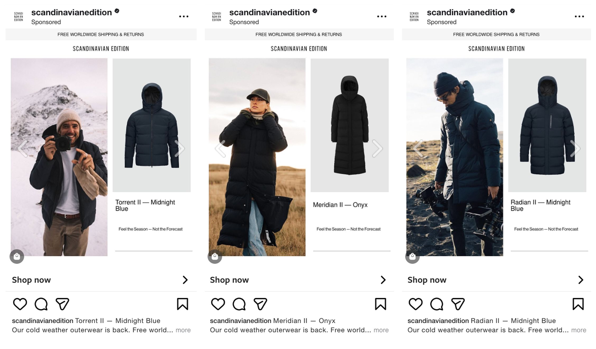
The Ad: A calm, winter-ready catalog ad that builds interest through simplicity
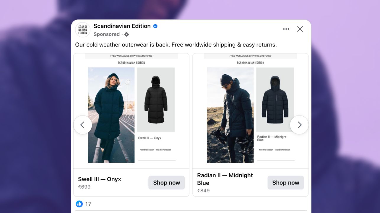
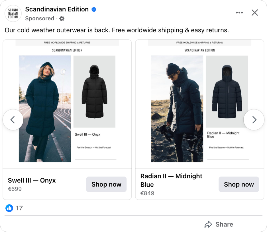
These catalog ads take a quiet approach to winter marketing. Instead of leaning on dramatic cold-weather themes, they use a clean split layout that places equal weight on mood and product. The result is an ad experience that feels clear, focused, and easy to understand at a glance.
This simplicity also makes the creative naturally adaptable across placements, giving the same story room to breathe in both feed and vertical formats.
Scandinavian Edition is a brand known for minimal, technical outerwear, and that identity translates naturally into this format. Working with their creative team, they created a visual system that mirrors the brand’s design: restrained color, clear structure, and an emphasis on real functionality rather than heavy seasonal messaging.
Each variation pairs a lifestyle photograph with an isolated product image. The lifestyle side introduces light, weather, and movement, helping viewers picture how the jacket performs outdoors. The product side balances this with structure and detail, which is exactly where catalog ads excel.
Because this pairing is consistent, it holds up equally well whether viewed in a tall 9:16 Story or a more compact 4:5 feed placement.
The layout feels intentional and uncluttered, giving the catalog ads a premium tone without adding visual weight.
Why it won Catalog Ad of the week
This set of catalog ads performs because it uses restraint as a design strategy. Nothing feels rushed or crowded. Instead, the ads let viewers process one idea at a time: mood, product, and benefit.
That clarity creates a premium impression, which naturally supports stronger engagement from shoppers who care about quality more than urgency.
The performance data reflects this. ROAS increased by 30% and conversion rate rose by 33%. This pattern is typical of well structured catalog ads that attract fewer casual clicks but bring in far more committed shoppers.
By pairing lifestyle and product, limiting text, and building a calm winter narrative, the creative attracted viewers shows that premium messaging does not depend on dramatic graphics or heavy visual effects.
It comes from clarity, consistency, and a layout that supports how shoppers naturally evaluate outerwear.
The consistency across 9:16 and 4:5 formats also plays a role here. When the same visual logic appears across placements, recognition builds faster and friction drops, even as users move between surfaces.
In this case, the catalog ads did exactly that, turning a simple structure into a meaningful performance advantage.
What makes this Catalog Ad great
Using price-free design to signal premium quality
Leaving out the price changes the way viewers read these catalog ads. It removes the immediate urge to compare or calculate and replaces it with a focus on form, texture, and craftsmanship.
This is especially effective for a brand like Scandinavian Edition. Their products are built around technical quality and minimal design, and the absence of price supports that identity by slowing down the viewer’s evaluation process.
.png)
Instead of deciding whether the jacket is “worth it” within the ad itself, shoppers move into the product page with curiosity. This shifts their mindset from discount hunting to discovery, which often leads to higher quality engagement.
In catalog ads, this strategy filters out low-intent clicks and encourages a more thoughtful interaction.
Showing the product in real life through lifestyle imagery
The lifestyle photography gives the catalog ads emotional context without overwhelming the layout. Viewers see soft winter light, a sense of movement, and a clear feeling of temperature. These cues help them imagine the jacket in real use.
Lifestyle imagery also adds dimension to the brand story. Scandinavian Edition focuses on functionality and calm Scandinavian design, and these scenes translate that philosophy into something tangible.
.png)
When placed next to an isolated product shot, the contrast becomes a strength. One side communicates environment and experience. The other communicates structure, silhouette, and material clarity.
This balance is a core advantage of well executed catalog ads. It invites viewers to understand both the promise and the product in a single glance.
Using layout to guide the viewer’s eye
The eye first lands on the lifestyle image. This is the largest and most dynamic element, and it sets the mood immediately. Cold light, movement, and posture communicate season and use before any text is read.
From there, attention naturally shifts to the product frame and name. The isolated jacket, paired with the product title and color, gives viewers clarity and confirms what they are looking at. This is where comparison and evaluation begin, which is exactly where catalog ads need to be strongest.
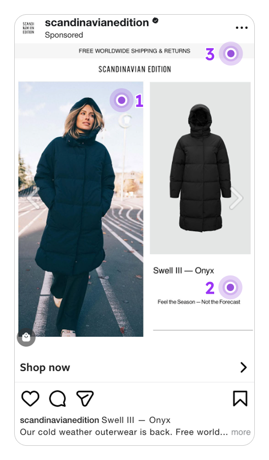
Only after that does the viewer register the brand and supporting information. Scandinavian Edition and the free worldwide shipping message sit calmly at the top, reinforcing trust and reducing friction without interrupting the flow.
The line Feel the Season Not the Forecast anchors the layout at the bottom. Repeating it in the same position across variations stabilizes the visual system and ties emotion back to function, completing a clean and confident reading path.
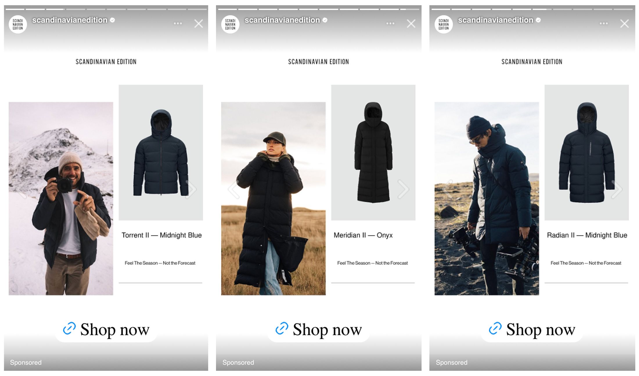
Adapting the story across 9:16 and 4:5 formats
The catalog ads are built to work across both 9:16 and 4:5 without changing the core idea. Instead of redesigning the message for each placement, the same visual logic carries through, making the story feel consistent wherever it appears.
In 9:16, the lifestyle image takes the lead. The taller format gives more room for atmosphere and movement, which strengthens the emotional side of the ad and works naturally in Stories and vertical feeds.
In 4:5, the balance shifts slightly toward product clarity. The layout still pairs lifestyle and product, but the tighter frame makes comparison and evaluation easier as viewers scroll.
By designing the system to flex across formats, the ads avoid feeling fragmented. The story stays intact, recognition builds faster, and the catalog ads feel cohesive across placements instead of adapted as an afterthought.
Key Takeaways
The strength of these catalog ads comes from a blend of restraint, structure, and clear visual storytelling. Each design choice supports how shoppers naturally scan, compare, and evaluate outerwear, which is why the creative delivered stronger efficiency and higher value conversions.
👉 Using price-free design to signal premium quality
Removing the price shifts attention toward craftsmanship and design, helping the catalog ads position the jackets as premium items and attracting more intentional shoppers.
👉 Showing the product in real life through lifestyle imagery
Pairing real outdoor scenes with isolated product shots gives the catalog ads both emotion and clarity, making it easier for viewers to understand function and form in a single glance.
👉 Using layout to guide the viewer’s eye
A clean, predictable structure guides the viewer’s eye smoothly through the ad, reinforces brand identity, and supports more efficient performance.
👉 Adapting the story across 9:16 and 4:5 formats
The same visual system works across vertical and feed placements without losing meaning. This consistency strengthens recognition and keeps the catalog ads cohesive wherever they appear.