SOFACOMPANY
December 23, 2025
The Ad: Minimalism that turns a sofa into the whole story
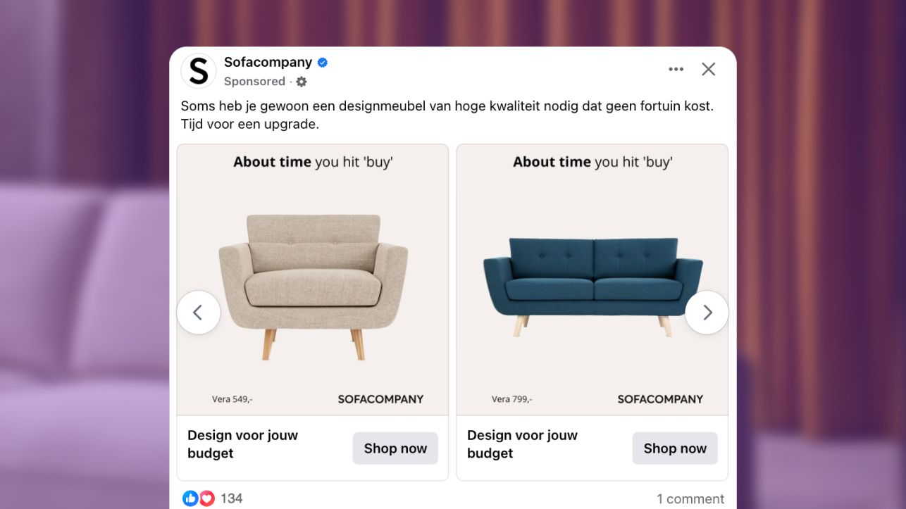
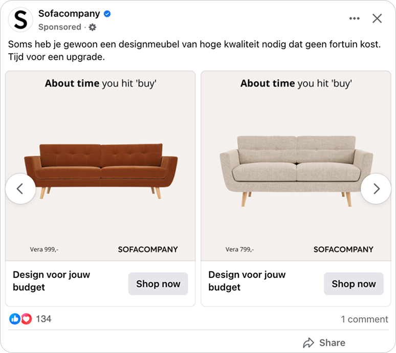
SOFACOMPANY took a completely stripped back approach for this catalog ad campaign. No room setup, no lifestyle cues, no added styling. Just a sofa on a clean background with a headline that says simply: About time.
The idea works because it feels confident and true to their Scandinavian design roots. The layout is calm and intentional, giving the product room to breathe. Viewers know instantly where to look and why it matters.
Both the light and dark versions keep the same clear visual language throughout. The sofa stays centered, the tone remains friendly, and the price is easy to read.
The 1:1 formats suit quick catalog browsing, while the 9:16 versions feel more immersive without adding clutter.
Why it won Catalog Ad of the week
Because it leans into how people actually make furniture decisions. SOFACOMPANY’s catalog ads don’t try to persuade with noise. They simply show a sofa clearly, pair it with a gentle About time, and meet viewers right where they already are in their decision process.
The results reflect that approach. ROAS increased 85%, and conversion rate rose 42%. Average order value also climbed 28%, suggesting the clean presentation made the products feel more considered and more premium.
The minimalist layout reinforces that feeling. Everything is calm, easy to take in, and free of pressure. The headline adds a human touch that feels like a small nudge rather than a sales message, giving the ads relevance without forcing urgency.
SOFACOMPANY won by creating space for shoppers to feel sure about what they were seeing. The design helps people process the product quickly and trust their own taste. It is a natural example of how catalog ads support decisions that are already in motion.
What makes this Catalog Ad great
Ultra minimalist layout that puts full attention on the sofa
SOFACOMPANY kept the layout as simple as possible, removing anything that didn’t highlight the product. With no room scenes or decorative elements, the sofa becomes the clear focal point the moment the ad appears.
.png)
This kind of simplicity changes how people browse. The clean space slows the viewer just enough to notice shape, texture, and detail without any visual noise. It feels intentional rather than empty, which naturally elevates the product. The approach also matches the brand’s Scandinavian roots. The ad looks as considered as the furniture itself, creating a sense of trust and clarity. For catalog ads, that alignment helps viewers make quick, confident decisions.
A bold conversational headline that hooks the viewer
The “About Time” headline works because it speaks directly to the viewer in a way that feels personal. It doesn’t announce a campaign or call out a promotion. Instead, it mirrors a thought many people already have, which makes the message feel natural rather than sales driven.
That simplicity helps the ads land quickly. Viewers are not asked to decode an offer or react to urgency. They are met with a line that feels familiar, almost like a quiet acknowledgment of a decision they have been putting off.
.png)
What makes “About Time” even stronger is that it isn’t limited to these catalog ads. SOFACOMPANY uses the line across their website and organic social, turning it into a recognizable brand voice rather than a one off idea.
Seeing the same message in different places builds familiarity. Each exposure reinforces the line, so when it appears in a catalog ad, it already feels known and trusted.
.png)
The headline also adapts naturally to different moments throughout the year. Variations like hit buy, you stopped waiting for sales, or you got what you wished for reflect different mindsets without naming a specific season.
By speaking to how the viewer feels rather than what the calendar says, “About Time” stays relevant. It remains direct, human, and timely without ever needing to call out a campaign period.
Designed for placement, not resized to fit
What really sets these catalog ads apart is how thoughtfully SOFACOMPANY considered where the ads would actually appear.
Instead of relying on one square layout to be automatically adapted across placements, the creative was built specifically for feeds, stories, and reels. That decision keeps full control over how the sofa is framed and experienced.
When a single design is auto adjusted, brands often lose control over spacing, cropping, and visual balance. Key details can shift or feel compressed, especially in immersive placements.
.png)
SOFACOMPANY avoided that by designing each placement intentionally, making sure the product always looks the way it should.
In feed environments, the ads feel calm and structured, making them easy to browse and compare. In stories and reels, the sofa has more room to breathe, which adds scale and presence without adding decoration. Across every placement, the experience stays consistent and focused on the product.
Key Takeaways
This campaign shows how little you need for a catalog ad to make an impact. With a strong product and a clear message, simplicity does most of the work. SOFACOMPANY leaned into that idea, and the results show how effective a focused creative can be.
👉 Minimalism that lets the sofa shine
By removing every extra detail, the ads give the product room to breathe. The clean layout feels intentional, modern, and premium, which naturally draws viewers in.
👉 A headline that feels friendly rather than sales driven
About time adds personality without pushing urgency. It makes the catalog ads feel human, and that familiarity helps them stand out in a crowded feed.
👉Designed for placement, not resized to fit
Building ads for each placement avoids auto adjustments and keeps framing, spacing, and clarity exactly as intended.