Popken Fashion
November 19, 2025
The Ad: Blending colors, models, and layout into higher ROAS
Popken operates over 200 stores in Europe and has a total of 5 distinct fashion brands, including Ulla Popken, Studio Untold, Laurasøn, JP1880, and Happy Size.
The company already performs well both in-store and online, but they wanted to push sales heading into the holiday season by leaning into the early Black Friday demand and giving shoppers access to a pre-sale offer.
Their optimized Black Friday ad, which showcased bold colors, product shots and models, and a few other smart design tactics, utilized a clean layout to help them achieve more clicks, more conversions, and overall better returns.
Why it won Catalog Ad of the week
Shoppers are already in a buying mindset around Black Friday, but strong design still determines which ads get noticed. Notably, Popken launched this campaign ahead of the official Black Friday date to capture early attention, making the design particularly critical for standing out.
Popken’s ad stood out because it blended seasonality with a layout that made the products look good and feel relatable at the same time. It achieved a higher click-through rate (+42%), a higher conversion rate (+143%), and an overall higher ROAS (+137%).
The lift in performance highlights how effective clear visual hierarchy and seasonal relevance can be when they align with audience expectations.
What makes this Catalog Ad great
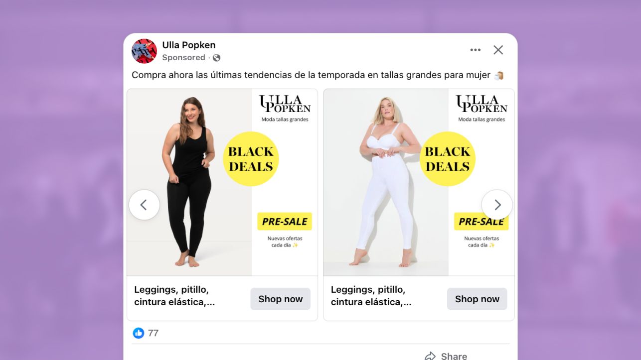
High-impact offer design through color repetition
The first thing this ad does well is direct the viewer’s eye straight to the offer.
The bright yellow “BLACK DEALS” and “PRE-SALE” labels immediately draw attention because they contrast strongly against the clean, white background. Instead of relying on darker tones or heavy sale graphics, Popken uses a simple pop of color to signal that this is a limited-time event. The message of "New offers every day" reinforces this tactic, suggesting fresh deals are always added to sustain Black Deals interest.
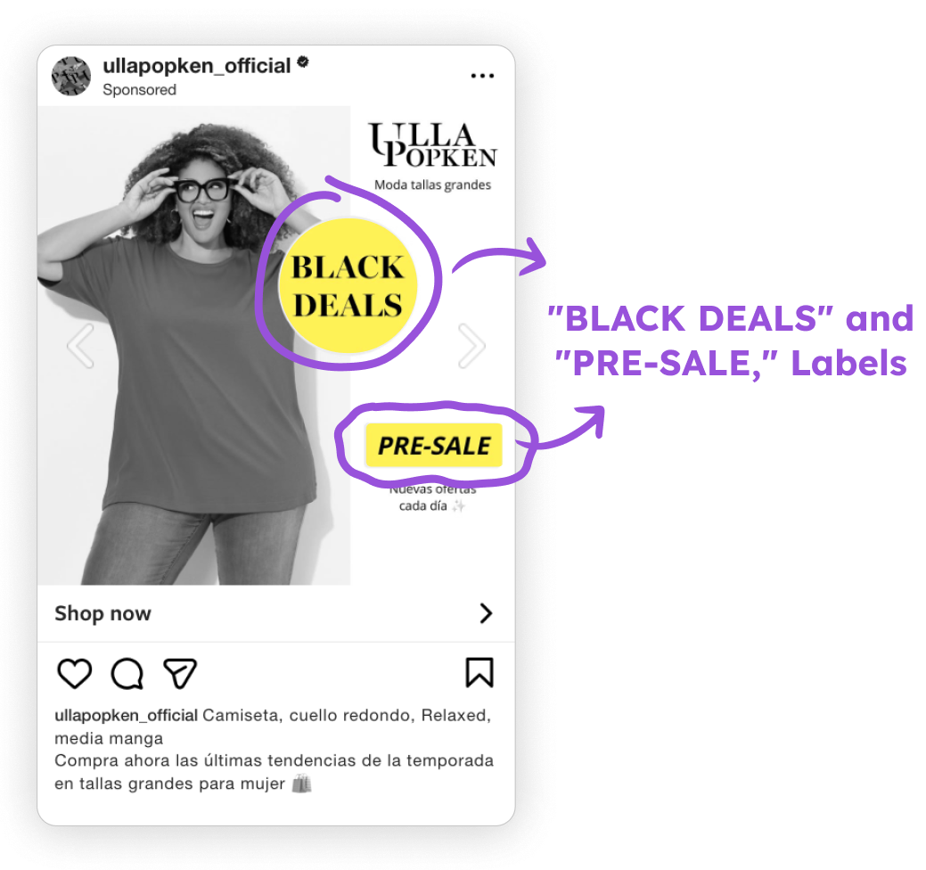
The all-caps typography adds clarity, the message is short, direct, and easy to read even at a glance. And because the same yellow tone appears in both the offer circle and the pre-sale badge, the design feels cohesive across the entire frame.
It’s a minimal approach, but an effective one: the repeated use of yellow guides the viewer’s eye, reinforces the promotional message, and gives the ad a clear focal point without cluttering the layout.
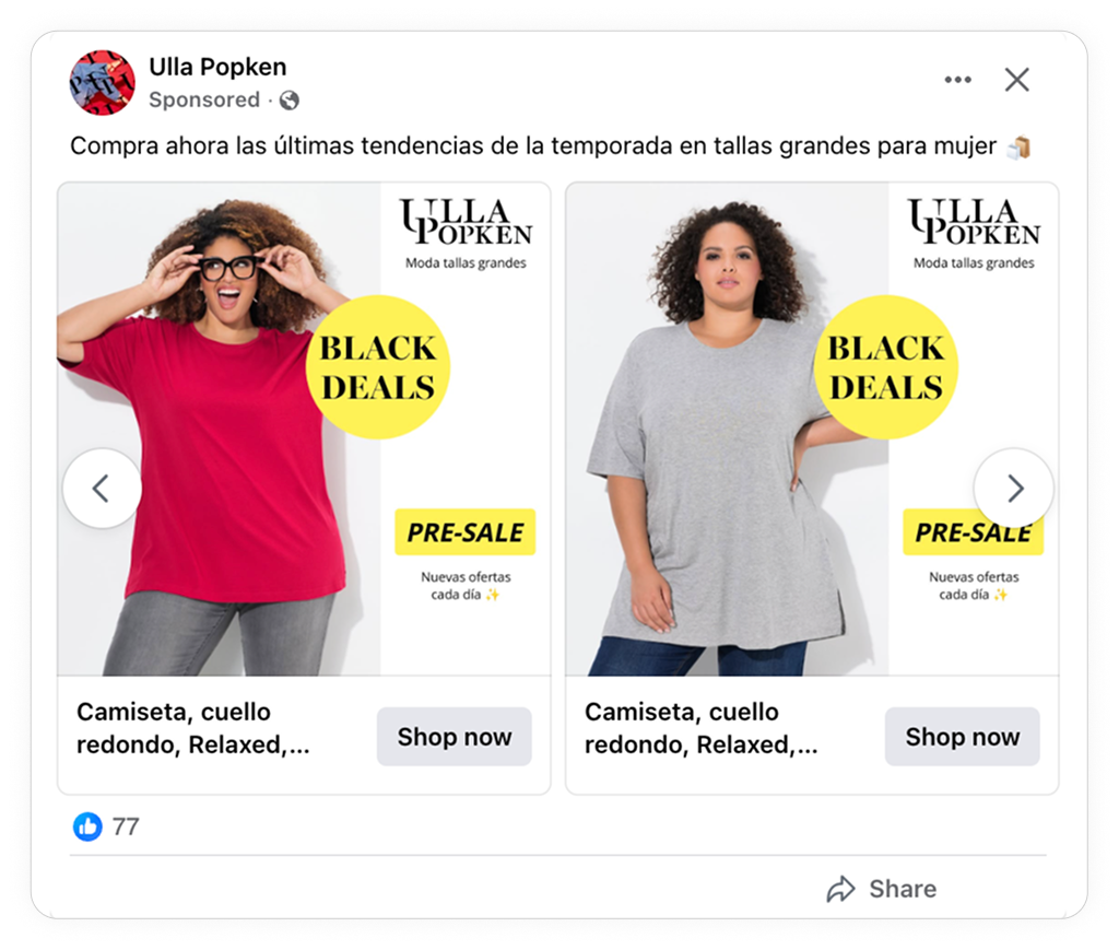
Strong Visual Storytelling With Human Models + Product Shots
Another effective choice was pairing models with clean product shots, giving the ad both relatability and clarity.
.png)
Models make pretty much any product feel more relatable. But they’re non-negotiable when it comes to fashions. Models make it easier for people to imagine themselves wearing clothing, as well as helping them get a feel for the size and fit of a piece.
If it was the models that set up expectations, it was the clean, high-quality product shots that helped close the deal. Popken’s product shots did a great job of highlighting finer details, quality, and even the textures of the materials used.
The combination creates a balanced experience: the ad feels human and approachable, while still showing the products clearly and professionally.
High-Impact Composition: 2/3 Product + 1/3 Offer
Popken used a layout that keeps the product at the center while still making the pre-sale offer visible and easy to understand.
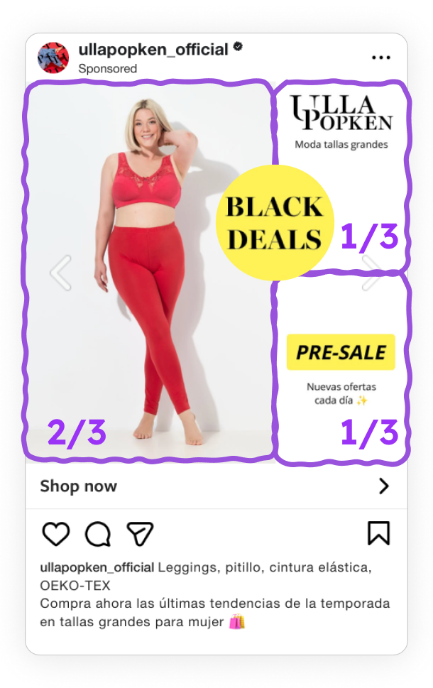
The composition is roughly two-thirds product-focused and one-third offer-focused, which works because it:
- Keep the layout clean.
- Make the offer recognizable.
- Maintain the product as the main focus.
This structure creates a clear visual hierarchy: viewers understand what’s being sold first, and what the promotion is second, all within a single glance.
It’s a simple, intentional layout that helps both engagement and conversions without relying on heavy sale graphics or cluttered design.
Key Takeaways
Popken’s ads show us that strong results aren’t accidental. Popken created an ad that used high-contrast colors, models and product shots, and a balanced layouts, which helped them achieve better returns than what they would have achieved with standard carousel ads.
👉 Use colors and fonts to guide attention and evoke urgency
By using high-contrast colors and an all-caps typography, the ad naturally guides viewer attention to important details. But it was also a great way to create a sense of urgency at the same time.
👉 Show models + packshots to promote your products
Using models and product shots created a balance between relatability and product focus. The models made the ad more engaging by helping shoppers get a feel for sizing and fit, while the product shots showed off all the finer details.
👉 Leverage balanced design compositions
The ad used a design that was ⅔ product-centric and ⅓ promotion-centric. It was a balanced design that made the ad look clean. But also ensured the offer was still visible and that the product remained the hero.