Mizuno & Like Honey
January 28, 2026
The Ad: A January sale catalog ad built for fast, confident decisions
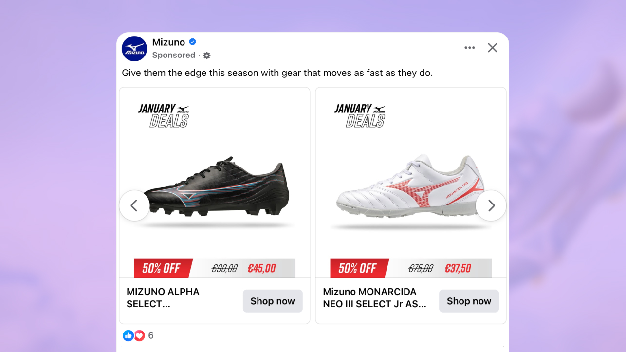
This catalog ad is clearly positioned as a January sale moment. From the first glance, the reduced pricing and clear comparison set the tone, making it obvious that this is about finding a good deal, not browsing for inspiration.
Developed by Mizuno together with Like Honey and Studio Black, the creative is designed to scale cleanly across 1:1 and 9:16 placements. The product stays centered, the spacing remains consistent, and the sale message carries through naturally across formats without losing clarity.
The old and new price do most of the talking. You immediately understand what the product is, that it is on sale, and roughly how strong the offer feels. That directness fits how people shop in January, when they actively look for clear reductions.
The structure stays disciplined throughout. The product leads, with the sale information placed close enough to support the decision without complicating it. You can decide relevance in seconds, which is exactly what strong catalog ads enable during high intent sale periods.
Why it won Catalog Ad of the week
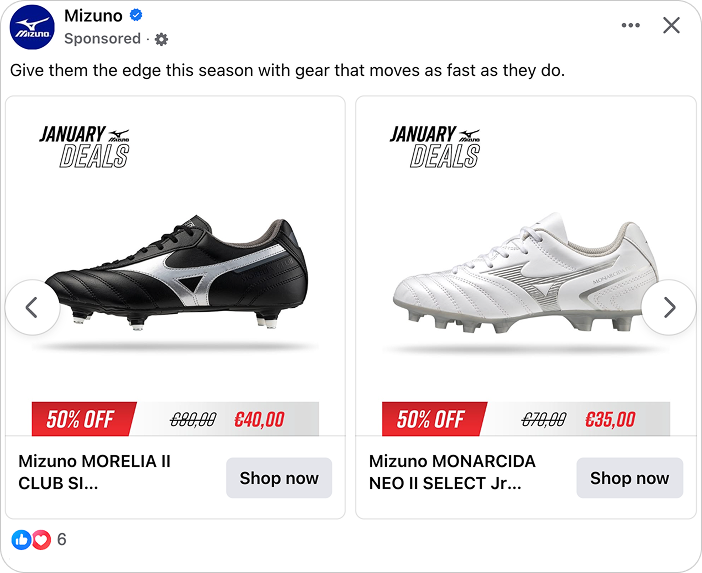
This catalog ad shows clear intent in how it handles size across placements. The product is scaled with purpose, so it feels equally considered in square feeds and vertical environments.
The structure does most of the work. The product remains the anchor, the offer is easy to read, and the layout behaves the same in both square and vertical formats. That consistency reduces hesitation and keeps the decision flowing naturally.
The results reflect that clarity. ROAS increased by +34%, showing that users were able to move from seeing the catalog ad to taking action with minimal friction. When the experience feels familiar and easy to read, performance tends to follow.
By designing sizing upfront rather than adapting later, the creative keeps the product familiar across placements. During a January sale, that familiarity helps shoppers move faster, because they do not need to re learn the layout before evaluating the offer.
What makes this Catalog Ad great
Sizing adaptation that works naturally in 1:1 and 9:16
This catalog ad shows clear intent in how sizing is handled across placements. The product scales cleanly between 1:1 and 9:16 without changing its role in the layout, which keeps the experience familiar as you move between formats.
In the square version, the shoe sits comfortably within the frame, with enough space for both the product and the sale details to feel balanced. In the vertical version, the same product remains visually dominant, with the January sale banner and pricing staying fully visible rather than pushed to the edges or cropped.
.png)
That consistency matters because catalog ads are rarely seen in isolation. People move between feed, stories, and reels quickly, and layouts that shift too much break the flow of decision making.
What works especially well here is that nothing needs to be relearned when the format changes. The product, the sale message, and the price hierarchy behave the same way in both views, which is critical during a January sale when people are comparing multiple offers at speed.
By designing sizing upfront rather than adapting later, the creative keeps the product and the sale equally legible across placements. That stability helps shoppers focus on evaluating the offer itself, not adjusting to a new layout.
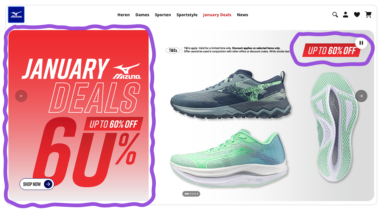
By setting expectations clearly inside the ad itself, the offer feels resolved before the transition. The website becomes the next step in the decision, not a place to re-evaluate it.
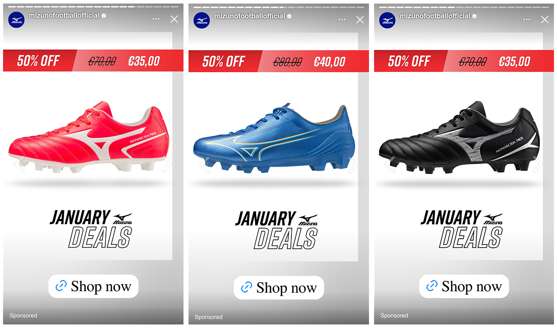
Offer design that feels familiar from ad to website
This catalog ad presents the offer in a way that feels settled and complete. You are not invited to explore the deal further to understand it. The information shown already feels final.
Rather than leaning on visual similarity to the website, the design focuses on clarity of structure. The pricing hierarchy, discount framing, and placement signal that this is the full offer, not a preview or a simplified version.
-1.png)
That choice is smart because it limits second guessing. When an ad leaves room for interpretation, people tend to click just to confirm details. Here, the offer answers those questions upfront. This changes the role of the click. Instead of clicking to validate the deal, users click because they have already decided it makes sense. That distinction is subtle, but important in how catalog ads guide intent.
Simple offer presentation anchored by product placement
This catalog ad keeps the product firmly at the center of the experience. Even though it is a strong sale execution, the shoe never steps aside for the discount.
The offer is placed close enough to support the decision, but it does not dominate the layout. You notice the reduction because you are already looking at the product, not because the ad forces your attention toward it.
.png)
That hierarchy is important in a January sale context. When discounts take over the layout, products can start to feel interchangeable. By anchoring the offer to the product, this ad keeps the item feeling specific and considered, not generic.
The pricing confirms value without rewriting the story. You understand the deal, but your judgment is still based on whether the product itself fits what you are looking for. This is where the simplicity pays off. The ad remains promotional without feeling disposable, because the product stays in control of the message rather than the discount.
Key Takeaways
This catalog ad shows how strong sale creatives do not rely on noise. By keeping structure, hierarchy, and expectations aligned, the design supports confident decisions even in a high pressure January sale context.
👉 Plan sizing as a system, not an adjustment
When catalog ads behave the same way across feed, stories, and reels, shoppers stay oriented. Consistent sizing helps people compare offers without having to relearn the layout.
👉 Set expectations before the click
Clear offer structure inside the ad removes the need for validation later. When the deal feels complete upfront, clicks come from intent rather than curiosity.
👉 Let the product lead, even in a sale
Anchoring the discount to the product keeps the item specific and considered. This hierarchy allows catalog ads to stay promotional without feeling disposable.