Liberty London & Journey Further
April 8, 2026
The ad: When thematic alignment and brand-driven design carry performance
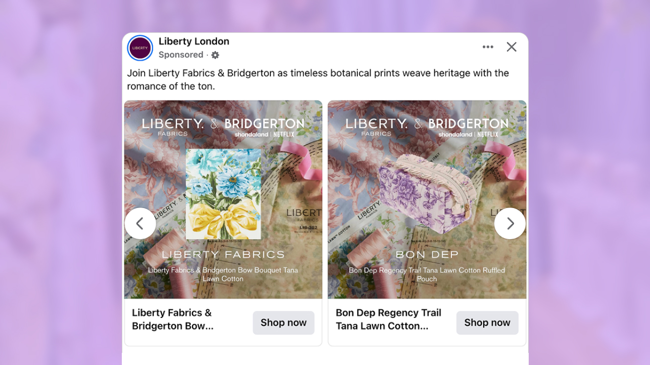
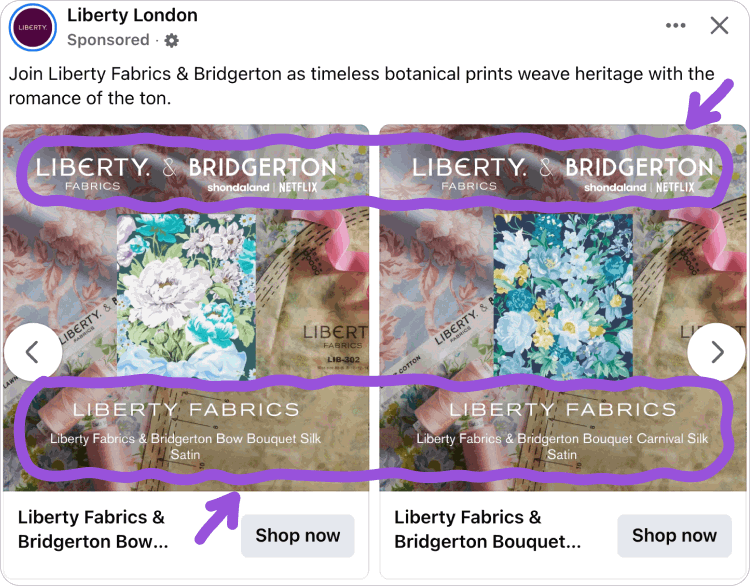
This catalog ad removes lifestyle imagery and isolates the Product within a minimal layout. Without models or environmental context, the focus goes directly to the Product during the first glance.
Liberty London and Journey Further position the Product slightly elevated from the background. This creates clear separation and helps the Product stand out without relying on additional elements.
The layout is built as a single, uninterrupted frame where the Product dominates the composition. This makes the catalog ad easy to scan and ensures users immediately understand what to look at.
The ad excludes price and discount information. Instead, it introduces the Bridgerton collaboration, which acts as a recognizable cue and encourages users to pause while scrolling.
Supporting elements remain secondary and help frame the Product without pulling attention away from it. This keeps the catalog ad focused and visually controlled.
By removing pricing, the catalog ad shifts attention toward the Product itself. This works well in browsing environments where users are exploring before making a decision.
Why it won Catalog Ad of the Week
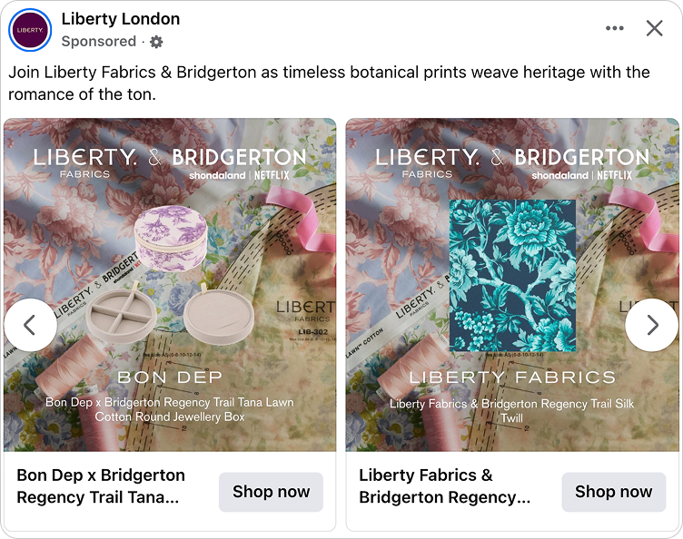
The catalog ad uses the same structure across all variations, aligning Product presentation with the campaign. This makes each version easy to understand without needing to adjust to a new layout.
Liberty London and Journey Further keep every catalog ad visually consistent. This creates a predictable experience where users can focus on the Product instead of figuring out how the ad is structured.
The catalog ad keeps the focus entirely on the Product, making it easier for users to evaluate what they are seeing without distraction.
Together, these factors contributed to the ad achieving a +66% return on ad spend and winning Catalog Ad of the Week.
In catalog ads, reducing unnecessary elements often improves engagement, especially when users can quickly understand what is being shown.
What makes this Catalog Ad great
Drawing attention to the Product with a clear focal point
While many catalog ads use split layouts, this catalog ad keeps everything within a single frame. This ensures the Product is the first thing users see.
The structure makes the hierarchy clear from the start, so users immediately understand where to focus.
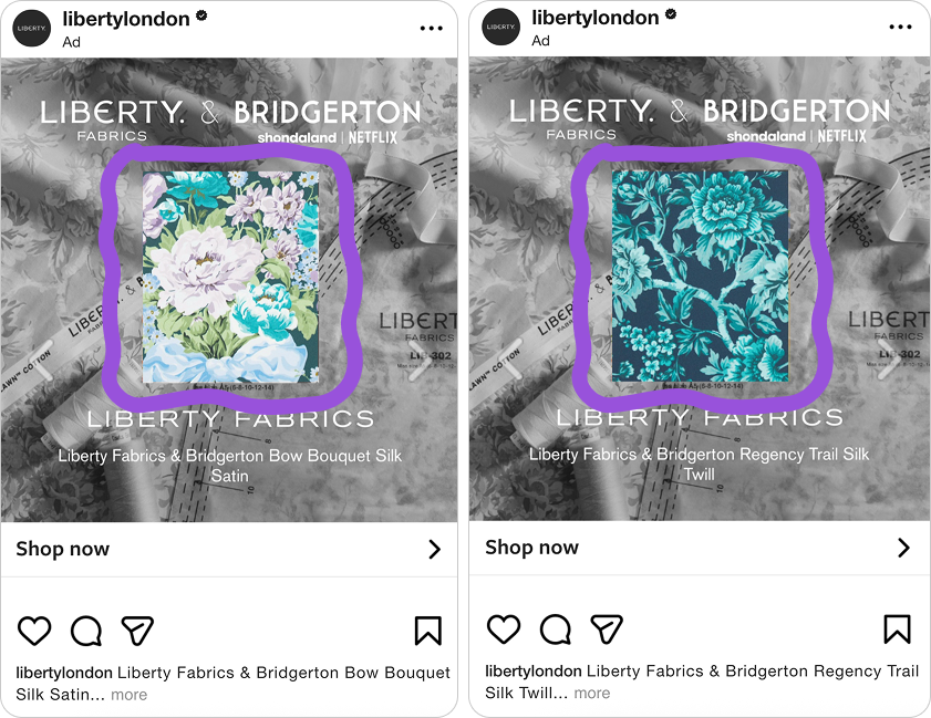
Keeping everything in one frame also removes separation between the Product and supporting elements. This increases the chance that users engage with the Product first.
Liberty London and Journey Further use this approach to simplify how the catalog ad is read, helping users recognize the Product quickly and engage with it more directly.
Together, all of this encourages longer visual inspection of the product before deciding whether or not to click on the ad.
Aligning the background with the campaign theme
The background is aligned with the Bridgerton collaboration, which is part of a broader partnership across Liberty London’s channels, including their website and campaign activations.
Because of this, the catalog ad builds on a campaign that users may already recognize, rather than introducing something new.
This makes it easier to understand the context of the Product without needing additional explanation.
The use of a known collaboration increases familiarity and helps the Product feel more relevant during browsing.
By using an established partnership, Liberty London and Journey Further make the catalog ad easier to recognize and more effective at capturing attention.
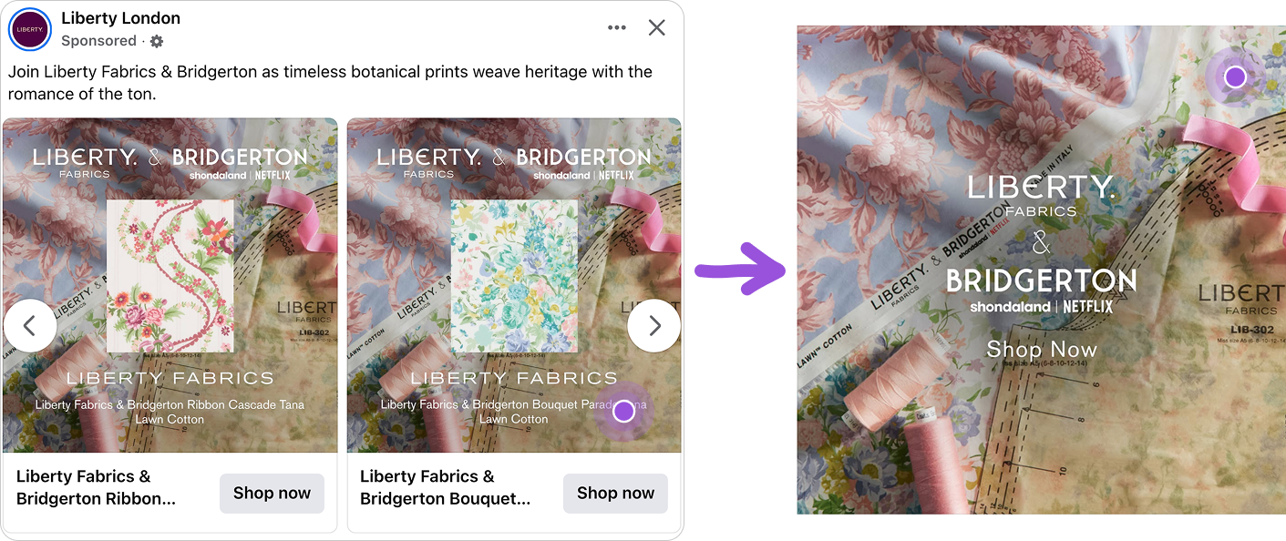
Consistent product details and branding to reinforce awareness
Another strong performance driver is how Product details and branding are positioned consistently across variations. This repetition makes catalog ads easier to navigate.
A predictable structure helps users quickly find Product information without needing to search for it.
The layout stays visually balanced by placing brand and campaign names above and Product details below the image.
Across all variations, Liberty London and Journey Further use the same structure. This makes each catalog ad feel familiar and supports faster decision-making.
Key Takeaways
This ad demonstrates that product-focused layouts can outperform promotion-heavy designs when visual hierarchy is clearly defined and cognitive load is minimized.
👉 Let the Product carry the catalog ad
Removing extra elements and keeping a single clear frame allows the Product to hold attention and makes the catalog ad easier to process.
👉 Build on existing campaigns instead of creating new context
Using a known collaboration like Bridgerton increases recognition and makes the catalog ad faster to understand during scrolling.
👉 Design catalog ads to be predictable across variations
Consistent structure helps users quickly find Product information and move through catalog ads with less effort.