LITO & ARPON Agency
June 3, 2026
The ad: The catalog ad that makes fine art feel like it belongs in your home
Most Catalog Ads show a product. This one makes you want to own a piece of history.
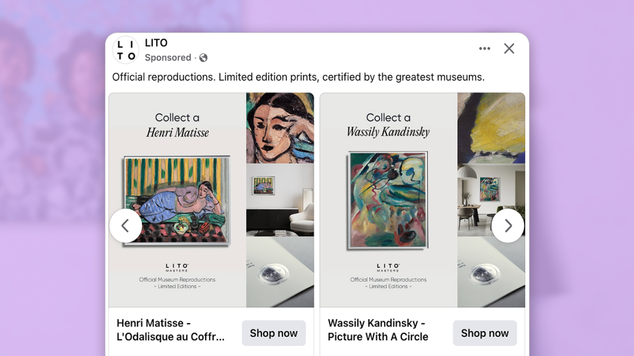
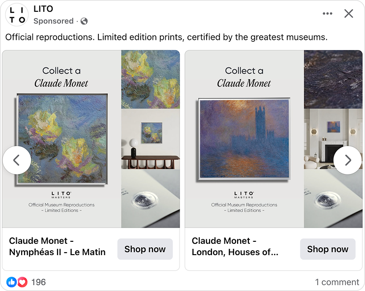
LITO Masters and ARPON Agency lead with artist identity rather than product detail. Every ad opens with a simple but powerful frame. "Collect a Monet." "Collect a Magritte." "Collect a Matisse." Before the price, before anything transactional, the viewer is already thinking about themselves as a collector.
Instead of separating the artwork from its context, the ad combines them within one structured view, placing the piece in a real home environment while making the collector framing visible at a glance.
Buying art online comes with a specific set of concerns. Is the quality what I expect? Will it actually work in my home? Can I trust where it comes from? Instead of leaving those questions for the product page, the ad answers them upfront - inside the design itself.
The whole ad range runs across multiple formats, with each artist treated as its own creative world. The result is a catalog that feels nothing like a product feed and everything like a curated gallery.
Why it won Catalog Ad of the Week
Buying art online has a fundamental problem. You cannot stand in front of the piece. You cannot feel the scale of it, see how it catches the light, or understand how it will change a room. Most art advertising either ignores this or throws copy at it. LITO Masters and ARPON Agency solve it at the design level.
Every card answers three questions a buyer has before they click. What does the artwork actually look like up close? Will it work in my home? Is this the real thing? The close-up shot answers the first. The room context shot answers the second. The certification and artist name answer the third. All three, inside one frame, before the buyer has made a conscious decision to engage.
This Catalog Ad delivered a +59% higher Return on Ad Spend compared to other brands running Catalog Ads. A buyer who arrives on the product page having already seen the piece in a real space, understood its provenance, and registered its scarcity is not evaluating anymore. They are confirming a decision they have mostly already made. That shift in intent is what moves the number.
What makes this Catalog Ad great
Highlighting every product detail that matters
Most ads selling art online show the painting on a white background and leave the rest to imagination. LITO Masters and ARPON Agency take the opposite approach.
Every card in the ad is built around three zones. A close-up of the artwork's surface shows the brushwork, the texture, the physical character of the piece - the kind of detail that tells you whether a reproduction is worth owning before you read a single word. The full framed piece sits center, giving a clear sense of scale and presentation. A room context shot shows the artwork on a real wall, in a real home, at real scale.
A Matisse card and a Kandinsky card use the same layout. They feel nothing alike. Because each artist brings a completely different color world and brushwork character, the same structure produces a genuinely different experience every time.
Quality answered. Scale answered. Feel answered. All before the click.
That variety also does real work for the algorithm. Someone who pauses on a Magritte is wired differently to someone who lingers on a Monet. Because each artist-led creative carries distinct visual signals, Meta can find both buyers without any manual audience setup. The variety in the creative becomes the targeting.
Social proof built into every card
When you buy a painting online, two questions follow you all the way to checkout. Is this actually what it claims to be? And is it worth what I am paying?
LITO Masters and ARPON Agency answer both inside the design, not in the caption.
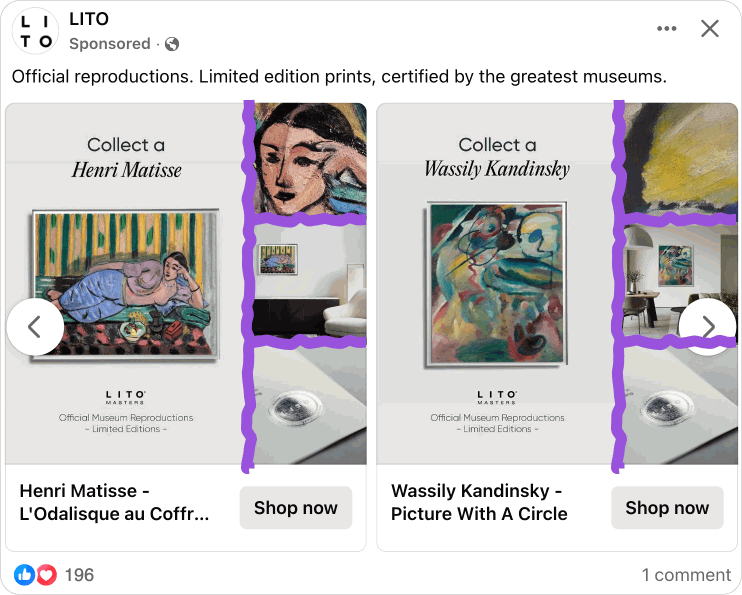
Below the artwork, every card carries the same credential block. The LITO Masters logo. "Official Museum Reproductions." "Limited Editions." A wax seal that carries the visual weight of institutional authority.
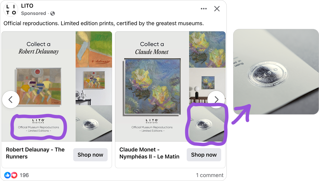
These are not decorative. "Official Museum Reproductions" handles the authenticity question - is this a generic print or the real thing? "Limited Editions" handles the value question - scarcity implies desirability. If anyone could have one at any time, it would feel like a poster. The fact that they cannot changes how the buyer thinks about the decision.
The reason this works so well is where these signals live. They are not a line of post copy that gets cut off on mobile. They are built into the visual structure of every card, present across every format, readable at every size. The message is only as strong as its placement, and ARPON Agency placed it accordingly.
Running as Story ads too - and it shows
The move from a square feed ad to a vertical Story ad is where most Catalog Ads fall apart. A layout built for 1:1 gets forced into 9:16, text lands in the wrong place, elements get cropped, and the whole thing looks like an afterthought.
LITO Masters and ARPON Agency built the layout to work in both from the start.
.png)
Art buyers do not follow a neat path to purchase. Someone slowly browsing their feed on a Sunday morning is in a completely different headspace to someone catching an ad mid-swipe through Stories. Covering both with the same coherent creative means the campaign stays in front of the buyer across the full window between first seeing the piece and deciding to buy it.
The artwork expands to lead the vertical space in 9:16. The room context and credential detail follow. The artist headline stays prominent.
.png)
Nothing gets cropped, nothing overlaps, and the certification lines stay fully readable wherever the ad runs. That is not a production fix applied at the end. It is a design decision made at the start, and it shows in how clean every placement looks.
Key Takeaways
This Catalog Ad from LITO Masters and ARPON Agency shows how answering a buyer's real questions inside the design - before the click - turns a product ad into something that actually sells.
👉 Show the detail, the context, and the proof - all in one frame
A close-up of the artwork, a room context shot, and a certification block. Each one answers a specific question the buyer has before clicking. Put all three inside the design and you do the work the product page usually has to do.
👉 Use the artist name and credentials as social proof
The artist name is the most powerful trust signal in the ad. Pair it with museum certification and limited-edition status built into the visual - not the caption - and you handle authenticity and value in the same glance.
👉 Build Story ads from the start, not as an afterthought
A Catalog Ad that works in a square feed and breaks in a vertical Story is only half an ad. When the layout is built to adapt intelligently across formats, the campaign stays present across every moment a buyer might encounter it - and the algorithm has more to work with.