JYSK
November 26, 2025

The Ad: A clean, price-forward catalog ad built to win Black Friday attention
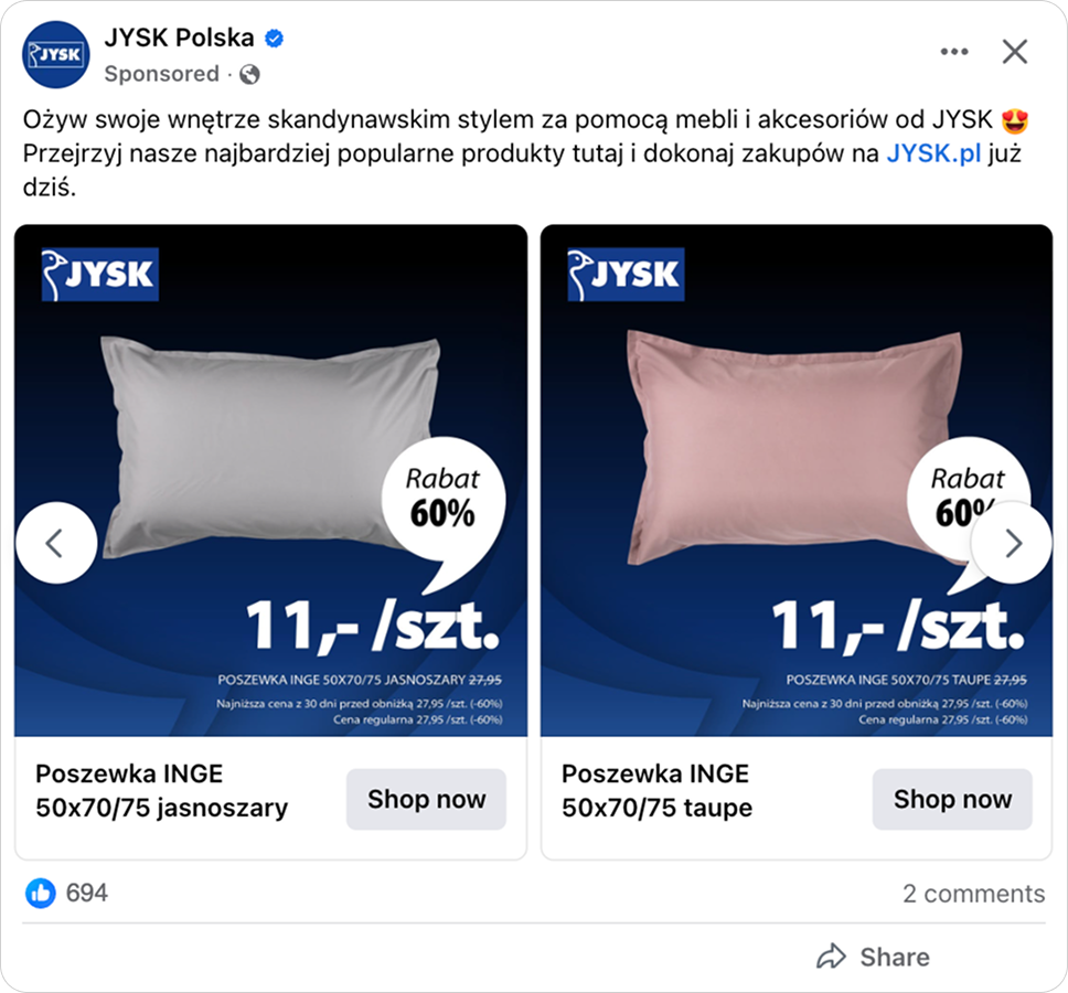
Some Black Friday ads rely on loud graphics, dramatic animations, and heavy red and black themes. JYSK did the opposite. They created a simple, value-first catalog ad that immediately highlights the offer, and that is exactly why it grabbed attention so effectively.
Founded in Denmark in 1979, JYSK now operates more than 3,500 stores across 50 countries. With decades of retail experience, they know exactly how a clean catalog layout can influence shoppers who are scrolling fast and thinking even faster. This ad is a great example of that expertise in action.
As the holiday rush approached, JYSK wanted to capture high-intent shoppers early. Kicking off their Black Friday deals a bit ahead of the crowd helped them catch people who were already in “buy mode” but not yet overwhelmed by competing offers. Their catalog ad presents product, price, discount, and promo details instantly, lowering friction and helping shoppers make decisions with almost no effort.
Why it won Catalog Ad of the week
JYSK’s catalog ad may not be heavily Black Friday themed, but it absolutely capitalized on the upcoming shopping frenzy. This clean, price-forward catalog format achieved a +30% ROAS compared to the brand’s standard carousel ads. The ad also achieved a higher click-through rate (+116%).
Performance was naturally boosted by seasonal demand, but the real engine behind these results was JYSK’s consistency, visual hierarchy, and crisp value-first communication. Everything in the design works together to grab attention and convert it.
What makes this Catalog Ad great
Clean, on-brand designs that fit the season
The ad never mentions Black Friday outright, but the deep blue-to-black gradient gives it that “seasonal sale” feeling without resorting to cliché holiday colors.
Instead of switching to the usual red and black, JYSK sticks to its own palette, so the ad still feels festive while staying very recognizable.
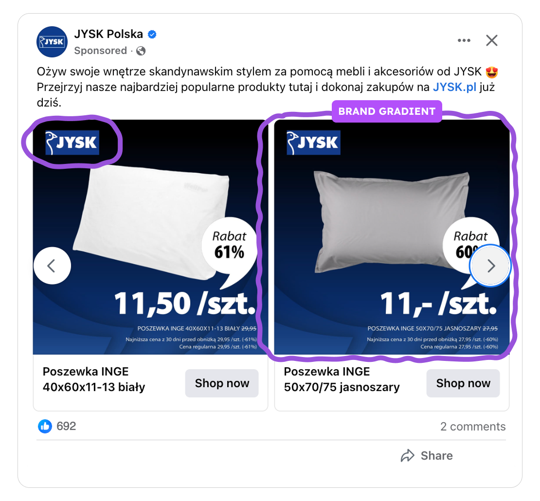
That consistency runs across their other marketing channels too, like the website, TV ads, and their online catalog. All share the same gradient, distinct discount badge, and typography.
It’s impressive how well the campaign is synchronized across multiple touchpoints. It covers the entire customer journey, from awareness that likely starts with TV ads, continues through digital ads, and ultimately ends on the website.
So whether someone sees JYSK on a TV commercial or while scrolling Reels, it all feels cohesive and familiar. It’s seasonal, but still undeniably JYSK.
Strong value presentation
Pricing takes center stage in this catalog ad, and JYSK makes sure shoppers see it the moment the creative appears. During Black Friday, people skim quickly, looking for fast clues about savings. Highlighting price and discount upfront helps capture intent in an instant.
.png)
The large, bold price paired with a clearly visible discount does the heavy lifting. It filters casual scrollers from high-intent buyers immediately, which is especially important when competition is intense and CPMs rise.
By presenting the value without any unnecessary elements, JYSK makes the decision process simple: see the product, see the price, understand the deal, click.
Placement-ready design
The ad is also built to perform across formats, adapting smoothly to both 1:1 and 9:16 placements. This ensures the value message stays consistent whether someone sees it in feed, Stories, or Reels.
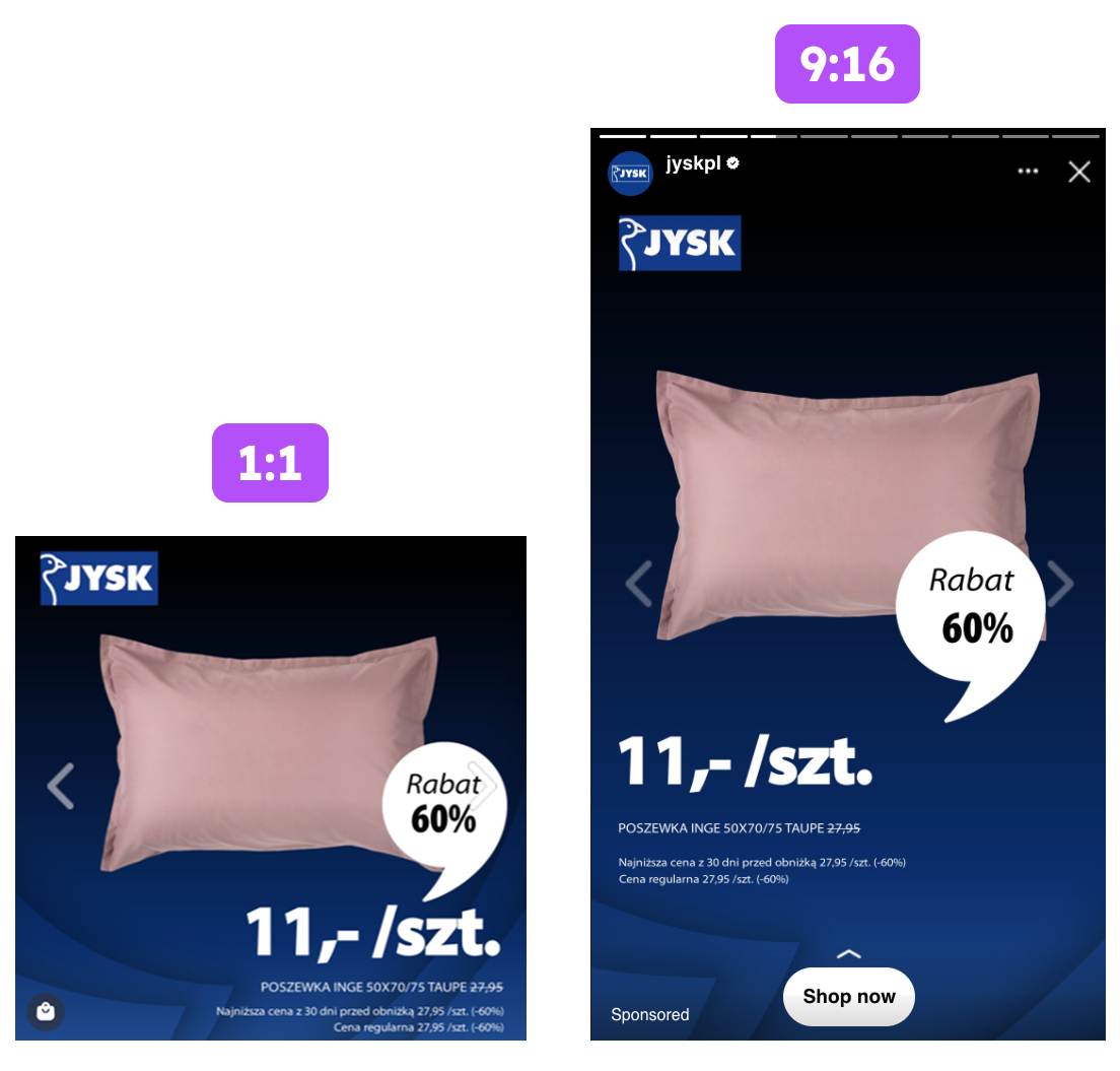
The 9:16 variations were especially strong, and showcasing three versions side by side made it clear how flexible the layout is. Even with slight spacing or alignment changes, the structure remains solid.
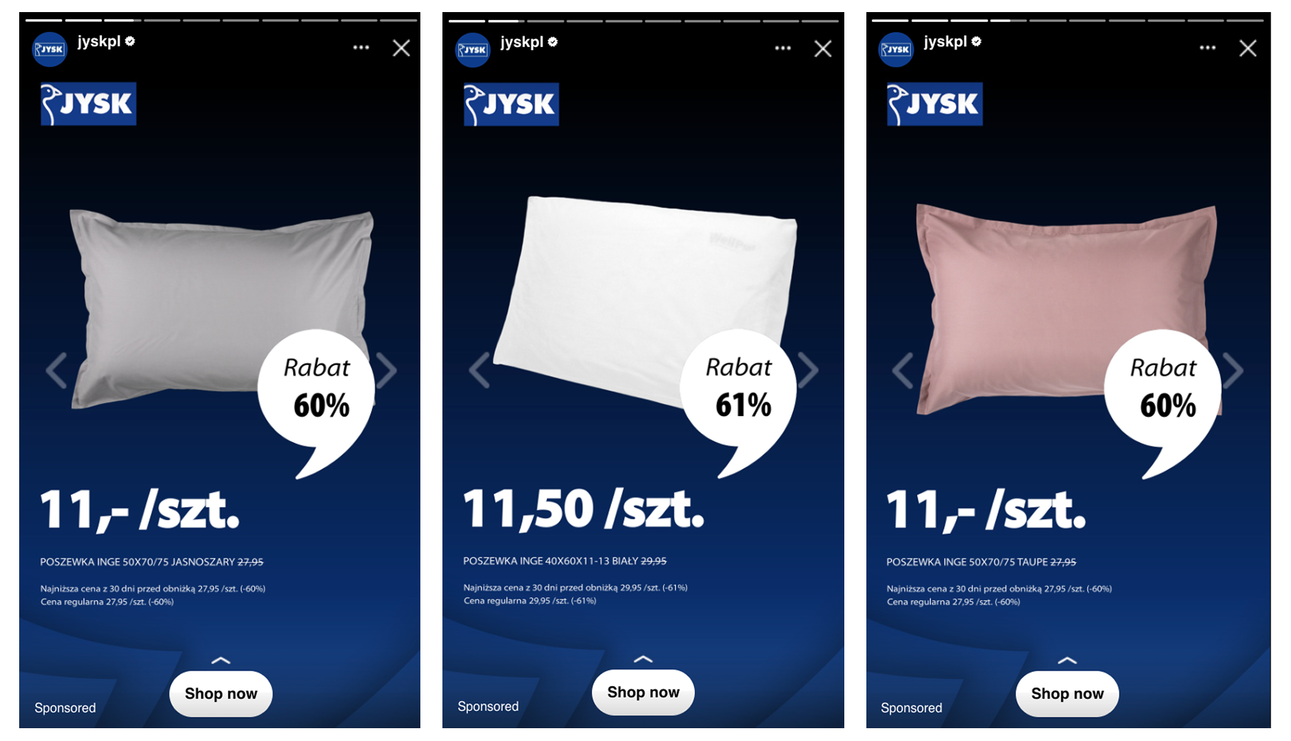
Across every format, the visual order stays consistent: product, price, discount, offer, CTA. That familiar layout makes the ad readable in under a second, no matter the placement.
By pairing a clear message with placement-ready versions, JYSK gets more visibility, stronger performance, and better results in every environment.
Key Takeaways
JYSK’s clean, on-brand, price-forward catalog ad delivered more clicks, lower costs, and higher returns. Its strength comes from strategic simplicity, brand consistency, and smart formatting choices that meet shoppers exactly where they are.
👉 Use clean, on-brand catalog designs to captivate attention
A cohesive visual identity across TV, web, and Meta makes shoppers feel grounded. When everything looks and feels like the same brand, recognition builds faster and trust follows naturally.
👉 Lead with a clear value presentation that shoppers can grasp at a glance
People skim during Black Friday, so putting price and discount front and center helps attract serious buyers fast. The simpler the layout, the easier it is for someone to understand the offer and click without hesitation.
👉 Use placement-ready formats to keep performance high everywhere the ad appears
Optimizing both 1:1 and 9:16 versions ensures the message stays strong whether shoppers are browsing feed, Stories, or Reels. This flexibility lets the same creative do more work across placements and contributes directly to lower acquisition costs.