Craft & s360
April 1, 2026
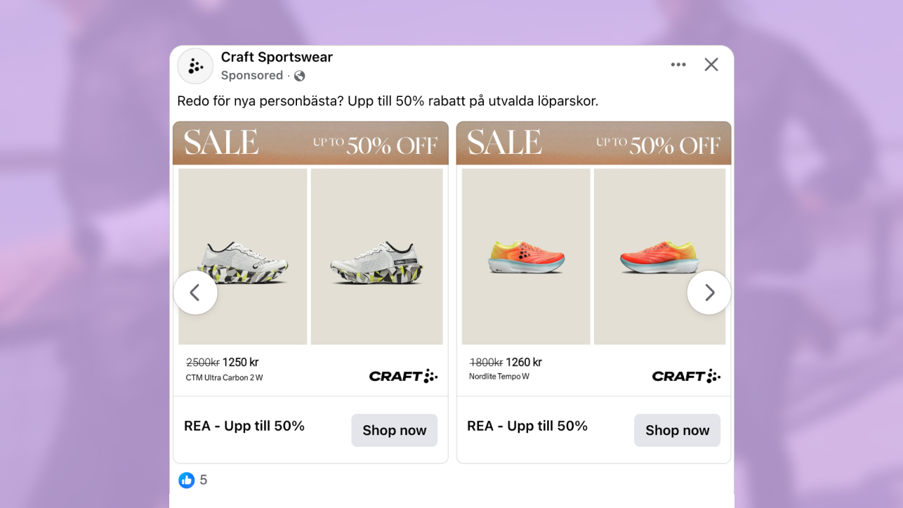
The ad: A calm and neutral sales ad with a high-end feel
This catalog ad uses a neutral color palette and a structured layout with generous negative space. The restraint in the design isolates the key elements, making it easier to process the product and pricing in a single view.
The layout, designed by Craft Sportswear & S360, centers the product within a balanced frame, ensuring it remains the primary focal point and reducing competition from other visual elements. It shows the product from two different angles, which provides additional visual context and feature details to the viewer.
The combination of neutral colors and a structured layout directs attention toward pricing and product details, improving clarity and reducing decision friction. But that’s not because the design is loud or flashy. It’s not begging for attention. Yet it still captures attention thanks to the contrast between the imagery and the surrounding negative space.
Ultimately, the design has a clean, modern look that creates a premium visual impression. But more importantly, it presents information in a structured hierarchy, allowing viewers to quickly scan pricing, product details, and discount without feeling overwhelmed.
The spacing and light tones simplify visual processing and support faster decision-making. This is a defining characteristic of high-performing catalog ads, where clarity and structure directly influence results.
Why it won Catalog Ad of the week
This ad performs well because it presents all key decision-making information within a single view. When you pair those details with the clean and neutral split layout, it becomes even easier to spot relevant details without being distracted.
That’s actually the strongest design choice in this ad. Because viewers don’t even need to click to find the info they need. The ad clearly communicates value, by showing prices and the discount. This enables faster decision-making by reducing the need for additional information.

But we’re not just saying this is a great ad. It’s proven by the fact that it achieved a +28% ROAS. When ads remove decision-making friction, they discourage window-shoppers and attract higher-intent users who are more likely to convert.
By reducing the effort required to evaluate the offer, the ad naturally attracts users with higher intent. That efficiency is what translates into stronger conversion and improved return.
What makes this Catalog Ad great
A top-positioned sale message establishes value immediately
The “SALE UP TO 50% OFF” message sits at the top of the ad, making it the first element users process. This placement ensures the offer is understood instantly, before attention moves to the product or pricing.
By presenting the discount upfront, the ad removes the need to search for key information. Users can immediately assess whether the offer is relevant, which shortens the time required to make an initial decision.
.png)
The message also sets the context for everything that follows. Instead of discovering the promotion later, viewers interpret the entire ad through the lens of the discount from the very beginning.
Importantly, the execution remains visually controlled. The sale message is integrated into the overall design rather than dominating it. This keeps the layout consistent and avoids the overly aggressive feel often seen in discount-led catalog ads.
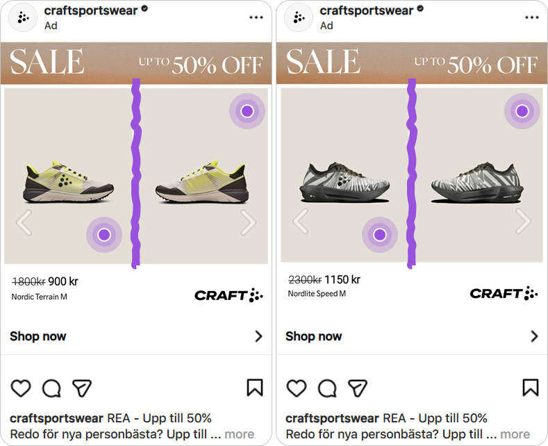
Dual-angle images to enhance understanding and increase confidence
Another effective design choice is showing the shoes from different angles on opposing sides. This is a unique and sharp way to show the product. Using multiple angles increases visual information, allowing viewers to better evaluate the product and reducing uncertainty before they click.
By presenting multiple perspectives upfront, the ad makes the evaluation process more complete. Users can assess the product more confidently because important visual details are already visible.
This approach is especially effective in catalog ads, where users make quick decisions based on limited information. Instead of relying on assumptions, the ad provides enough context to support a faster and more informed judgment.
As a result, the decision process becomes more efficient. The added perspective reduces the effort required to interpret the product, which directly supports higher engagement and conversion.
Subtle pricing presentation supports a premium perception
Pricing and discount details are clearly visible, but they are not given excessive visual weight. This keeps the focus balanced and allows the product to remain central within the layout.
Prices and discounts matter because they’re some of the biggest decision-making factors shoppers consider. So it was a smart choice to include them. This is done while maintaining a restrained visual presentation that avoids overwhelming the viewer.
.png)
At the same time, including both price and discount provides the information users need to evaluate the offer. These elements are key decision drivers, and their presence removes the need for additional steps.
By integrating pricing in a controlled way, the ad maintains a more premium perception while still communicating value. This balance allows catalog ads to appeal to both value-driven and quality-focused users.
Key Takeaways
This catalog ad uses a restrained layout and neutral tones to present the product and pricing clearly in one view. The structure makes it easy to understand the offer quickly, which is key to how high-performing catalog ads drive decisions.
👉 Lead with the offer
Placing the discount at the top helps users immediately assess relevance and move faster toward a decision.
👉 Show products from multiple angles
Multiple images can reduce uncertainty by showing the product from multiple perspectives, eliminating the need for guesswork. This increases product transparency, reduces hesitation and supports faster purchase decisions.
👉 Keep pricing controlled
Pricing details are important. But it’s best to include them in a way that won’t reduce perceived quality. Soft colors, negative space, and quiet designs are more likely to retain attention and preserve perceived product quality than overly aggressive, discount-heavy designs.