Colorful Standard & Mongine
March 18, 2026
The Ad: A color +catalog ad that makes every product instantly clear
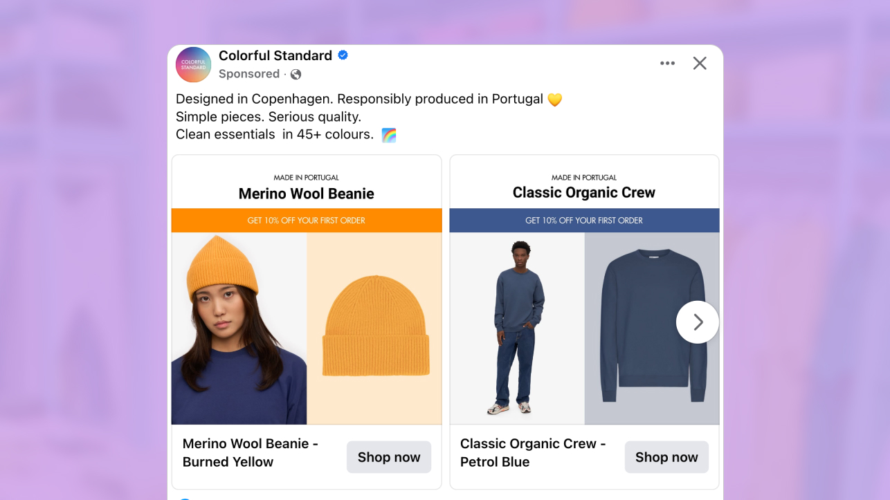
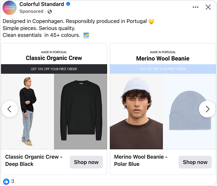
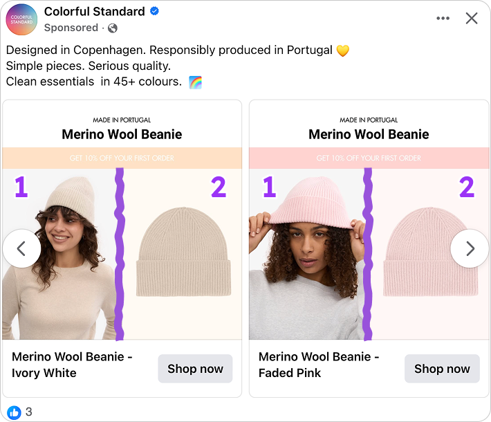
This catalog ad presents a range of unicolor essentials, each shown in a bold, single shade. Each product also controls the surrounding visual system. The background color, the promotional banner, and the product framing all adapt to the specific product tone.
From knitwear to sweatshirts and beanies, every product follows the same visual structure, so you instantly understand what is being promoted.
Colorful Standard worked with Mongine to create a consistent design system across all variations. While each ad variation looks carefully designed by hand, the color combinations are actually driven by rules tied to the product itself.
Each product is displayed in a split layout with a lifestyle image on one side and a clean packshot on the other. A strong color bar with the welcome offer sits at the top, visually connected to the product tone.
The reading flow is simple and controlled. Product name first, then origin detail, followed by clear product views. This structure is what allows catalog ads to feel organized and easy to shop in fast moving placements.
Overall, the ad feels confident and product led. It highlights variety through color and category, while the visual logic remains stable, which is exactly how strong catalog ads maintain clarity at scale.
Why it won Catalog Ad of the week
This catalog ad won because it simplifies choice in a category where color and product variations can quickly feel overwhelming. Instead of changing the layout for every item, the structure stays consistent, which makes comparison feel natural and fast inside catalog ads.
You are not spending energy understanding the design. You are simply deciding which color and which piece fits you best. That clarity is what strong catalog ads aim for, especially in fast scrolling environments where hesitation leads to drop off.
Part of this clarity comes from how smoothly the design system adapts to each product. Instead of manually producing dozens of creatives, the ad uses dynamic rules that generate consistent catalog ads for every color and product variation.
The performance proves the point. The campaign delivered a 198% increase in conversion rate and a 216% lift in ROAS.
When catalog ads remove friction and keep the visual logic stable, users move through the decision process with more confidence, and that confidence translates directly into revenue.
In the end, this catalog ad supports buying intent rather than distracting from it. It makes the path to purchase feel straightforward, which is exactly why it earned Catalog Ad of the Week.
What makes this Catalog Ad great
Dynamic color systems that make catalog ads feel handcrafted
Promotions in catalog ads are often added as separate elements. When the color of the offer has no relationship to the product, the design can feel disconnected.
In this campaign, the product color defines the surrounding visual environment. Backgrounds and promotional banners follow the same tone, so the entire composition reads as one coherent frame. Each product appears within its own matching color environment, where the background and promotional banner support the product rather than competing with it. This rule applies consistently across all variations.
.png)
What makes this execution stand out is how it is produced.
Although each creative looks individually designed, the system behind the ad is dynamic. Product imagery, lifestyle photos, background colors, promotional banners, and product information are all generated directly from product data.
The product controls the color environment and key visual elements, while the layout structure stays consistent. This allows the campaign to scale across many products without losing clarity.
For catalog ads, that balance is powerful. The structure remains familiar while each product variation feels visually intentional.
Dual product views remove doubt before the click
One of the biggest challenges in catalog ads is uncertainty. You might like the color or the vibe, but you still wonder about fit, texture, or proportion. That hesitation can easily stop the journey. Here, the execution is much calmer. The only commercial element in the frame is the welcome discount. There are no detailed prices, no layered offers. Just the product name, the brand, and a clear percentage incentive. That keeps the layout focused and easy to understand.
Because pricing details are not crowding the design, your attention stays on the product itself. The brand becomes more memorable, and the item feels like the hero. The discount works quietly in the background as a reason to act, not as a distraction.
That balance is what makes the experience efficient. You are not forced to click just to clarify basic questions. The ad does part of the work upfront, which is exactly how strong catalog ads increase confidence and drive action.
A discount that supports the product instead of overpowering it
Discounts in catalog ads can easily take over the entire visual. Big price stacks, crossed out numbers, and multiple savings messages often end up competing with the product rather than supporting it.
Here, the message is simple and specific. “Get 10% off your first order” is easy to understand and tied to a clear action. It does not shout. It does not overload the frame with conditions.
.png)
Because the product is already presented clearly, the incentive works as a gentle nudge rather than a rescue tool. You are not being convinced that the item is good. You are simply being given a reason to act now instead of later.
That distinction matters in catalog ads. When the product stands strong on its own, the promotion can stay calm. And when the incentive feels proportional to the product, it increases motivation without reducing perceived value.
Built for every placement without losing clarity
Many catalog ads look great in one format, but the moment they are resized, something feels off. A layout that works perfectly in square can suddenly feel cramped or unbalanced in vertical or full screen placements. Text shifts, spacing tightens, and the product does not stand out the way it should.
Here, that problem is solved upfront. The centered hierarchy and split layout are built to scale naturally. Whether the ad appears in 1:1 or 9:16, the product stays in focus. The offer remains easy to spot, and the two product views keep their visual balance.
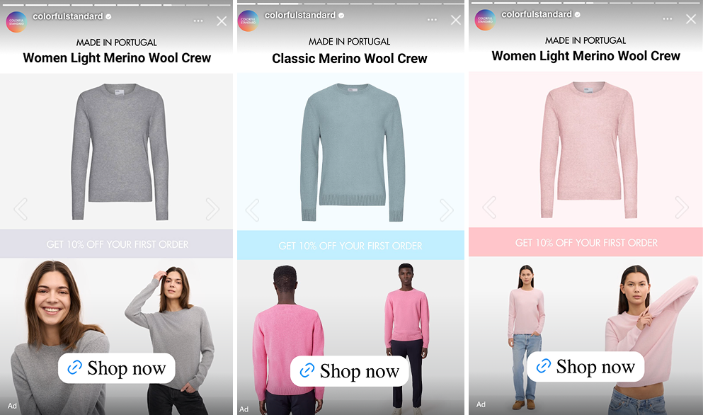
That level of consistency does not happen by chance. The creative was clearly designed with multiple placements in mind from the beginning, not just resized after the fact. The proportions feel intentional, giving each element enough space to breathe even in taller formats.
Strong catalog ads need to travel well. People move between feeds, stories, and full screen environments without noticing the shift. When catalog ads keep their structure everywhere, the message stays clear and performance stays steady.
Key Takeaways
This campaign shows how disciplined design choices make catalog ads easier to shop and easier to scale. Nothing feels decorative. Every element supports clarity, comparison, and confidence.
👉 Let the product shape the visual environment
When product colors influence backgrounds and promotional elements, catalog ads feel more cohesive and easier to scan.
👉 Communicate value quickly and efficiently
The best ads communicate value quickly and efficiently, without distracting from the product. This can be done by using large discount badges, bold fonts, or high-contrast colors that make offers easy to spot.
👉 Support products and give ads a premium feel
Split layouts can be used to guide attention towards important details. Choose layouts and copy that support products and offers, without being overly descriptive, which creates catalog ads that look better and feel more approachable.