Bravissimo & Bonded Agency
May 7, 2026
The ad: A Catalog Ad that sells fit before the click
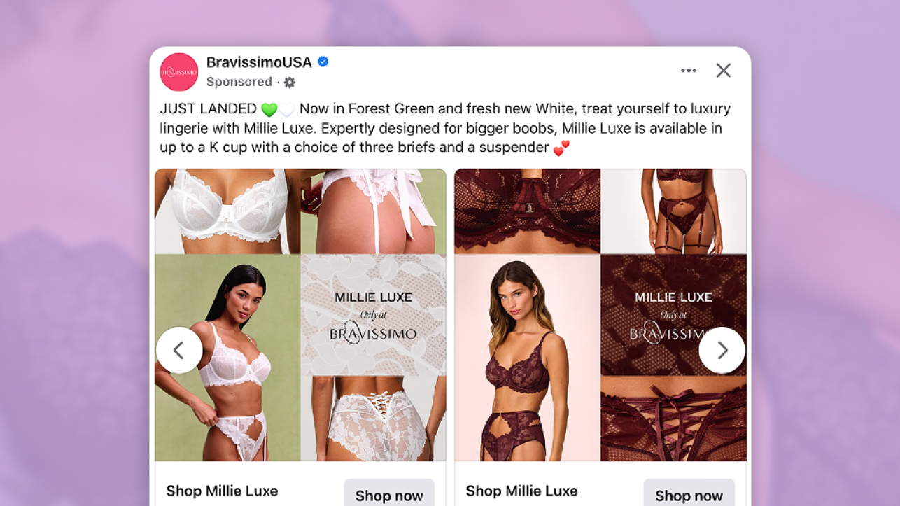
This Catalog Ad from Bravissimo shows a clear and deliberate approach to one of the hardest challenges in lingerie advertising: helping a shopper decide before she visits the product page.
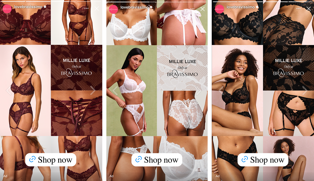
Bravissimo's in-house design team structured the creative around a split layout. The left panel carries four close-up shots of the Millie Luxe bra from different angles, showing lace texture, strap detail, and how the product sits against the body. The right panel shows a full-body model shot, giving the complete picture of how the set looks worn.
Bonded Agency plays a key role in shaping how that creative comes to life. They continually feed insight into the team around both creative and placements, and that ongoing input has shaped Bravissimo's creative process to respond to the latest trends and platform opportunities.
What stands out is how the design addresses the specific concerns a lingerie shopper carries. Fit and texture are impossible to assess from a product flat on a white background. By placing close-up detail shots alongside a model image in a single frame, Bravissimo answers both questions at once, before the click.
The name card anchoring the center of the layout does a second job. "Millie Luxe. Only at Bravissimo." tells the shopper exactly what she is looking at and where she can get it. Together, these elements build confidence at the moment of first interaction, not just after.
Why it won Catalog Ad of the Week
This Catalog Ad performs because Bravissimo structured it in a way that compresses the entire evaluation process into a single pause in the feed. The shopper does not need to click to understand the product. The creative does that work for her.
The layout is built to guide attention in a specific sequence. The detail shots on the left introduce the product at a level of closeness most Catalog Ads never attempt. The model shot on the right places the product in context, showing fit, silhouette, and how the lace behaves on a real body. The viewer moves from detail to context naturally, without effort.
This structure drives the +45% ROAS improvement.
A shopper arriving on the product page having already seen texture and fit on a body is arriving to confirm a decision she has mostly made. That shift in intent, from evaluation to confirmation, is what pushes conversion rate up.
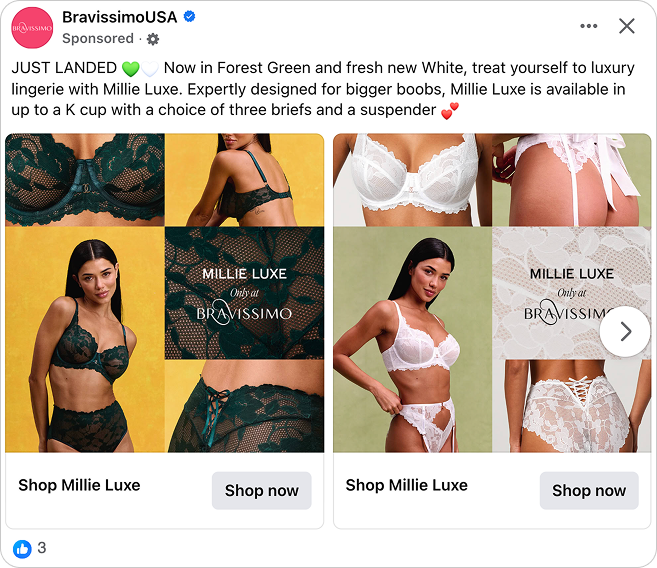
Each element in the layout supports a specific role. The close-ups show what the product is. The model shot shows what the product does. The name card tells her where to get it and that she cannot get it anywhere else. Nothing in the frame is decorative. Everything is there to move her forward.
What makes this Catalog Ad great
A lookbook in your feed: the editorial collage layout breaking banner blindness
Most Catalog Ads look like Catalog Ads. A product image from the feed, a price overlay, a logo. Shoppers have learned to scroll past this pattern before they have consciously registered what they saw. It is banner blindness, and it is the first problem Bravissimo solved.
The collage layout on the left panel does not look like a product ad. It looks like a page from a campaign lookbook. Multiple images composed together, a branded name card placed deliberately within the grid, a full-height model image anchoring the right. At scroll speed, the brain pattern-matches this as editorial content, not an ad trying to interrupt.
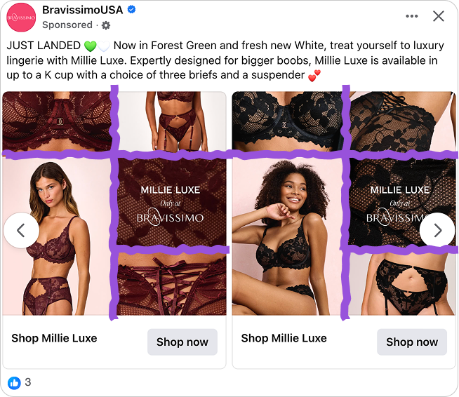
The reason this works goes deeper than aesthetics. The brain decides what to look at before conscious attention kicks in. A standard Catalog Ad matches the "product ad" pattern and gets filtered out. This layout matches the "campaign visual" pattern and earns a second look before the viewer has decided to give one.
That second look is where everything else in the creative can do its work.
Show the lace, sell the luxury: texture close-ups and what the product page cannot do
Lingerie is a tactile category. Shoppers want to know how the lace sits, how it holds against the body, how the fabric moves. A single product image on a white background answers none of those questions. It shows what the product looks like. It does not show what the product feels like.
The close-up shots in the left panel do both simultaneously. The lace pattern is visible at a level of detail that communicates weight, texture, and construction in a single glance. Bravissimo chose shots that function as texture demonstrations as much as they function as product images.
.png)
This is dual coding in practice. When visual and contextual information are delivered together in a single image, the message encodes more deeply and is recalled more easily. The shopper is not just seeing a product. She is reading the fabric, understanding the fit, and assessing the quality all at once.
For Bravissimo's customer specifically, this matters more than for most lingerie brands. A shopper buying in a larger cup size has been let down before by products that looked fine in a product shot and fit differently in reality. Seeing the lace pattern, the strap construction, and the way the fabric holds at the cup tells her something a flat product image never could.
"Only at Bravissimo": three words that change the decision
The Millie is Bravissimo's bestselling bra. One sold every 6 minutes in the UK, built on 30 years of in-house fit expertise, and designed specifically for bigger busts. Millie Luxe is the elevated version of that product, available in a luxury stretch lace and offered up to a K cup. It exists nowhere else.
For a shopper in a larger cup size, that exclusivity carries real weight. Most brands stop well below a K cup. Finding something that fits, looks premium, and was designed specifically for her body rather than scaled up from a smaller size is genuinely rare. "Only at Bravissimo" tells her she has found it.
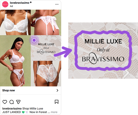
Bravissimo placed that message directly in the design, on the name card, centered in the layout, visible in every carousel panel. Design is seen even when caption copy is skipped. Putting the strongest claim in the layout rather than the post text ensures it lands regardless of how quickly someone scrolls.
The message also removes a specific friction point. A shopper who might otherwise continue browsing to compare options is told there is nothing to compare. This product exists here. That clarity shortens the decision loop.
The same design, rebuilt for every placement
The feed layout is one thing. What Bravissimo also built is a creative that does not simply stretch from one format into another. The structure is rethought for each placement, and the result is an ad that feels native whether it appears in a square feed or a vertical Story.
The move from 1:1 to 9:16 is where most Catalog Ads break down. A layout built for a square frame gets forced into a vertical one, text lands in the wrong third, products get cropped at the edges, and the whole thing feels like an afterthought. Here, the hierarchy shifts intelligently.
The model image expands to fill the vertical space. The detail shots redistribute around her. The name card holds its position, readable and prominent at both ratios.
That adaptability is a design decision made at the brief stage, not a production fix applied at the end. When format adaptation is built into the layout from the start, each placement feels like it was made for that environment. When it is not, every format except the original one shows the compromise.
The same structural logic carries across all three colorways shown in the Stories format. Burgundy, white, black. Model centered, detail shots supporting, name card anchoring. The proportions change. The color world changes. The design language stays consistent, and the shopper always knows exactly where she is and what she is looking at.
Key Takeaways
This Catalog Ad from Bravissimo and Bonded Agency shows how a deliberately structured layout can answer the shopper's most important questions before the click, and turn a Catalog Ad into a genuine brand moment.
👉 A lookbook in your feed stops the scroll
The editorial collage layout breaks the pattern shoppers have learned to ignore. When a Catalog Ad looks like campaign content rather than a product feed, it earns attention before the viewer has consciously decided to give it.
👉 Show the texture, not just the product
Close-up shots of lace, fabric, and construction answer the questions a product flat never can. In any category where feel and fit drive the decision, texture close-ups do the pre-qualification work the product page is usually left to do.
👉 Put your strongest claim in the design, not the caption
Copy is skipped. Design is seen. "Only at Bravissimo" sits in the layout itself, not buried in the post text, because a message that strong earns a place in the frame where it will always be seen.
👉 Build for adaptability, not just one format
The move from 1:1 to 9:16 is where most Catalog Ads break down. When format adaptation is a design decision made at the brief stage rather than a production fix applied at the end, the layout restructures intelligently across placements and the brand message stays intact everywhere the ad runs.