Blundstone & Illuminate Digital
May 13, 2026
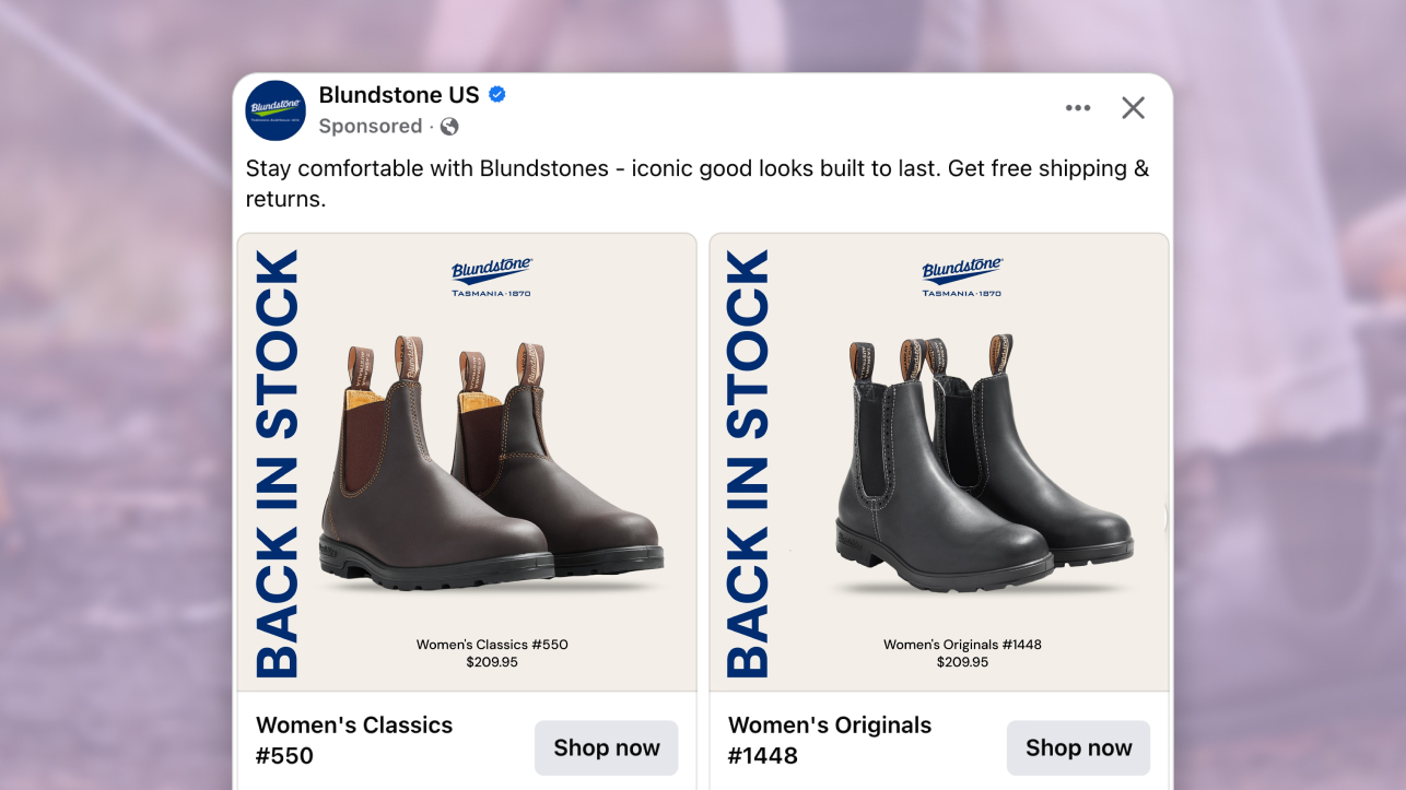
The ad: A Catalog Ad that turns a restock into a reason to stop scrolling
What makes this Catalog Ad from Blundstone and Illuminate Digital so good is how clearly it speaks to one specific person. Someone who has seen these boots before, liked them, and just never pulled the trigger. This ad finds that person and makes it really easy to act.
"Back In Stock" takes over the left side of the frame in bold vertical typography, almost as tall as the boot itself. You know instantly what kind of moment this is. Not a promotion, not a seasonal campaign. Just a straightforward heads up that something worth having is available again.
The layout keeps everything calm around it. Clean background, the boot sitting center frame, the Blundstone heritage mark up top, price and style name at the bottom. It feels uncluttered because Illuminate Digital gave the message space to breathe rather than surrounding it with noise.
The whole thing feels less like an ad and more like a useful nudge from a brand you already trust. It does not try to sell you on the boot. It just reminds you it exists, tells you it is back, and gets out of the way. That is exactly why Catalog Ads work so well for bringing shoppers back.
Why it won Catalog Ad of the Week
This Catalog Ad works because it is not trying to introduce Blundstone to someone new. It is talking to a much more valuable audience: people who already know the brand, already considered buying, and just needed the right moment to come back.
Restock campaigns are one of the highest intent opportunities in eCommerce. The demand already exists. The shopper already did the research. Illuminate Digital recognised that and built a Catalog Ad to capitalise on that existing intent, rather than create new interest from scratch.
A +34% increase in Return on Ad Spend does not come from a clever visual trick. It comes from message-market fit: the right creative, shown to someone whose decision was already mostly made. When that is the case, the Catalog Ad does not need to persuade. It just needs to remove the last bit of friction.
A restock message in the caption would have reached the same audience and done far less. Putting it inside the frame, at that scale, in that position, means every impression carries the full weight of the message whether the shopper reads the post copy or not.
What makes this Catalog Ad great
"Back In Stock" as the hero message: urgency baked into the design, not the caption
Most restock announcements live in the caption, where a big chunk of shoppers will never see them. Illuminate Digital made a different call with this Catalog Ad and it changes everything about how the message lands.
When urgency is part of the design, it gets seen at scroll speed before the viewer has made any conscious decision to engage. That is how pre-attentive processing works: size, contrast, and position are read by the brain before conscious attention kicks in.
The "Back In Stock" text is big enough, bold enough, and positioned prominently enough that the message registers before the viewer has decided whether to look.
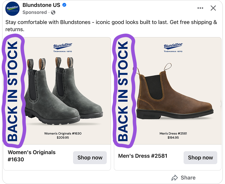
There is also something honest about the way it is executed. Blundstone boots genuinely sell out. This is not manufactured scarcity dressed up as news. And "Back In Stock" works as proof in disguise - if it sold out, other people wanted it too.
That social signal sits quietly underneath the urgency message, doing extra persuasive work without ever needing to say it. Shoppers can feel that difference even if they cannot explain it.
Catalog Ads are uniquely positioned to carry this kind of message because they pull directly from the product feed. Every shopper sees the specific product relevant to them, with the restock message built around it. That is something static ads simply cannot do.
Clean background, real texture: how negative space sells the product for you
No lifestyle shot, no model, no busy background. Just the product given enough room to show exactly what it is. Illuminate Digital made a deliberate choice to let the boot carry the creative rather than dressing it up with elements that add noise without adding value.
A lot of brands fill the frame because empty space feels like a missed opportunity. Here it does the opposite. The off-cream background and generous breathing room signal quality through what designers call processing fluency: designs that are easy to process feel more trustworthy and more premium, even when the viewer cannot explain why.
A cluttered ad feels low-end. A clean ad with one clear focal point feels like it belongs in a campaign.
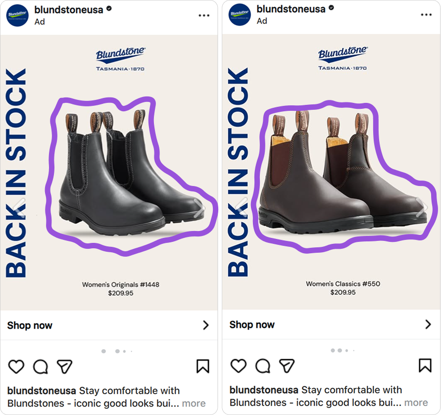
The brogue detailing, the elastic side panel, the leather texture - all of it is visible because nothing is competing for attention. The shopper does not need to imagine what the product looks like. The Catalog Ad shows them.
Blundstone has been making the same iconic silhouette since 1870. The design does not need to create desire from scratch - it just needs to show the boot clearly enough that the desire already there can do its job.
Price and SKU in the frame: the shopper arrives knowing exactly what to search for
Most brands save the style name and price for the product page. Illuminate Digital put both in the frame. It sounds like a small detail but it completely changes how a shopper experiences the moment after the click.
Someone who sees "Men's Dress #1306" in the ad can go straight to the Blundstone website and search that exact name. The right product surfaces immediately - no browsing, no filtering, no wondering if this is the one they saw.
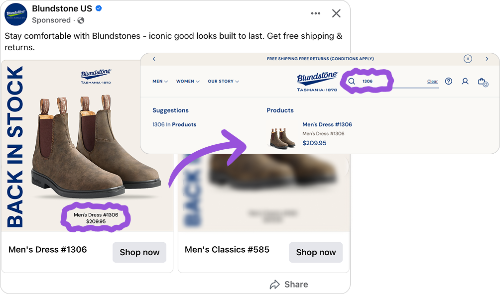
The price works differently but equally well. A shopper who sees the price and taps through has already decided it works for them. They are not arriving to evaluate - they are arriving to buy. Illuminate Digital is not trying to win over everyone. They are giving the right people every reason to act, and getting out of the way for everyone else.
Consistent visual system across every placement: one design, built to work everywhere
The same visual language holds across every format - feed, stories, reels - without losing what makes it work.
That consistency compounds. The mere exposure effect tells us that repeated exposure to a consistent visual builds familiarity, and familiarity builds trust. Each impression reinforces the last.
Most Catalog Ads are built in 1:1 and resized for everything else. That is where things break. Text lands in the wrong position. The product gets cropped. The whole thing feels like an afterthought - because it is. A shopper who sees a polished ad in the feed and a clunky, cropped version in their stories does not consciously register the inconsistency. They just feel slightly less confident about the brand.
.png)
Blundstone and Illuminate Digital avoided that entirely. Each format was built with its own layout logic - the 1:1 centered and confident, the 4:5 more generous, the 9:16 fully restructured so the product and the message both hold at full-screen height.
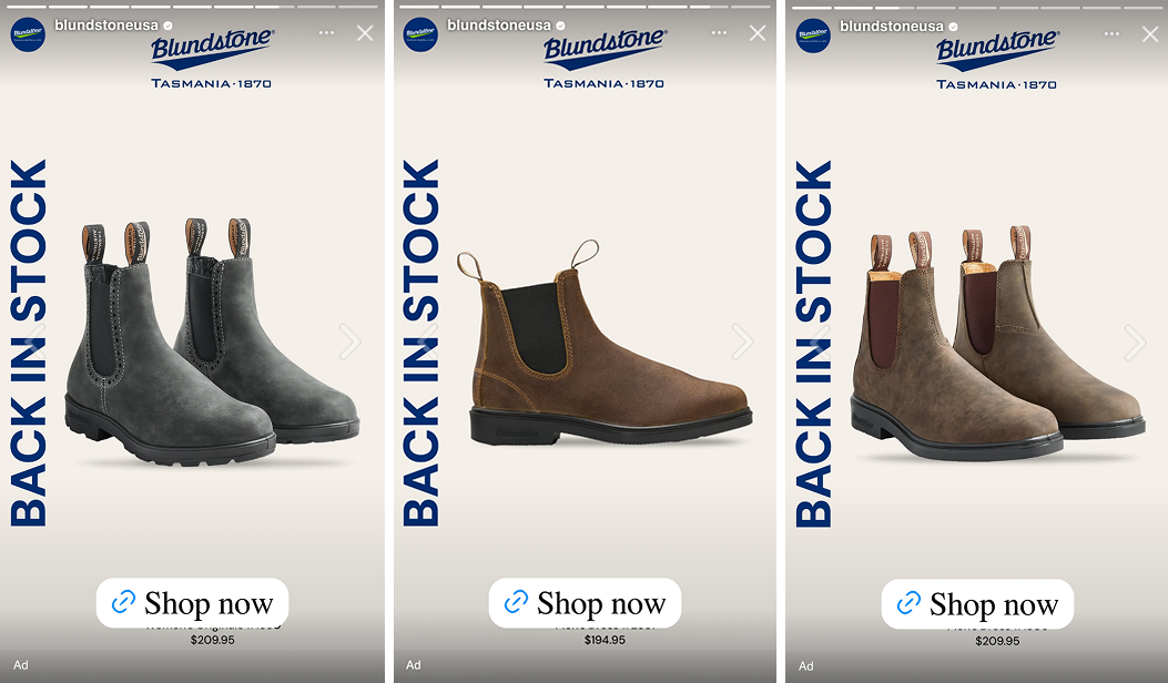
The visual language stays identical across all three. Same off-cream background, same bold blue typography, same brand mark. But each format is built for its placement, not just surviving it.
When your Catalog Ad looks intentional everywhere it runs, each impression compounds. A shopper who sees the same confident visual system across multiple placements starts to feel like the brand is everywhere - and that is exactly what drives the decision to finally click.
Key Takeaways
Every decision in this Catalog Ad - from the typography scale to the product framing to the price placement - serves one purpose: making it as easy as possible for the right shopper to act.
👉 Urgency belongs in the design, not the caption
Captions get skipped. Design gets seen. When the most important message in your Catalog Ad lives inside the frame, every impression carries the full weight of that message regardless of how fast someone is scrolling.
👉 A clean frame is a creative decision, not a lack of one
Negative space signals quality. Designs that are easy to process feel more premium to the viewer, even if they cannot explain why. In categories where the product drives the purchase, showing it clearly and trusting it is usually the strongest move.
👉 Showing the price upfront filters for the shoppers most likely to buy
A shopper who sees the price in the Catalog Ad and clicks anyway has already made their decision. They arrive on the product page ready to convert, not ready to evaluate.
👉 Designing for every placement is designing for trust
Most Catalog Ads are built in 1:1 and resized for the rest. In a 4:5 the text lands wrong. In a 9:16 the product gets cropped. Building each format with intention - same visual system, different layout logic per placement - means the ad feels native wherever it runs. That consistency is what makes a brand feel present rather than intrusive.