Blivakker
March 11, 2026
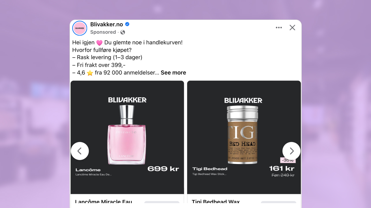
The ad: A beauty & cosmetic lover’s discount come true
This ad works because it feels considered. Every element has a role, and nothing feels accidental. The layout is clean, structured, and clearly built around helping shoppers understand the offer quickly.
In this carousel ad by Blivakker, the products are the starting point. The value message supports them, but never overshadows them. That order signals confidence. The brand is not relying on heavy persuasion. Instead, it lets the lineup of perfumes, creams, nail polishes, and other cosmetic products speak for itself.
The structure makes the browsing experience intuitive. You see the product. You see the price. You see the discount. There is no need to interpret or search for key details. The hierarchy guides you naturally from product to value.
It is this sense of clarity and control that makes the ad effective. The design respects the shopper’s time and decision process, which is exactly what strong catalog ads are built to do.
Why it won Catalog Ad of the week
This catalog ad worked because it used a price-forward design that gave viewers all the details they might need to know about the product before clicking through and visiting the brand’s shop.
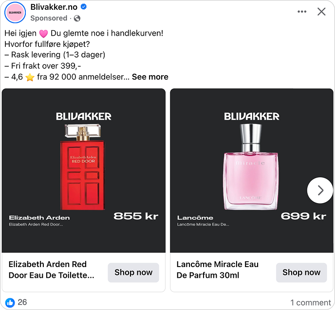
Even at a glance, viewers can see the stylish perfume bottles, the branding, price and discount, which is just one of the reasons why this ad achieved a +26% higher conversion rate and +28% higher ROAS.
These results reinforce the idea that price-forward designs really can make the difference between a good-looking ad, and a good-looking ad that actually drives sales and makes bank.
x
By showing viewers what they need to know, price-forward catalog ads like this seamlessly qualify traffic. This results in fewer window shoppers and more paid clicks that actually lead to sales. Another reason this catalog ad performs well is how the design adapts automatically to the product data. Products that are on sale clearly show both the discount percentage and the original price, while regularly priced products keep a simpler layout without sale messaging.
This type of dynamic variation helps catalog ads stay visually accurate to the product information while still maintaining a consistent structure across the entire carousel.
What makes this Catalog Ad great
Putting the product front and center (literally)
This ad does not just feature the product. It is built around it. The product sits right in the center of the frame, fully isolated, with nothing pulling your attention elsewhere. From the first glance, you know exactly what the ad wants you to look at.
That isolation makes a big difference. With a clean background and no extra elements competing for space, the product becomes the message. You are not scanning the image to figure out what matters. It is immediately clear.
Â .png)
The dark background paired with white typography strengthens that effect. The contrast helps the product stand out, while the price and branding remain easy to read, even in fast scrolling environments. Everything feels deliberate and easy to follow. This is often what strong catalog ads get right. They keep the structure simple, make the product unmistakable, and guide the viewer naturally from product to price. The result is a layout that feels effortless to process and easy to remember.
Pricing details that make value easy to see and understand
Another strong performance driver was the way this ad made value easy to understand.
Both the price and discount are easy to see thanks to the high-contrast font. But this is done in a way that it doesn’t distract from or compete with the isolated product shots.
We’ve often seen pricing and discounts be performance drivers for catalog ads because they show viewers exactly what they need to know about an offer, without having to click.

The thing is, advertisers are sometimes hesitant to show prices, fearing it might scare shoppers away. But that’s precisely the point! It WILL scare some shoppers away, the ones who weren’t likely interested in the product.
Meanwhile, viewers who see prices and stick around… They’re the ones who are most likely to make a purchase. They’re the ones you actually want looking at your ad and clicking through to your shop.
Using Design Rules to tailor catalog ads based on product data
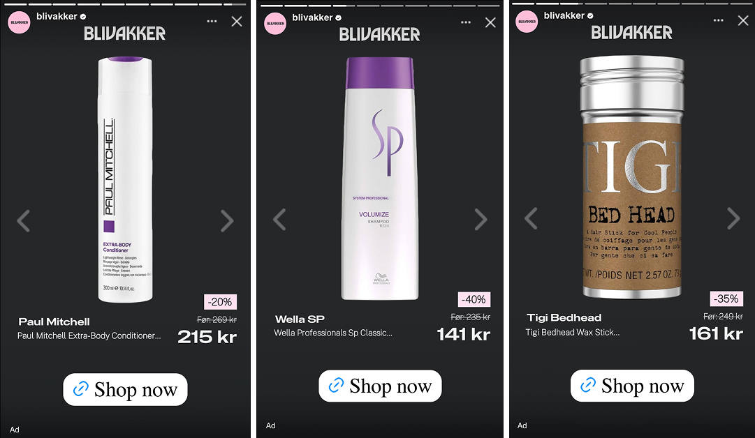
A particularly smart feature of this catalog ad is how the design changes based on product information. Instead of using one identical layout for every product, the design adapts depending on whether the product is on sale or not.
Products that are discounted automatically receive additional elements such as the “-XX%” badge and the original price. Products that are not on sale keep a cleaner layout without these sale indicators.
.png)
This approach uses Design Rules to tailor catalog ads directly to the product data. The design reacts to information like pricing and discount status, allowing the ad to stay visually relevant for every product in the catalog.
The result is catalog ads that stay accurate, structured, and consistent while still reflecting real product differences. Shoppers immediately understand which items are discounted and which are not, without needing extra explanation.
Catalog ads that respond to product data like this make large product feeds easier to manage while maintaining a clear and trustworthy presentation for shoppers.
Catalog ads that can be easily scaled across formats
Another great feature of this catalog ad is that it works naturally in 1:1. 4:5, and 9:16 formats.
The product is centered and price is anchored to the same spot, which means this layout is easy to scale across placements and various social platforms.
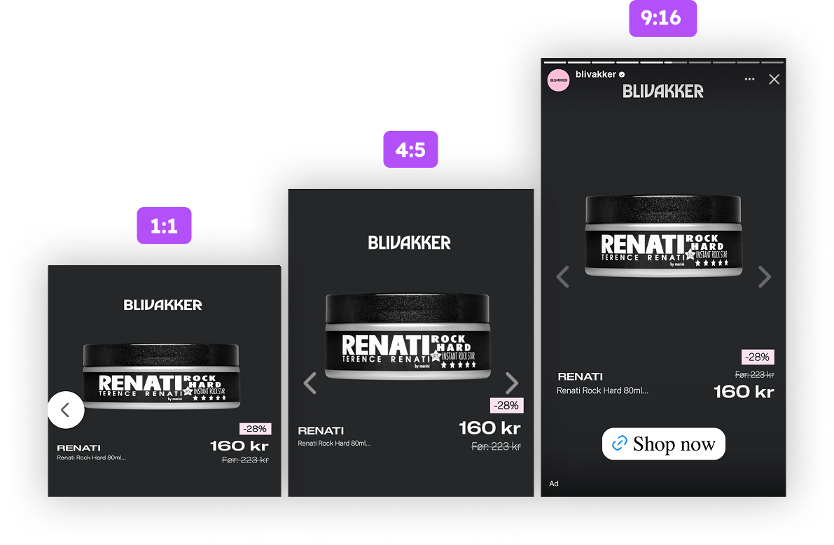
Because the layout structure is consistent and controlled through design rules, the same catalog ads can automatically adapt across formats without breaking the visual hierarchy.
Adaptable layouts increase distribution efficiency across catalog ads campaigns. It makes it easier for brands to create one design and use that same design anywhere or on any platforms where they can connect with their target audience.
It’s precisely that type of scalability that helps brands create catalog ads that look good everywhere and that resonate with audiences at the same time.
Key Takeaways
This catalog ad proves that it’s effective to create ads that show products, branding, pricing, and discounts, and all in a way that’s easy to digest and scalable across social media platforms.
👉Show products without distractions
Top performing catalog ads avoid noise and distractions. Put product centered in an ad, avoid excessive copy, or flashy designs, and you can create catalog ads that focus on what actually matters.
👉 Put the focus on pricing and value
Prices often scare away window shoppers. But trust us, you didn’t want those people clicking on your ads anyway. Instead, price-forward designs qualify traffic, making sure it’s only those most likely to buy your products that land on your website.
👉 Use design rules to adapt catalog ads to product data
Design rules allow catalog ads to adjust automatically based on product data. Sale items show discounts and original prices, while regular products keep a simpler layout, keeping catalog ads accurate and consistent at scale.
👉 Build ads designed for easy scalability
Top-performing advertisers create catalog ads that work well in all formats. When ads are easily scaled across platforms and placements, it becomes easier to connect with your target audience, no matter where they may be spending their time.