5 ways to A/B test your dynamic product ads
February 12, 2023
With dynamic product ads, Facebook's algorithm showcases products to users with laser precision based on their individual interests and past behavior.
They are the gold standard of Facebook ads for e-commerce brands.
But here's the thing: just because your DPAs perform well doesn't mean they can't perform even better.
But how?
The answer: Testing your creative. In fact, 47% of advertising effectiveness comes from the design itself! And this is true also for Facebook Dynamic product ads. This means that if you can pinpoint the absolute best creative design for your DPAs, you can drastically improve your conversion rate and overall revenue, resulting in increased sales and more revenue without doing any additional work!
But there are just very few advertisers testing their creatives for dynamic product ads.
Strange, right?
So, why aren't more advertisers testing different variables and elements of their DPAs?
The fact is that most advertisers don't even know they can run A/B tests on their dynamic product ads.
Or, even if they do, they usually only test variations of low-significance factors, such as the ad copy or targeting, forgetting that the most significant aspect is the creative itself.
So what's the best way to run A/B tests?
What variables should you test?
And how do you even get started?
Below, we’re exploring everything there is to know about A/B testing dynamic product ads on Facebook and explaining what you can (and should) test to increase your ad revenue.
Get ready to unlock the power of split testing and take your Facebook ads to the next level.
What is A/B testing?
A/B testing involves comparing a control version of your ad to a variety of small, single changes to determine which one performs the best.
But the trick is that you need to change only one variable at a time (such as different backgrounds, colors, images, etc.) to learn what works best.
If you only compare two completely different designs against each other, it’s impossible to know which elements help and which make things worse.
In other words, you'll find out which design performs better, but not WHY it performs any better.
That's where testing multiple variations of a similar creative comes into play.
By identifying which variables cause higher or lower performance, you can consistently optimize your ads to achieve higher ROIs and better conversion rates in the future.
Sure, your DPAs might perform well using a boring, white background packshot, but imagine how much more revenue they could bring in if you spend time perfecting the creative.
Even making a small change could have a huge impact on your campaign performance.
To know exactly what to do, read our full step-by-step guide on A/B testing dynamic product ads.
Note that the variables you change will help you optimize for specific goals, such as clicks, purchases, etc. For example, the ideal amount of text you use will depend on whether your goal is clicks or conversions.
So let's dive into it!
5 of the best variables to use for A/B testing
When it comes to A/B testing, the possibilities are virtually endless, and every little tweak imaginable can be tested for optimal performance.
But with so many options, where do you even begin?
Start by asking yourself, "What will make my ads perform better - X or Y?"
This could be anything from bright vs. dark colors to including a logo or not.
However, we know deciding what to test can be overwhelming, so we've created a handy list of split tests to help you get started.
Just remember to always start with bigger picture ideas and variables and work your way down to the nitty-gritty details. In other words, don't waste time tweaking the text size if your message isn't even resonating with your audience.
Ready to dive in and revolutionize your dynamic ad game?
Let's go!
1. The background - What backgrounds get users’ attention?
Changing and testing your DPA background is one of the easiest adjustments to make, but it can have a huge impact on your ad's visual appeal.
But here’s the catch: with so many options to choose from, finding the perfect background can feel like searching for a needle in a haystack.
Do you go for bold colors, subtle patterns, or eye-catching graphics?
To keep things simple, start by comparing broader variables, such as whether images with darker or lighter tones perform best!
No need to test every single color under the sun!

You could for example start by testing broader background variables, such as:
- Light or dark backgrounds?
- Saturated and colorful, or more muted tones?
- Flat color or a patterned background?
- Illustrations or a photograph?
Alternately, you can be a bit more specific and test different background colors, patterns, or photographs against each other.
2. Your ad message - What message resonates with your audience?
When it comes to crafting killer dnamic product ads, there's one crucial question you need to ask yourself:
What's the main message you’re trying to convey?
Are you advertising a sale, flaunting your latest products, or showing off rave reviews from happy customers?
But here's the kicker: different audiences respond to different messages, so there's no one-size-fits-all solution.
The point is that by testing out different messages, you can fine-tune your ads and optimize them based on what actually works and resonates with your specific audience.
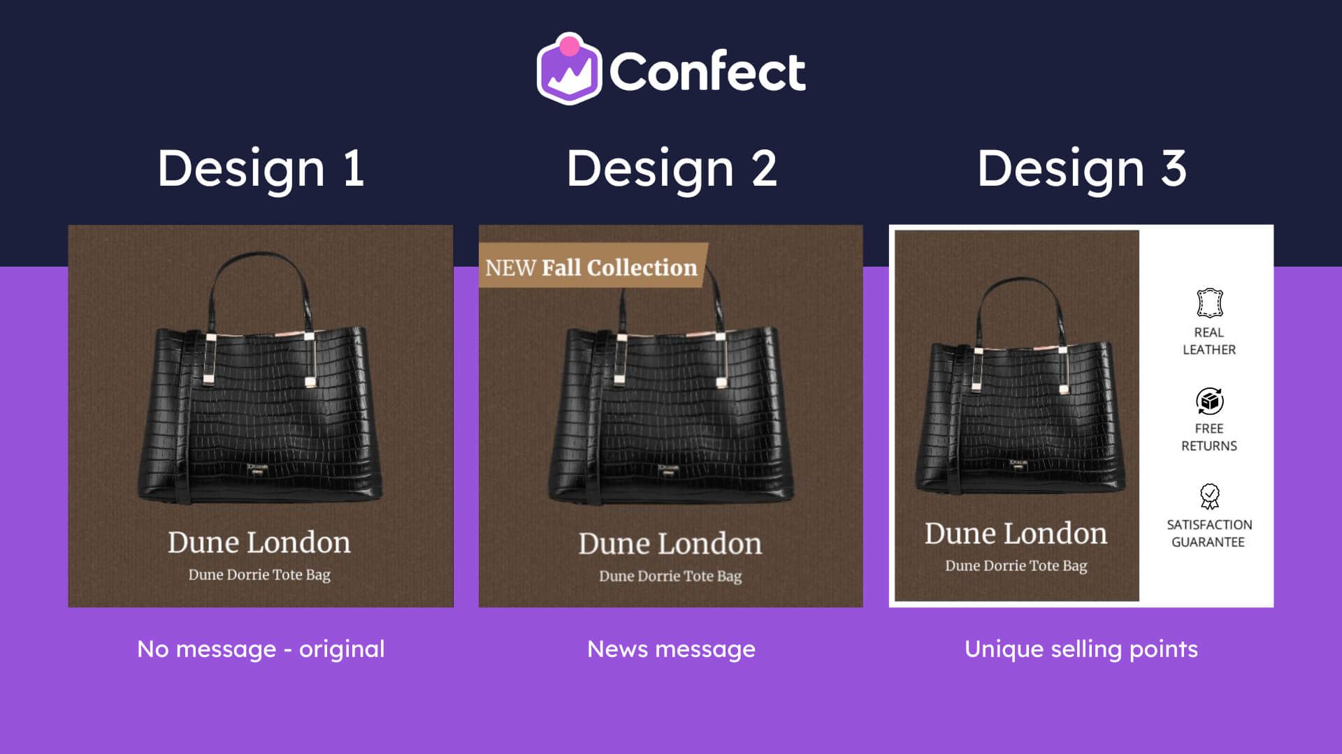
Here are just a few different message types that you might want to try out!
- No specific message - Perhaps your products speak for themselves and all you have to do is show them off.
- Mentioning your unique selling propositions - Clarifying the uniqueness of your products could make your brand stand out from the crowd.
- Reviews, ratings, or social proof - Ratings and social proof are one of the best ways to build trust, so why not test out which type of social proof works best?
- Shipping or delivery information -Maybe your audience really cares about convenience and wants their product as soon as possible.
- Promoting brand new product releases - People love finding new and novel products, but do news messages perform better than sales messages?
- Including a call to action, such as “Buy Now!” - Maybe your audience just needs to be told what you want them to do next.
- Offering a discount or a sale - Within this message type, we should also mention that there’s different types of sales you can test: i.e. Seasonal sale (autumn, winter), X% off everything, Up to X% off, etc.
3. The details - What information does your audience care about?
Now that you've nailed down your message, it's time to get into the nitty-gritty.
How should you design your ads and present the information to really hook your audience?
Keep in mind that users only spend a few precious seconds scanning your ad as they scroll, so you need to pack a punch with the most relevant information to create interest.
Don't try to cram everything in there!
Too much info can be overwhelming and lead to lackluster click-through rates and sub-par ROI.
Instead, focus on making changes and testing out variables that will have the biggest impact on your ad's performance, such as including a product’s price or not.
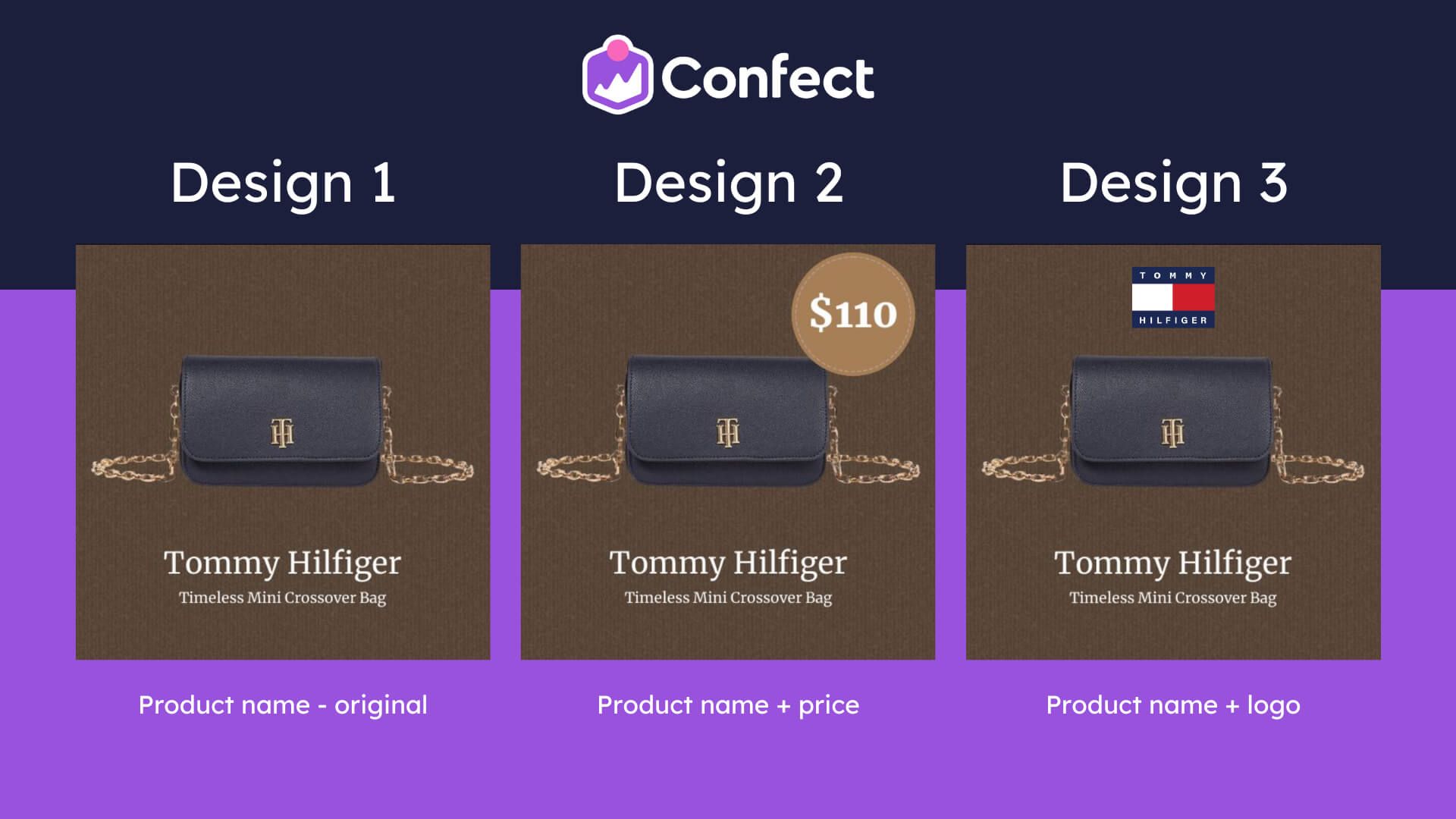
A few other design choices to consider might include:
- Showing discounts in percentages (%) or currency ($)? - Perhaps the standard percentages are the way to go, or maybe in some cases 100$ off could work better than 20% off. It's a great option for dynmic product ads as your feed has all this discount information
- The color and design of a “price splash” - Would a more colorful price splash draw attention and improve performance, or will it be too salesy?
- Which product details, or specifications, to mention? - Do people prefer knowing price, product size, weight, warranty information?
- Include a logo, or leave it out? - Branding can often help build trust, but including a logo doesn’t always mean better performance.
4. The text - What type of text makes your audience want to buy?
The amount of text you use can also be a game-changer!
Keep in mind that optimizing your ad’s text is a much more specific consideration that will depend on your message.
So, optimizing your text for a sale ad versus optimizing an ad for a new product release will require different approaches.
Don't let that scare you though!
Your ad’s text is still a crucial piece of the puzzle that shouldn't be ignored.
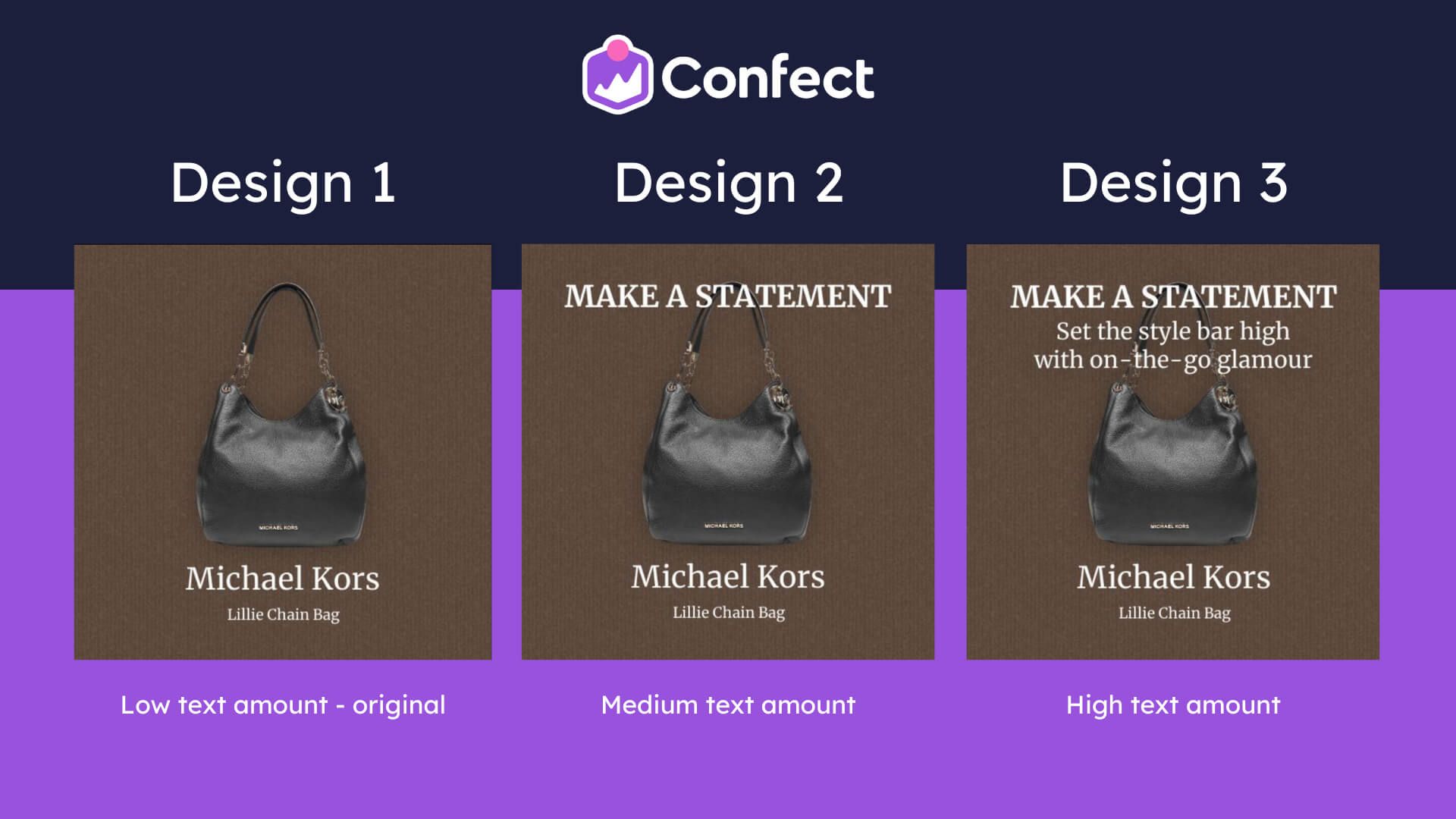
Try fine-tuning your DPA’s text using some of the following considerations.
- Including no text at all - Yes, you can relay a message purely with visual elements, but is that the best choice for your specific offer?
- Including just a little or a lot of text - Maybe your audience needs to know specific details about your offer for it to be effective.
- Small or large font size?
- Uppercase, lowercase or mixed letters?
- Where to place text? - Left or right? Top or bottom? In the center or in the corners?
- Experimenting with combinations - Some small, some large, some at the top, some in the bottom?
5. Minor variables - What tiny changes can lift performance?
Finally, make sure you don't overlook the little things that can make a big impact.
When you're creating new ad designs, even the tiniest details can be worth A/B testing.
Maybe you and your coworkers are split on whether to include emojis or pink hearts in your creatives.
Why not put it to the test?
Just because these small considerations are the last item on your to-do list doesn't mean they're any less important.
Believe it or not, we've seen small tweaks like changing a single word double the conversion rate!
So don't brush off the power of these minor adjustments! They might be the key to unlocking major performance gains.
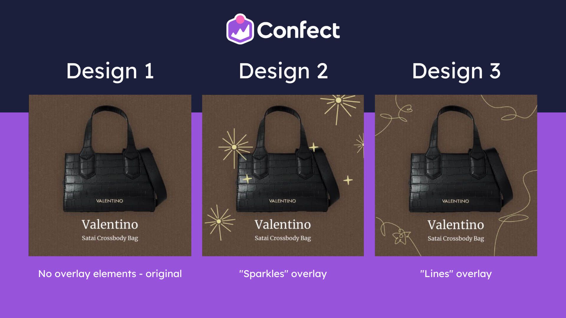
Some examples of minor variables you can test out include:
- Does X or Y tagline perform better?
- This word or that synonym?
- Longer or shorter descriptions in the ad body?
- Using emojis
- Including small illustrations in the design
The Importance Of Optimizing Your Dynamic Product Ads With A/B Testing
In the end, A/B testing your dynamic product ads on Facebook is a crucial step towards optimizing your overall advertising strategy.
By testing different ad variations, you can gain insights into what resonates best with your target audience and, in turn, you can adjust your approach accordingly.
Through continuous optimization and refinement, you can improve the effectiveness of your ads and drive better results for your business.
Essentially, you can test your way to more revenue in the future!
With ongoing A/B testing and a commitment to optimization, you can easily take your Facebook advertising efforts to the next level!
