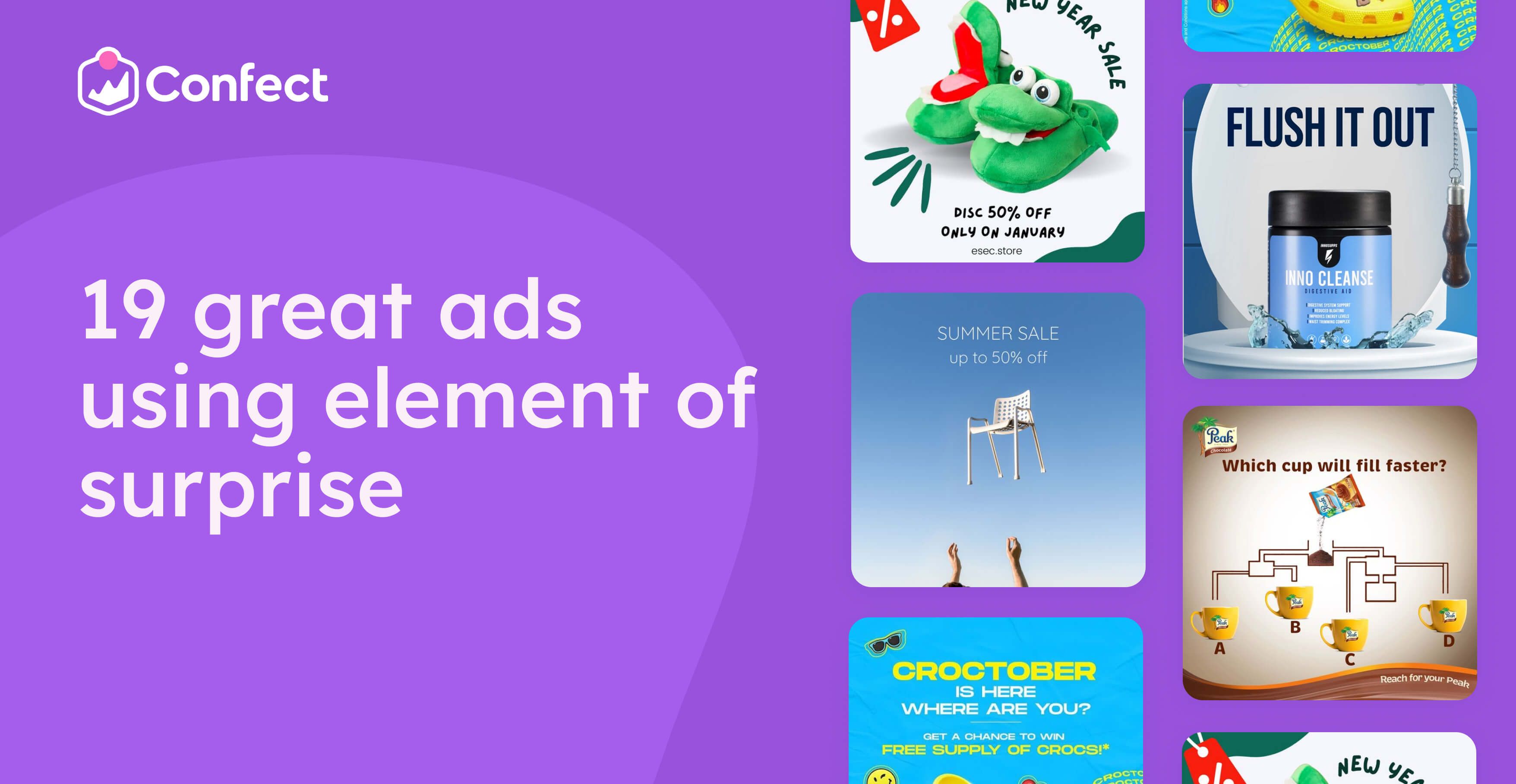
19 great ads using element of surprise
January 28, 2023
Let's be real! Scrolling through your social media feed can be a total snooze-fest.
After a while, all those ads for clothing and products start to blend together, and nothing really stands out.
But what if we told you there's a way to break free from the monotony and make your brand’s products or services truly memorable?
The secret lies in using surprise and unexpected ad elements.
By introducing something new and unexpected, you can catch viewers off guard and make your brand stand out from the crowd.
It's all about making a strong and lasting impression that sticks with people long after they've scrolled past your ad.
But you don't want to overdo it!
The key is to strike a balance and create just enough of a surprise to make them actively think about your ad, instead of mindlessly scrolling past it.
So if you’re ready to shake things up and add some excitement to your social media game, we've got you covered with a list of ad examples to inspire you.
But first, let’s review a bit of the theory behind this surprising and unexpected advertising technique.
What Is The Element Of Surprise?
In today's world, it's challenging to create ads that stand out from the rest.
And what’s worse is that humans have a limited attention span, especially when scrolling through social media feeds flooded with similar content
But when a user encounters something new or unexpected, their curiosity is piqued, and their attention span is heightened.
They want to understand what they're seeing and without even knowing it, they’ll devote more brainpower to deciphering the content.
So by adding an unexpected element to your ads, you can force your viewers to stop and pay closer attention to the content.
Moreover, adding unexpected elements can change behavior and break the cycle of mindless scrolling.
Essentially, the idea is to stop the user in their tracks and get them to interact with the ad actively, rather than passively scrolling past it.
Ultimately, this leads to stronger brand recognition and a deeper connection with the audience.
19 Examples Of Ads That Use The Element Of Surprise
Now that you have a better understanding of why surprise can be such an effective tool, let’s dive into our list of some of the best ads leveraging this technique.
But before we do, if you're looking for a great, easy, and extremely effective way to design better Dynamic Ads, you should know that Confect provides you with an all-in-one solution for editing and customizing your DPAs so that they'll stand out form the rest!
And the best part is that you can try it today for free!
1. Black Christmas??

In the world of marketing, swimming against the current can often take your advertising efforts far.
Showing people something different from what they’re expecting is a great way to capture their attention and make your products more memorable.
And that’s exactly what happened with this next Black Friday ad that was used to promote Christmas products.
Christmas is also an expensive season.
So why not leverage Black Friday to sell Christmas products before all your competitors start doing the same.
On another note, this ad could have performed even better by making one subtle change.
Because this is technically a Christmas ad, the advertiser went with a red and green color scheme.
However, we’ve found that during the week of Black Friday, ads that use Black Friday colors, such as black combined with orange, yellow, or white, often perform better.
.png)
2. Halloween is not only for kids

Whoever said Halloween is just for kids has clearly been missing out on the grown-up fun.
But let's be real, we're not talking about your typical candy haul here. We're talking about the sweet, sweet green that we all love to make: money! 💸
And if you think Halloween isn't a prime opportunity for marketing, think again.
If you remember one of our previous newsletters, I talked about the power of seasons in marketing.
Well, this car modification company is taking full advantage of the spooky season with their Halloween sale.
But it's not just them!
Any savvy business owner can capitalize on holidays and seasons to give their sales a major boost. And if you're not convinced, just check out this company's killer offer of 50% off before Black Friday.
They clearly know how to make the most of the season, and you can too by using the element of surprise!
3. Spin the wheel to boost sales

As humans, we're driven by desire, whether it's a craving for food, thirst for water, or the desire to feel important.
And that's where the spinning wheel in this ad comes into play!
It's a tantalizing teaser that ignites curiosity and leaves people itching to find out what promotion they'll receive when they give it a whirl.
But here's the best part, not only does this strategy work wonders for conversions, it's also an incredible lead magnet.
Every time someone spins that wheel, you've captured a valuable lead who's already shown interest in your Halloween products.
And let's not forget the power of a Halloween background.
It's the perfect way to warm up your leads for the spooky season and prime them for Black Friday.
4. A, B, C or D? 💡🤔
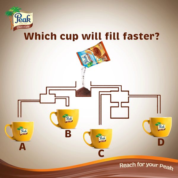
This is classic.
Oh, this ad is an absolute classic! I mean, who hasn't seen one of these ads before?
The beauty of it is that it's simple, yet engaging, making it the perfect fit for any product or industry.
And if you really want to take it up a notch, you can choose to throw in a coupon, prize, or giveaway, and watch those leads come rolling in.
Because let's face it, us humans love to prove to ourselves (and others) that we're smart enough to solve a puzzle.
And speaking of puzzles, did you solve this one yet?
Don't worry, we won't leave you hanging. The answer is C! 🥰💡
5. Is it really 50% off

The key to making your ads stand out is using something unexpected and illogical to provoke emotion and draw attention.
With an ad like this, you'll be able to grab your audience's attention, even the ones who are typically immune to any type of paid advertisements.
And once you've got their attention, you'll be able to reel them in with an irresistible 50% offer that they won't be able to resist.
But here's the real kicker! If you pair this approach with active retargeting, you'll be able to milk this audience long after the initial campaign is over.
Why settle for mediocre results when you can skyrocket your clicks with an out-of-the-box visual?
So don't be afraid to get a little creative, the results will speak for themselves!
Discounts with a twist catch attention - see how affordable and discount brands use Catalog Ads to promote surprising offers.
6. Hello super dads
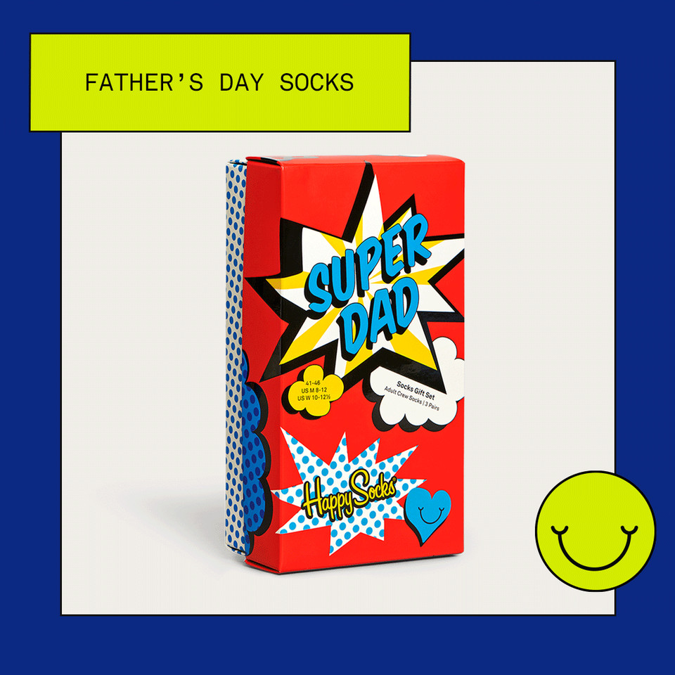
Happy Socks is a brand where simplicity meets quirkiness in the best way possible!
If you're familiar with their style, then you know what we're talking about.
The contrasting background, splashes of color, and perfectly aligned products create a visual harmony that's sure to catch your eye.
And the best part?
This ad’s bright, vibrant colors stand out like a shining star in anyone's feed.
And let's be real, who wouldn't want to sport these socks with pride?
7. SPIN For WIN🎁
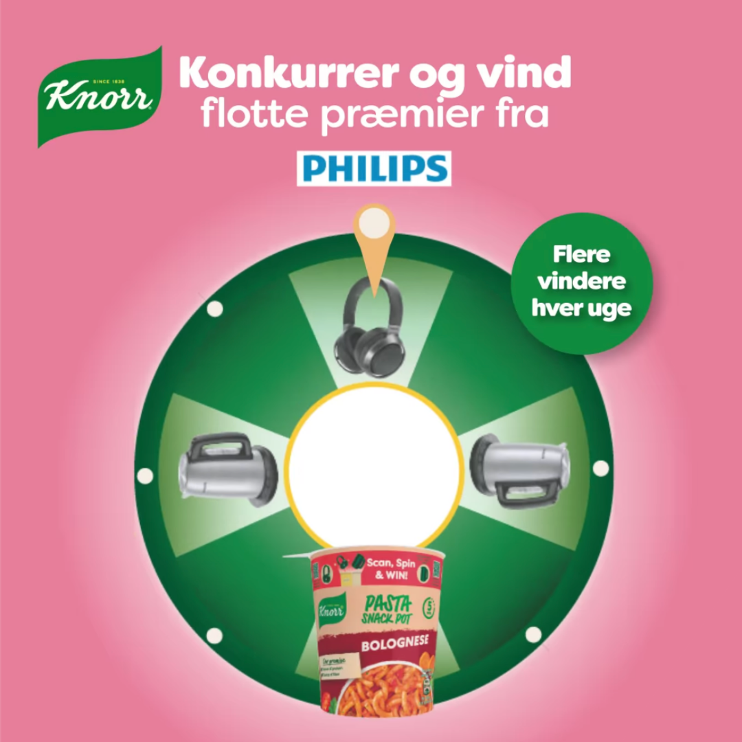
Have you seen the click-through rates on these types of ads?
They're absolutely phenomenal!
And the best part is, it's all thanks to a simple spin of the wheel that could potentially lead consumers to win some truly amazing prizes.
Not only is this a great way to attract new prospects, but it's also an excellent opportunity to grow your email list and plan some killer sales campaigns later on down the line.
The interactive game format is an entertaining way to engage users and encourage them to participate, and all while giving your brand some major exposure in the process.
So, we must give credit where credit is due!
Hats off to Knorr for nailing this Facebook ad with innovative and engaging tactics that are sure to attract potential customers and boost those sales.
8. A Yolky Good Time!
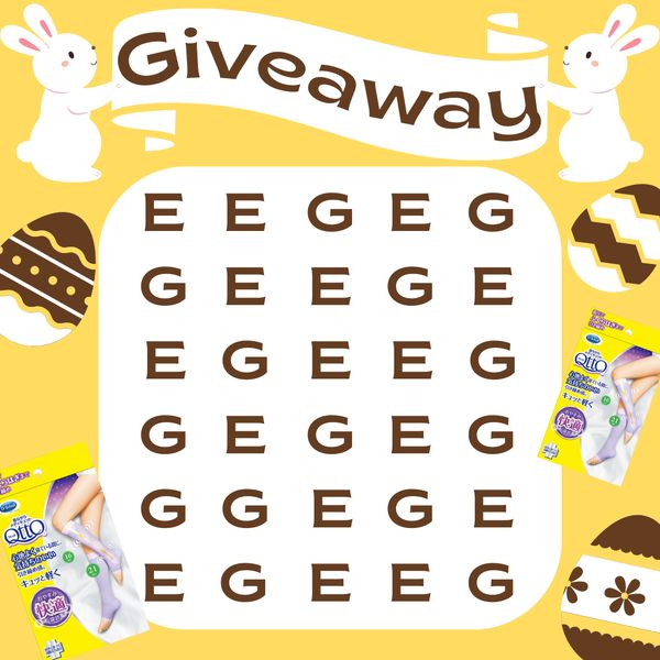
This next surprising, attention-grabbing ad is all about the color yellow, a happy-go-lucky hue that'll make you want to break out into a smile.
And it's the perfect fit for this particular holiday, Easter!
But that's not all! The elements in this ad are so thoughtfully put together.
Just take a look at those eggs, each with a gradient that fades from light to dark. They look like they're just about ready to hatch!
And let's not forget about the challenge that’s guaranteed to get people eager to participate and test their luck.
This ad is simple, straightforward, and the prize is clearly visible.
But what really seals the deal is those two adorable bunnies holding the sign that reads "Giveaway."
It's playful and oh-so-inviting.
Overall, this is a phenomenal ad that's sure to captivate people's attention and keep them glued to the content.
9. Out of the Box EGG🥚 Easter Treats

This year, treats are taking on a whole new level of creativity, and this company is making sure you’ll get your fair share!
Just take a look at this surprising ad!
It's like a burst of color, with soft hues that catch your eye and don't let go. And the Easter truly is a perfect touch to complete the theme!
But what really sets this ad apart is the playful way it showcases the products.
Just check out those eggs nestled in among the goodies! It's creative and oh-so-different. And the background color is downright attractive.
Plus, that textured font for the company name is extra easy on the eyes.
But that’s not where it ends! Oh no!
There are all sorts of other little details peppered throughout the ad, making it look dynamic and exciting by leveraging the element of surprise.
10. No cluckin' chickens

Quick, what color immediately comes to mind when you think of KFC?
If you answered red, you might want to think twice.
Because in this bold new KFC commercial, the unexpected color scheme will leave you pleasantly surprised.
The catchy text is in a vibrant green, and even the place mat that the food is presented on is green, breaking the mold of KFC's typical red branding.
What's even more exciting is that this ad isn't for the usual fried chicken, but for Kentucky Fried Plants 🌱, perfect for your vegetarian or vegan friends.
Despite the food positioning remaining the same, the clever use of visual cues and text makes it clear that something has changed.
And overall, this is just a great example of using the element of surprise to grab attention in your ads.
This playful surprise fits well with food and drink campaigns - check out how these brands use Catalog Ads to stand out in a crowded space.
11. Everything is Honey
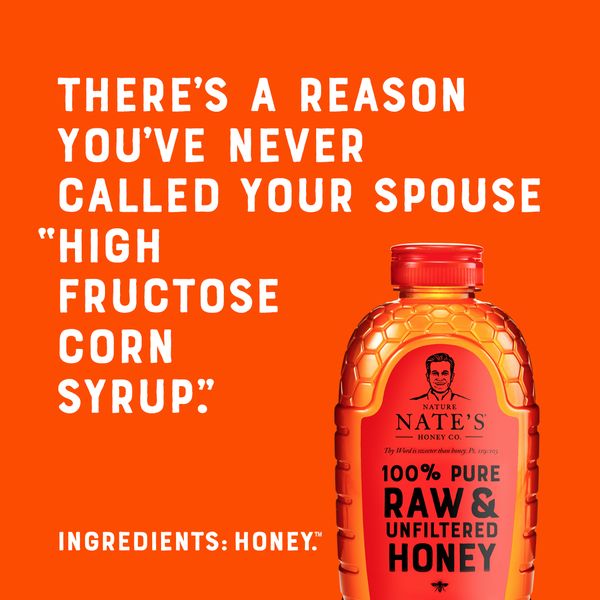
Get ready to buzz with excitement! This next ad is like a jar of warm honey on a sunny day.
The vibrant orange background is like a ray of sunshine, drawing you into the delicious golden honey featured prominently in the bottom right corner.
And the witty white text adds a touch of humor, making you smile and feel good about what you're about to indulge in.
It's no surprise that Winnie-the-Pooh would approve! 🐻 🐝
But it's not just the eye-catching design that makes this ad so great.
It's the fact that the product speaks for itself—100% pure & unfiltered honey.
Without any gimmicks, no additives, and just pure sweetness straight from the bees, this ad is a testament to the power of simplicity and authenticity in advertising.
12. Overly attached girlfriend

Get ready for an eyeful, folks!
This ad is dripping with romance and fun, with a classic pink background, heart motifs, and cute clouds playfully swirling around the product.
But what really catches the eye is the gorgeous image of a girl’s face (hopefully, your girlfriend’s) with wings that draws your gaze straight to the panties.
There’s no explanation necessary, the ad makes it crystal clear what's on offer here.
You can get your own custom-printed underwear with her face on them!
Imagine having a picture of your significant other gracing your unmentionables...it's the ultimate romantic gesture, right?
13. Froggin' Good deals

Get ready to hop into some fun with this ad!
These frog slippers are not only adorable, but the playful design of the ad makes them impossible to resist.
One frog has its mouth wide open while the other has googly eyes that will make you smile, the perfect way to capture audience attention!
The soft colors and playful font perfectly match the overall theme of the ad.
Plus, check out the action lines in the bottom left corner. They make it seem like the open-mouthed frog is shouting, adding even more to the surprising fun of the ad.
And with all that excitement and surprise, who wouldn't want a pair of these slippers? 🐸
14. Bright, fun, and emojis? 😋🔥
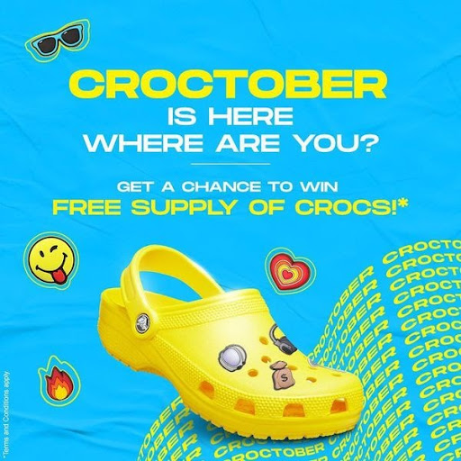
If you ask us, this next ad is absolutely Croc-tastic!
The bold fluorescent blue background sets the perfect stage for the white and yellow lettering to shine.
And let's take a second to talk about that product shot: the Croc steps right on the vertical lines of the lettering, creating a wave effect that adds a sense of movement and keeps your eyes locked on the ad.
But that's not all that makes this ad surprisingly great! The clever use of emojis is a stroke of genius.
They add a playful touch and create a feeling of happiness and ease, making you want to slip on a pair of Crocs and take on the world.
It's a shame that most advertisers shy away from using emojis in their ads, fearing that it will come across as juvenile and unprofessional.
However, top-performing advertisers understand the power of emojis to engage and connect with their audience, making their brand more relatable and approachable.
In fact, the best-of-the-best advertisers use emojis in their ads 54% more often than those with the lowest average performance.
 (3).png)
Learn about what are the: Five things top-performing advertisers are doing differently than others.
Vivid, emoji-driven designs often perform well for younger, trend-focused audiences - see how fashion brands tailor their Catalog Ads with bold creative like this.
15. Love At First Bite
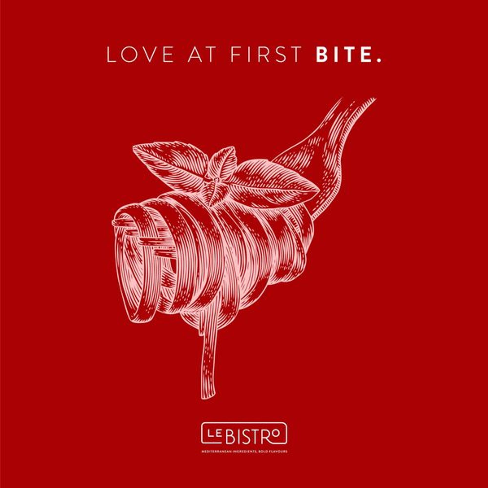
Get ready to fall in love with this next ad!
Le Bistro nailed the perfect design to help you and your significant other celebrate Saint Valentine's Day.
The bright, bold red background screams romance and sets the mood for a perfect date night.
And the image of perfectly twirled pasta on a fork is enough to make your mouth water and your heart skip a beat.
But what really steals the show is the clever play on words they've incorporated.
It's flirty, playful, and completely captures the essence of what this ad is all about: love at first bite!
16. Guiding the action

This ad is a master of suspense, leaving you wondering what the person is looking at with an enticing blurred background.
The cleverly placed person directs your attention to a specific point, and a powerful CTA demanding you to "Download App!" pushes you to act on your curiosity immediately.
This ad doesn't need fancy effects or visuals to grab your attention; it's simple and clear without any distractions.
And the best part?
It makes you feel like you're missing out on something, igniting a sense of urgency and curiosity.
Plus, the inclusion of the bike and logo gives you an idea of what the ad is about, while still leaving some mystery to unravel.
17. Soda Champagne?!
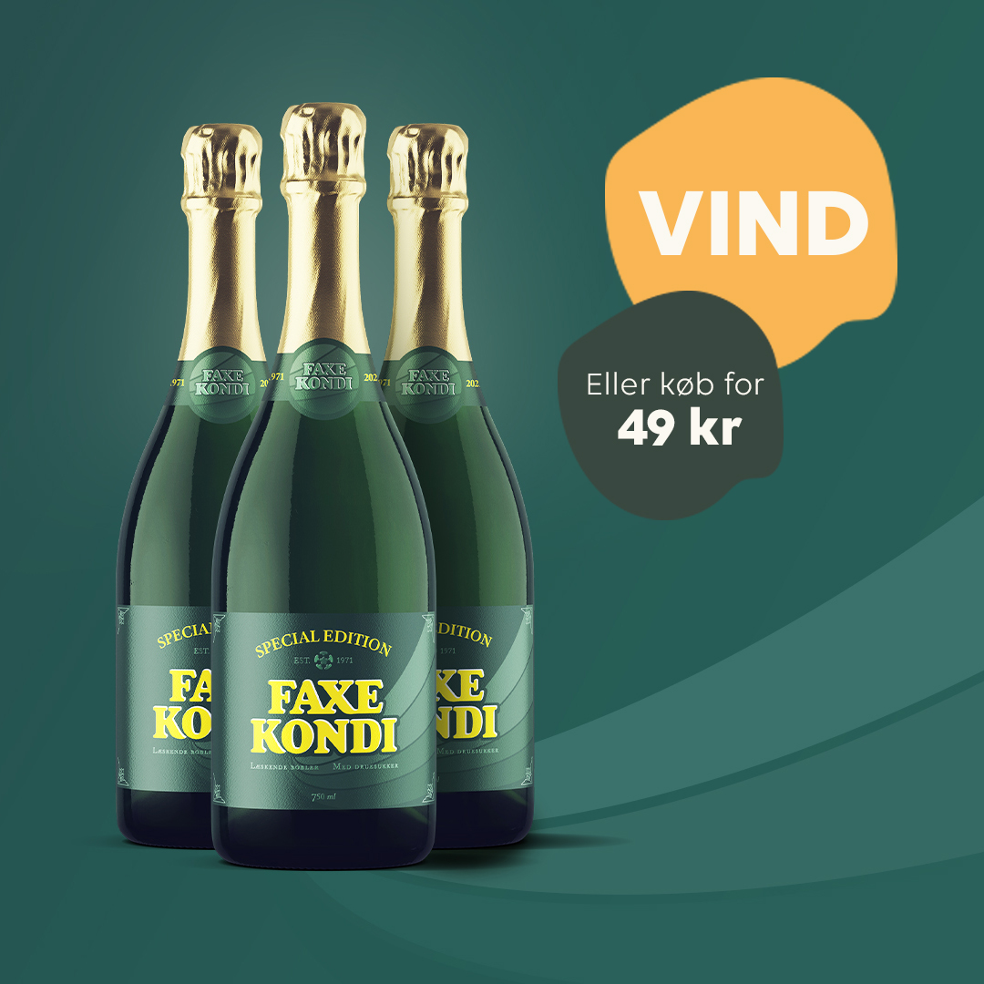
In this next ad, the first thing that grabs your attention is the bold and bright yellow splash with the word "VIND" written in all caps.
It's impossible to miss with its high saturation and luminance that make it stand out against the background.
And that's not all, the products featured in the ad are oversized and strategically placed in the left vertical half of the ad, making them impossible to ignore.
But what really seals the deal is the eye-catching blob of brightness behind the products, driving your focus straight towards them.
This ad knows how to command attention and keep it!
18. Weird enclosed chips
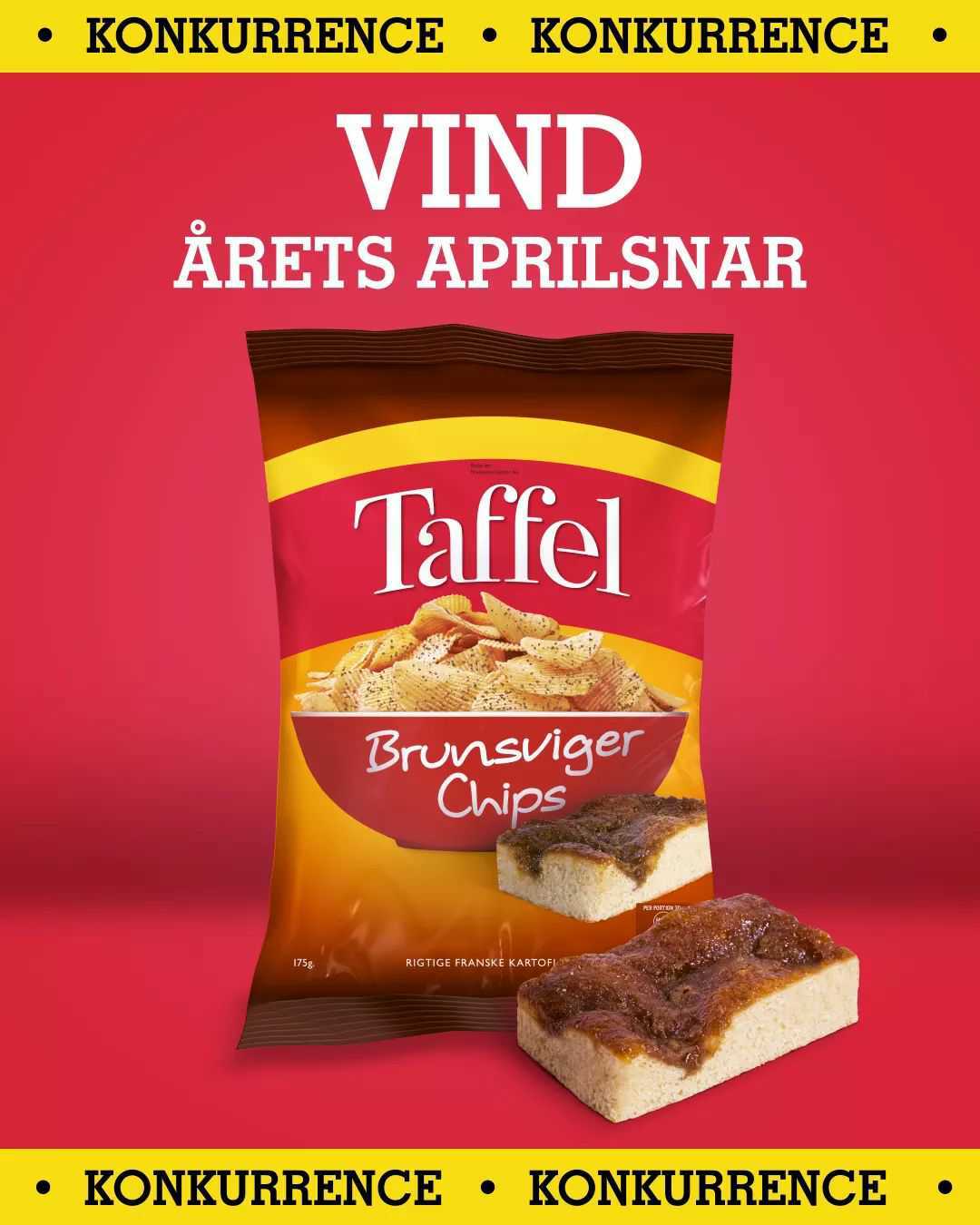
This ad demands attention with its bold yellow bars wrapping around the edges. It's like the ad is saying, "Hey you, look at me!"
And once you do, you can't help but notice the chips bag with its standout yellow stripe.
It's like a beacon calling out to you, "Try me, I'm delicious!"
But what really takes things up a notch is the text at the top, perfectly positioned to draw your eyes upward.
Together, all these elements make for an attention-grabbing ad that practically jumps off the page and into your memory.
19. Flushing It All Away
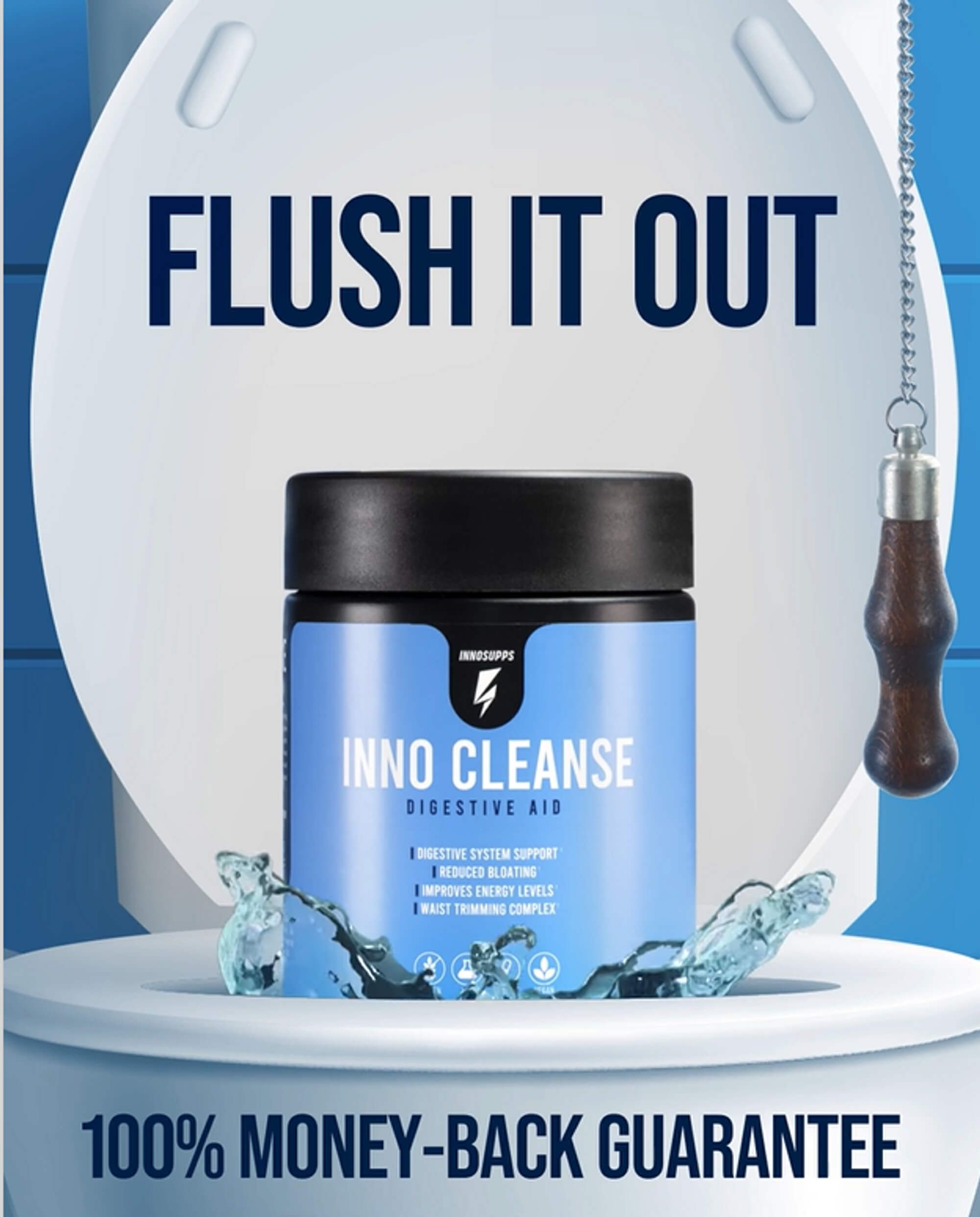
Get ready to be blown away by this ad from Inno Cleanse! With its eye-catching, controversial, and descriptive design, it's impossible not to love it.
The soft blue and white color scheme is not only visually captivating but also creates a calming and soothing effect that perfectly matches the digestive cleanse product they're promoting.
And let's not forget about the bold choice to feature a toilet in the background. It’s controversial, yes, but it definitely grabs your attention and drives home the product's effectiveness.
But what’s more is that Inno Cleanse takes it up a notch by offering a 100% money-back guarantee, giving consumers that added sense of value and security when trying out a new product.
Overall, this is a great ad design, straight out of left field, that is yet another perfect example of how you too can use the element of surprise in your marketing.
The Element Of Surprise To Boost Ad Performance
By adding unexpected and unanticipated elements to their ads, advertisers can ensure that users actually notice and pay attention to their content.
One of the most effective ways to use surprise is through videos with unexpected story developments.
But surprise can also be implemented into paid social ad creatives with a little creativity.
The key is to ask yourself, "What would the user expect, and how can we present that in an unexpected way?"
However, it's essential to remember not to go overboard with surprise. The goal is to surprise the audience, not to confuse them.
So, when using unexpected elements, it's crucial to strike a balance between surprise and coherence.
Either way, with a bit of creativity, unexpected elements can be used to enhance your ads, making them stand out and creating a lasting impression on your audience.
It's time you spend more time on your creatives - especially in dynamic product ads! Learn why here.
Try Confect for Free
Confect can help you to create great-looking Catalog ads and Dynamic Product ads for Facebook, Instagram, TikTok, Snapchat and Pinterest.