Safe zones
June 6, 2025
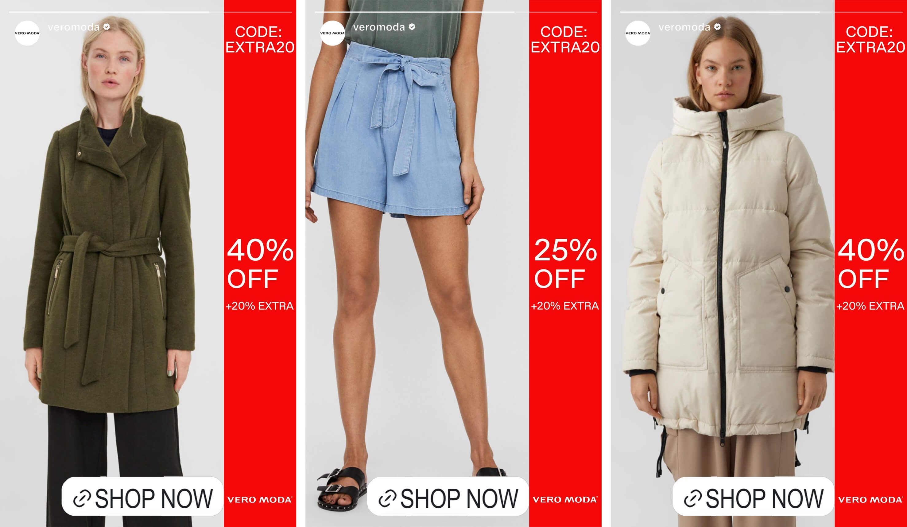
Safe Zones in Catalog Ads
A safe zone in Meta ads is the area where important content like text or logos should be placed to avoid being covered by buttons or interface elements. Staying within this zone, especially avoiding edges in Reels and Stories, keeps your message clear and effective across all devices and placements.
What Are “Safe Zones” in Catalog Ad Design?
Safe zones are the areas of your ad creative where important content, like product images, prices, logos, and calls-to-action, can be placed without risk of getting cropped, covered, or distorted across different devices, placements, and ad formats.
Think of them like margins in print design. Staying within them ensures your content remains legible, visible, and effective regardless of where your ad shows up.
Outside the safe zone? You’re gambling.
.jpg)
Why Safe Zones Matter
With catalog ads being dynamically generated and served across various Meta placements, like Stories, Feed, Reels, Explore, and Marketplace, the same creative might be displayed in dozens of contexts with different dimensions and overlays.
Here’s what’s happening in the real world:
- Your price tag overlaps your product image
- Your CTA is covered by Meta’s profile or action buttons
- Your headline is cut off in a vertical ad
- Your beautifully designed layout is misaligned and looks broken
These small errors tank performance, even if the rest of the ad is perfect.
So many advertisers unknowingly let their designs get mangled just because they didn’t account for safe zones. The result? Wasted impressions, missed clicks, and lost conversions.
Safe zones template
Let’s break down the issue. On Meta, your ad isn’t static. The same creative might be:
- Auto-resized into different aspect ratios (1:1, 4:5, 9:16)
- Displayed on various devices (iOS, Android, desktop)
- Overlaid with platform UI elements (buttons, profiles, captions)
- Cropped to fit dynamic placements like Reels, Stories, or right column
What looks fine in your design preview can easily be broken in live placements.
That’s where safe zones come in. They give you the boundaries you need to design with confidence.
How is Safe Zone made
Depending on your aspect ratio, each design has a different safe zone. But the principle is the same:
✅Keep key content (logos, prices, CTAs, text) within the central portion of the ad ✅Leave enough margin space around the edges to avoid overlap or cropping
✅Avoid putting text at the very top or bottom, especially in 9:16 and 4:5 formats
Here’s how this might look in practice for common aspect ratios:
For Square (1:1) Ads:
- Safe zone: The middle 80%
- Margins: 10% padding on all sides
- Watch out for: Overlap from platform CTAs or profile pictures
For Vertical (9:16) Ads (e.g. Stories & Reels):
- Safe zone: Middle 65–70% vertically
- Top unsafe area: Platform UI (profile name, music, etc.)
- Bottom unsafe area: Reactions, CTAs, swipe-ups
- Pro tip: Design with a top and bottom buffer (approx. 250px each)
For Portrait (4:5) Ads:
- Safe zone: Slightly more generous, but top/bottom caution still applies
- Best for: Feed placements on mobile where vertical space is tighter
Common Safe Zone Mistakes (And How to Avoid Them)
- Putting logos or CTAs in corners Fix: Always place them inside a center-aligned container or lower-third “belt” that stays within the safe zone.
- Adding text too close to the top or bottom in 9:16 formats Fix: Use a guiding grid or template when designing vertical creatives to account for UI overlays.
- Relying on a single design for all aspect ratios Fix: Create format-specific designs that respect unique safe zones per placement.
- Not previewing ads across placements before publishing Fix: Use a dynamic design tool (like Confect) to preview and auto-adapt.
The Real Cost of Ignoring Safe Zones
Safe zone violations don’t just make your ads look off. They directly affect:
- Readability: If users can’t see your value prop or CTA, they won’t act.
- Brand perception: Broken layouts look unprofessional.
- Ad relevance score: Meta may penalize your creative’s quality, leading to higher costs.
- ROAS: Every missed click is a missed conversion.
You may be unknowingly paying more to run ads that are being skipped, ignored, or misunderstood.
The Smarter Way: Design With Safe Zones From the Start
Rather than fixing broken ads after launch, it’s better to build with safe zones in mind. That’s where a tool like Confect gives you a serious edge.
With Confect, you can:
- Preview safe zones in real-time while designing catalog ads
- Create multiple format-specific designs from a single layout
- Automatically adapt your creative to each placement’s constraints
- Avoid overlaps with smart element positioning
It’s the fastest way to create dynamic product ads that look sharp (and work hard) on every screen.
Pro Tips for Safe Zone–Savvy Advertisers
- Use padding or guides when designing to keep text/content in check
- Test your ads in Meta’s creative preview tools for Stories, Feed, Reels, and right-column
- Don’t just “shrink” text to fit. It becomes unreadable. Instead, design natively for each format
- Group your product, price, and CTA into a single block inside the safe zone for consistent visibility
- If in doubt, go minimalist; simple layouts are harder to break
In Summary
Designing catalog ads without considering safe zones is like launching a product without testing the packaging. It might work in some cases, but when it fails, it fails big.
Safe zones aren’t just a design tip. They’re a performance lever! By keeping your product visuals, pricing, and CTAs within safe bounds, you ensure your message comes through loud and clear—no matter the placement.
And in a dynamic, crowded feed environment, that clarity is your competitive edge.
Because a perfectly designed ad that gets cropped… isn’t perfect at all.
Discover how to maximize your ROI by measuring and optimizing your ad performance effectively here.
Try Confect for Free
Confect can help you to create great-looking Catalog ads and Dynamic Product ads for Facebook, Instagram, TikTok, Snapchat and Pinterest.